UI kits for Figma and code
Ready-to-use sections and components in HTML, Astro and Tailwind CSS, with their Figma file when there is one.
UI kit
Paid on this site
UI kit
Paid on this site
UI kit
Paid on this site
UI kit
Paid on this site
UI kit
Paid on this site
UI kit
Paid on this site
UI kit
Paid on this site
UI kit
Paid on this site
UI kit
Paid on this site
UI kit
Paid on this site
UI kit
Paid on this site
What these kits contain
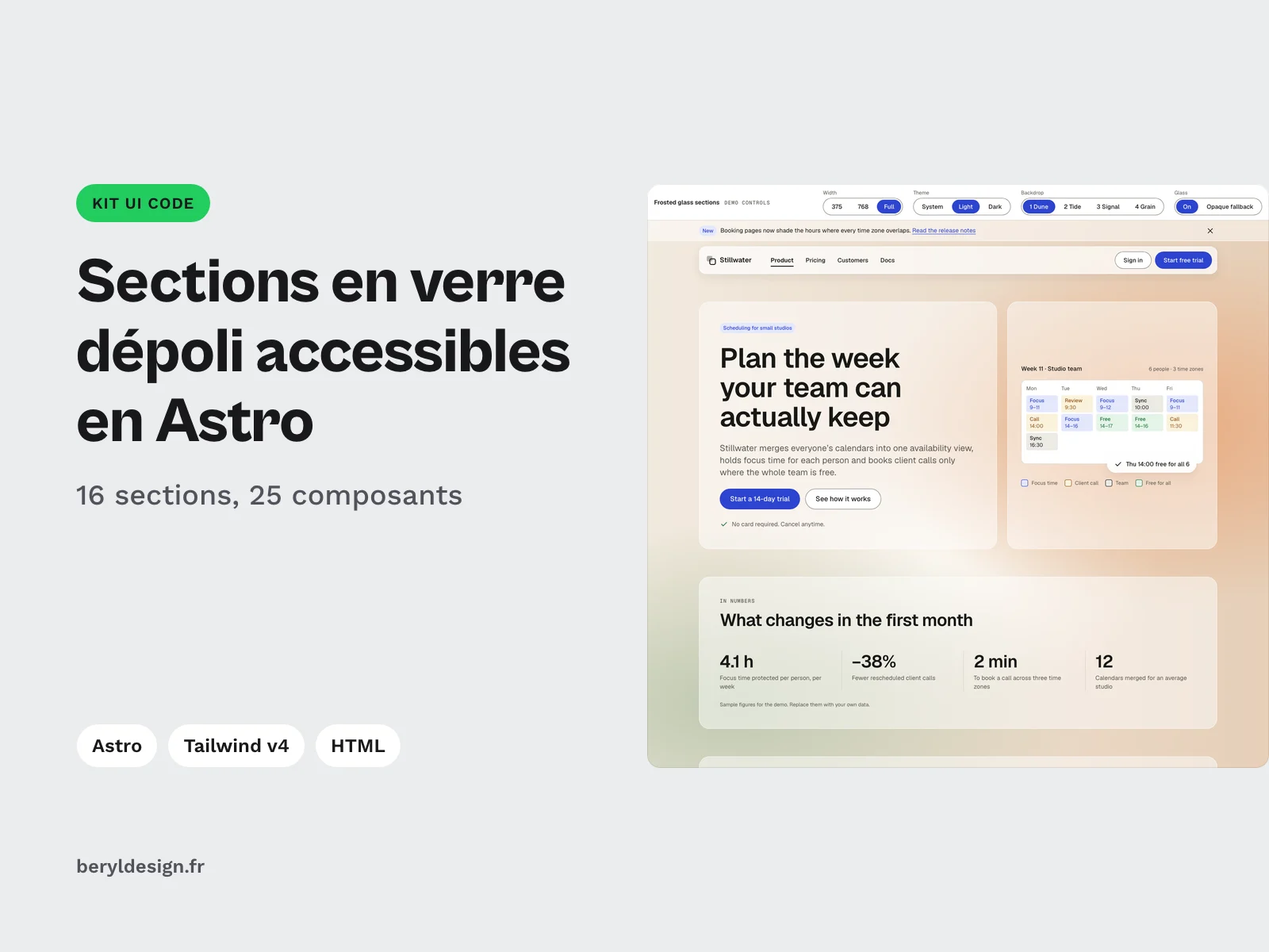
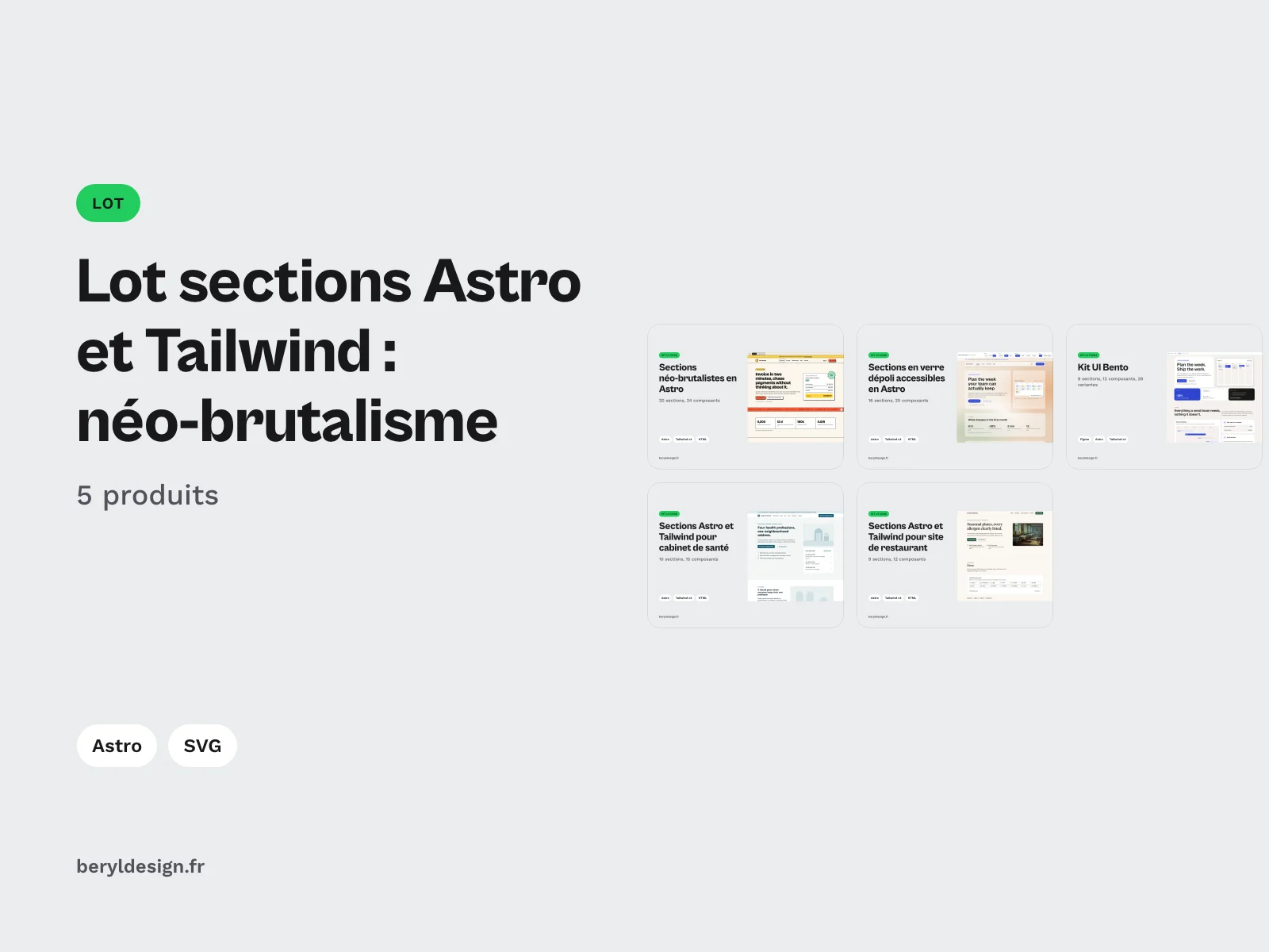
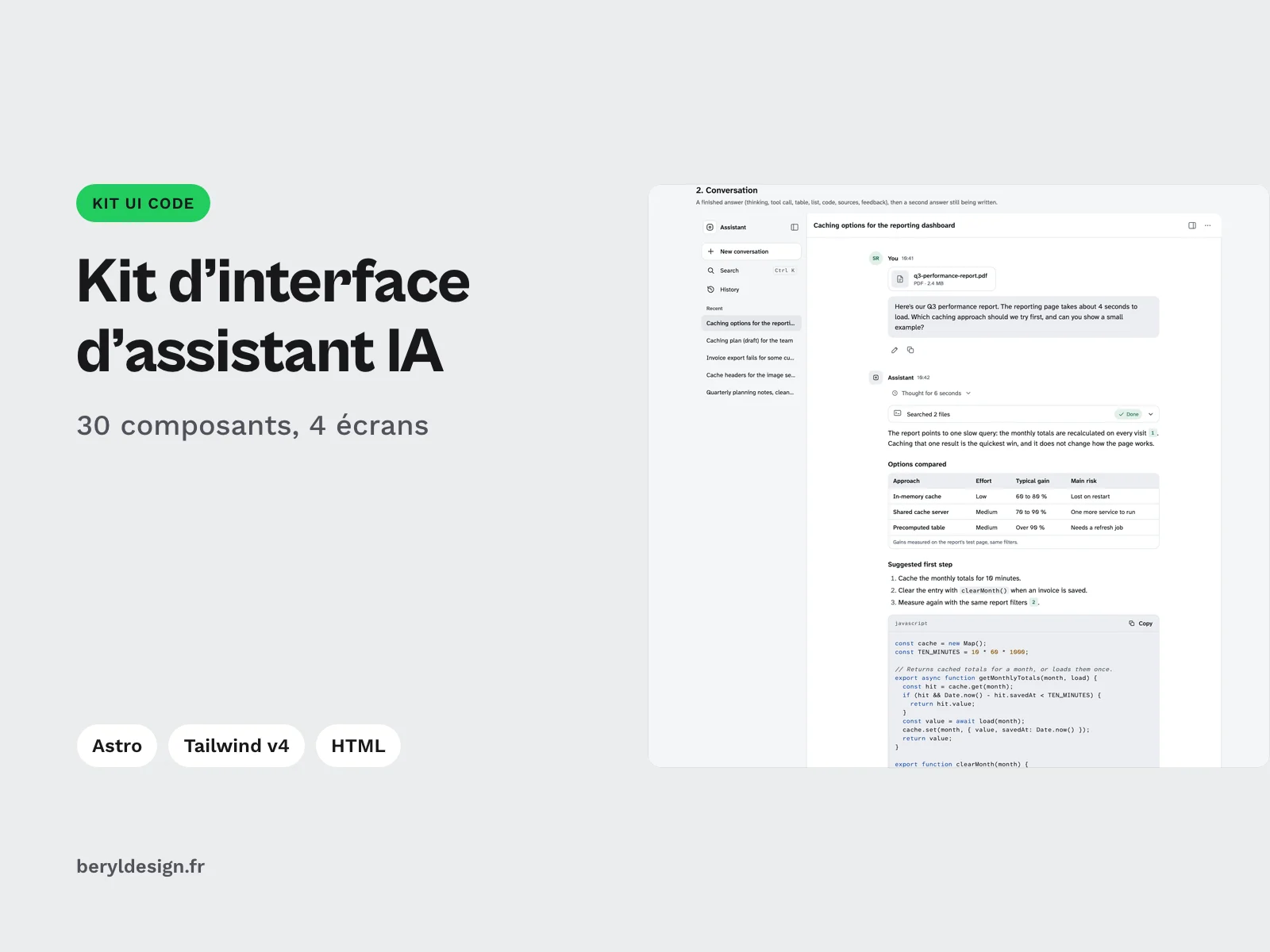
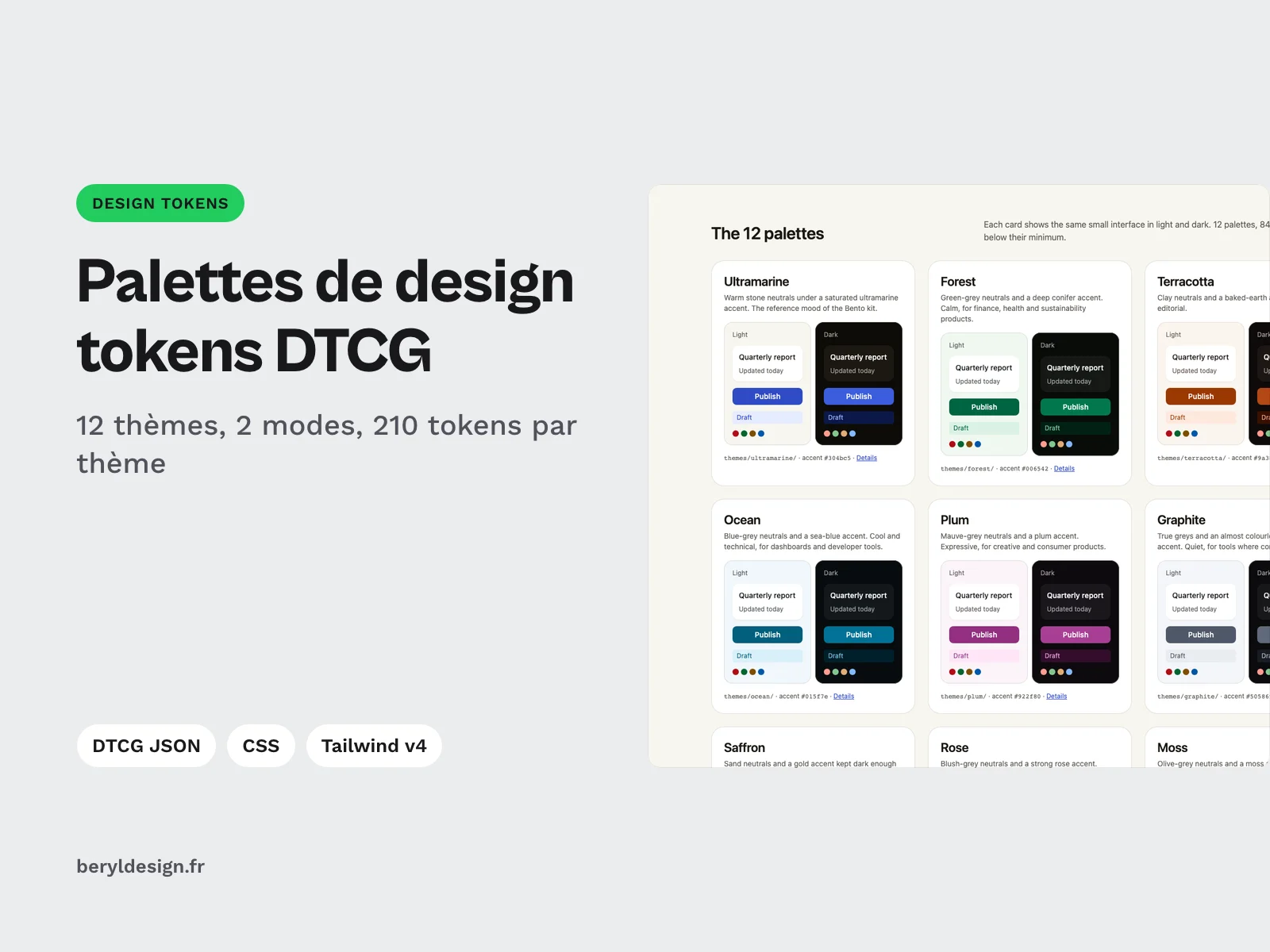
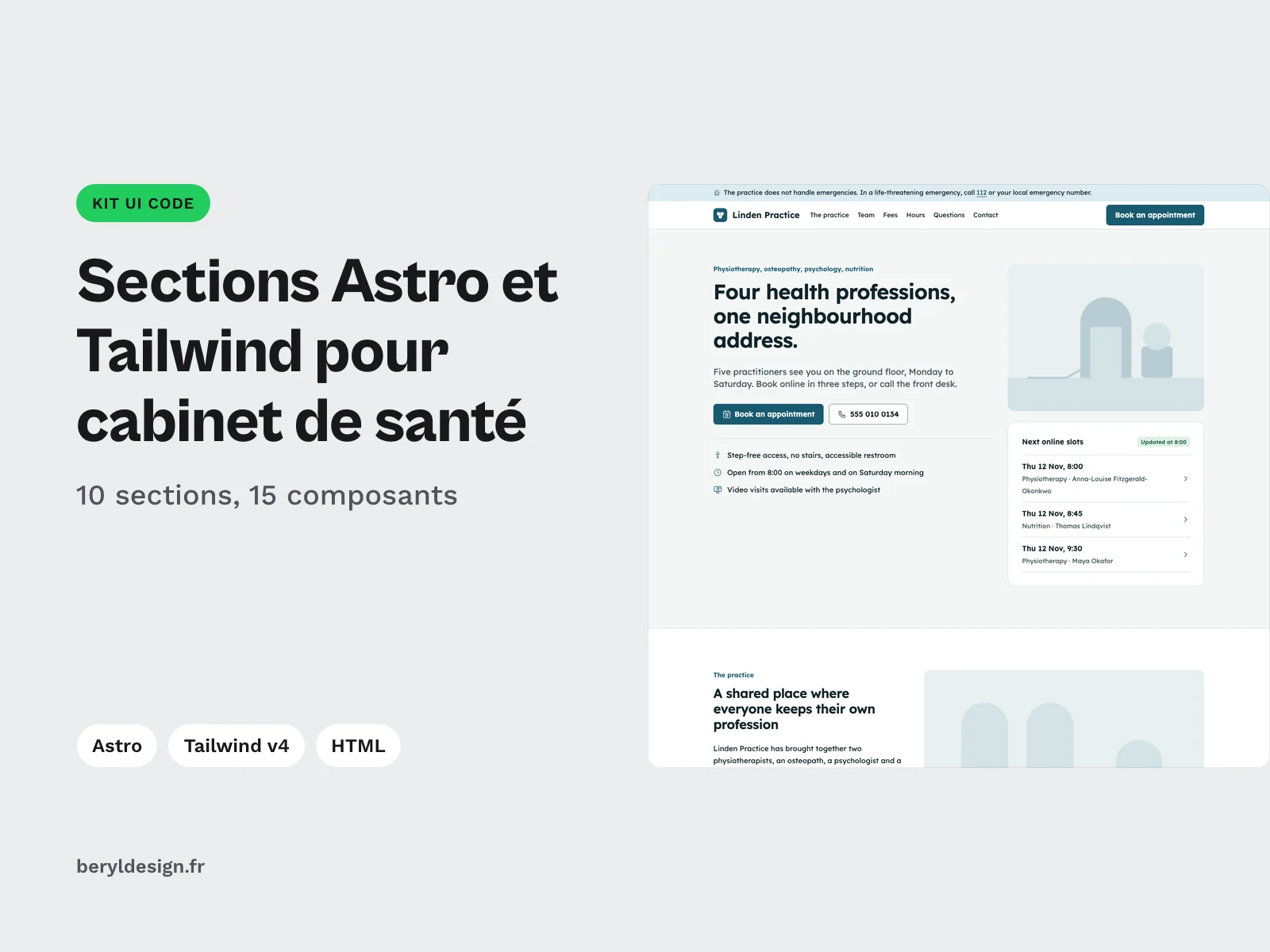
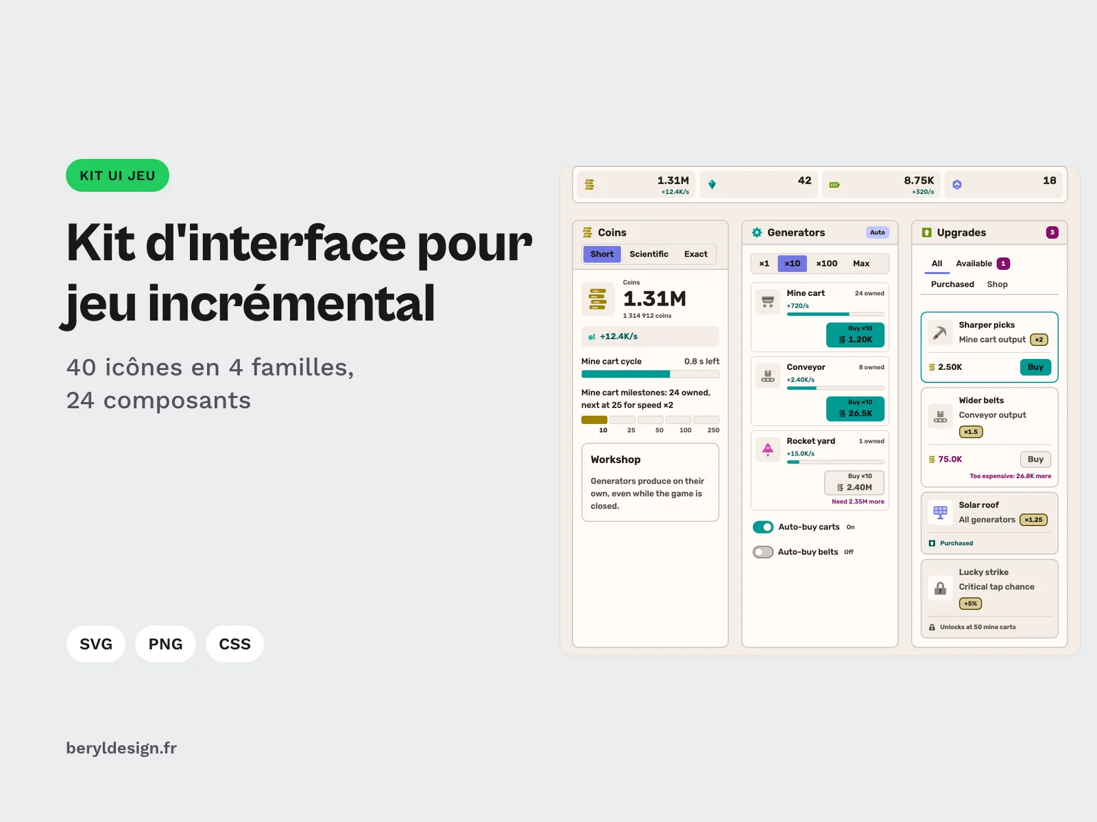
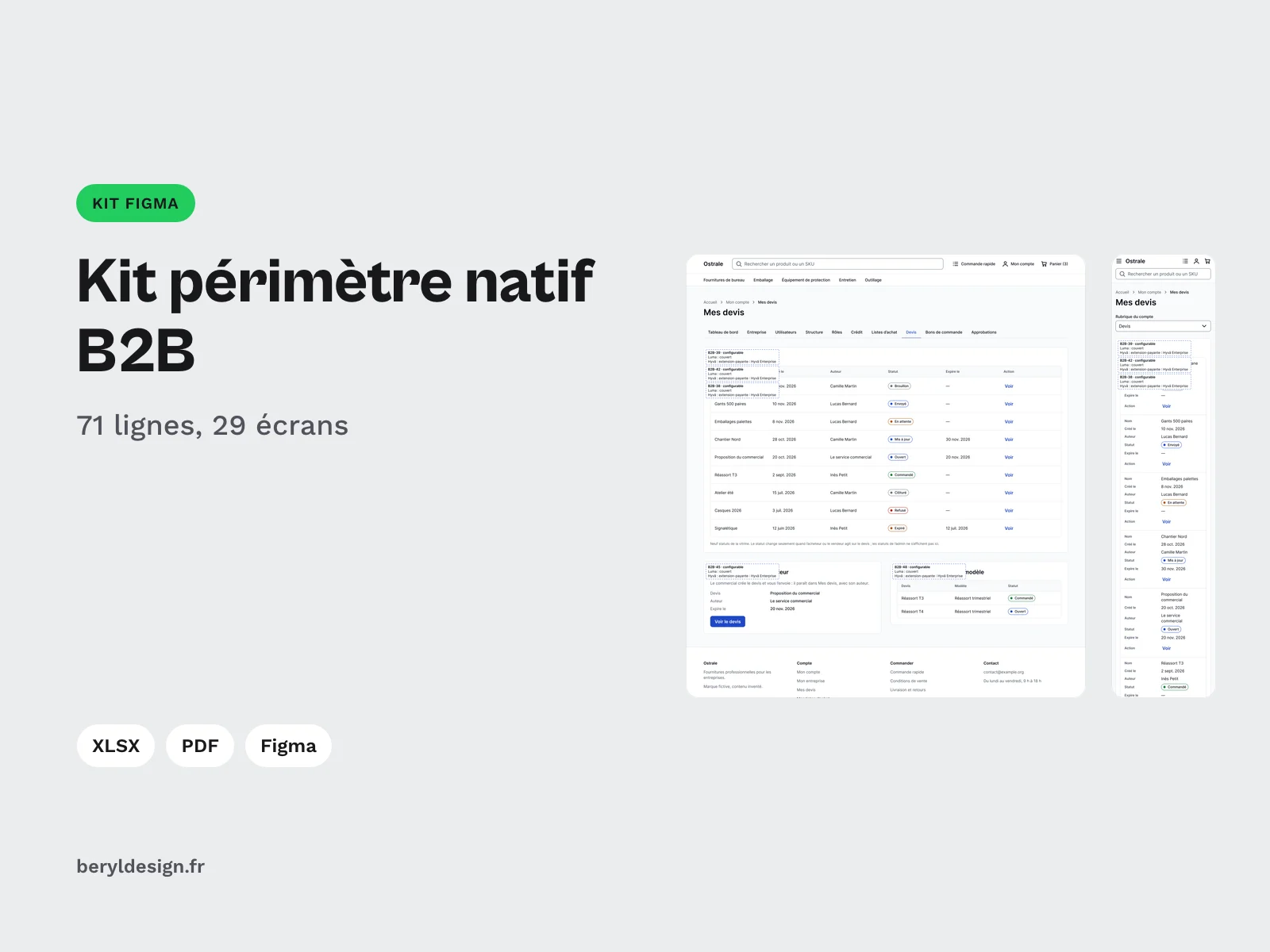
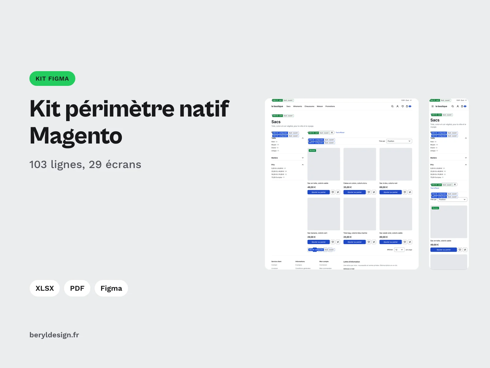
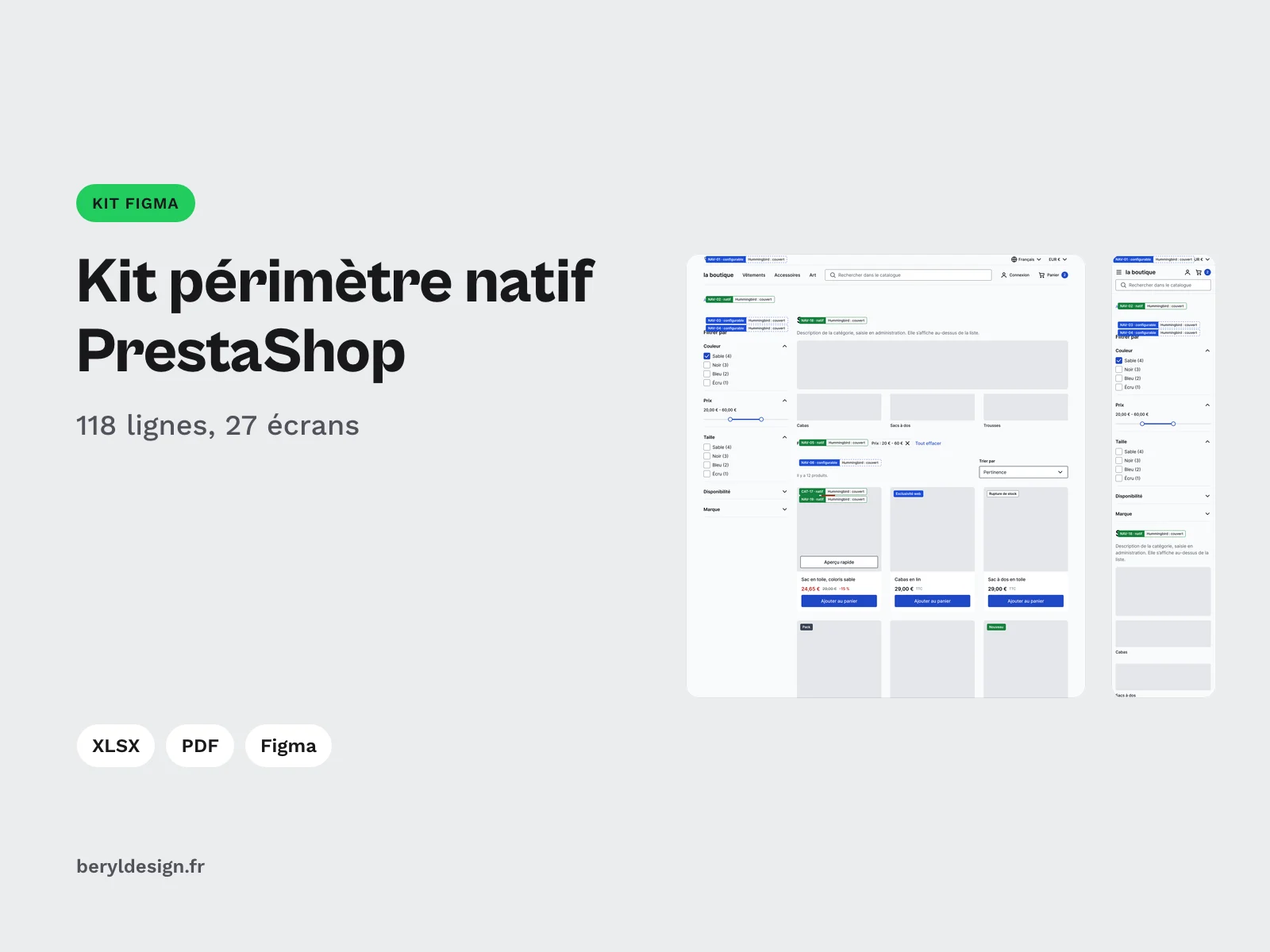
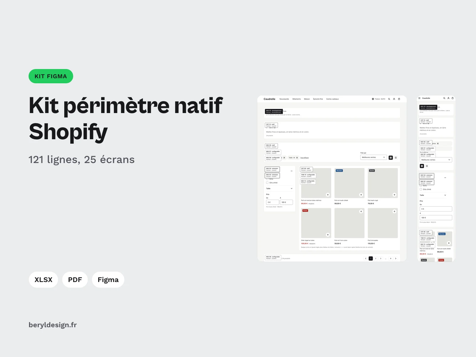
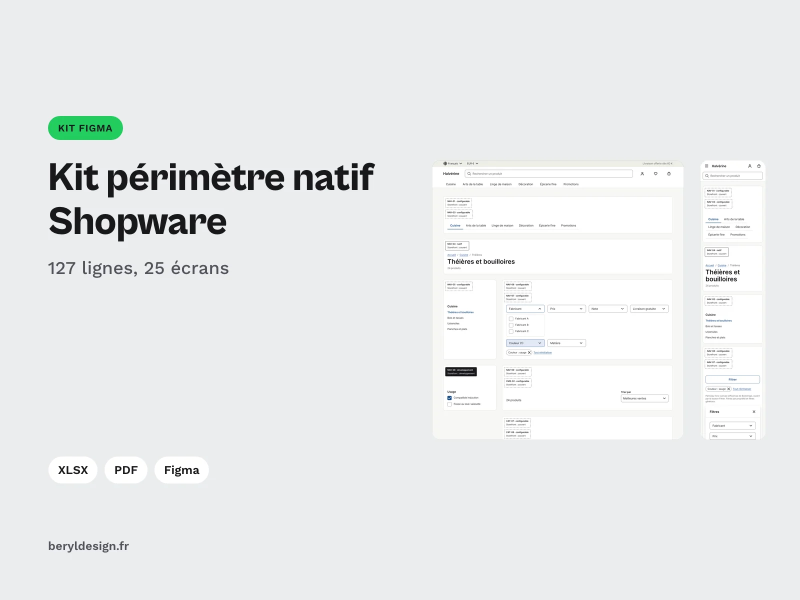
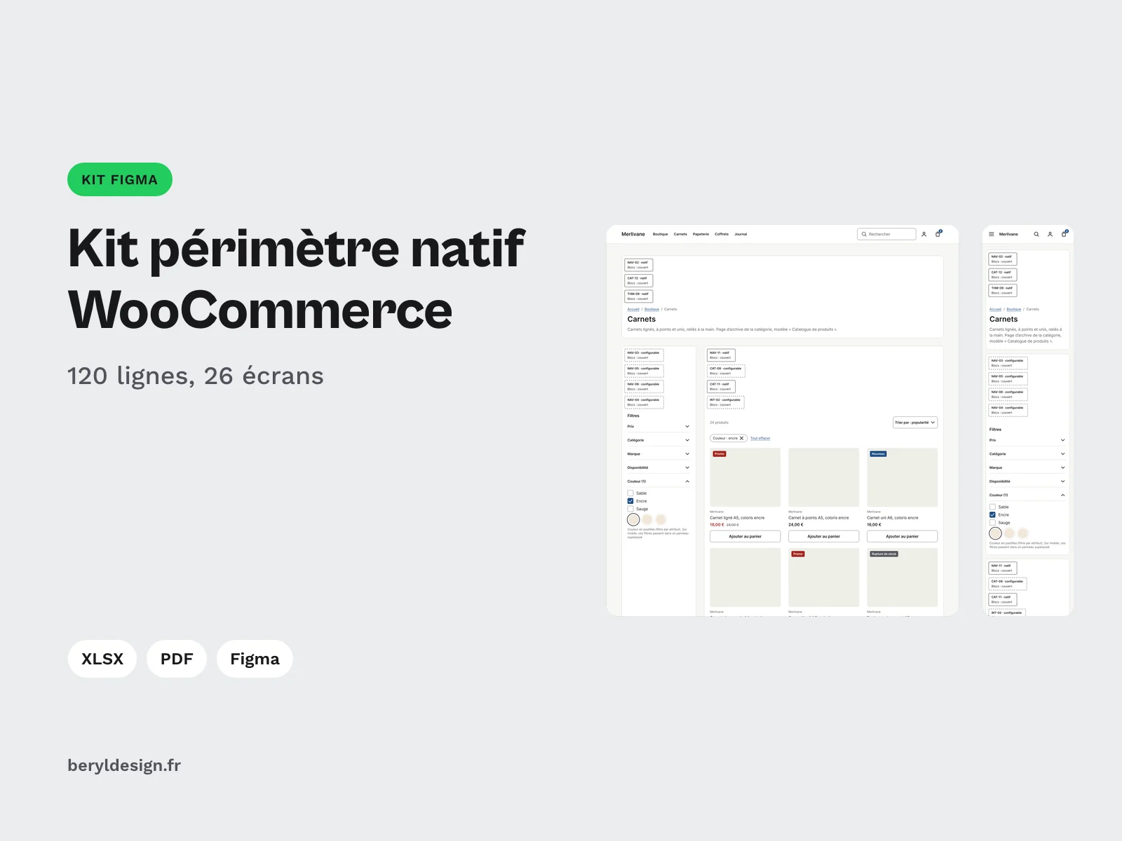
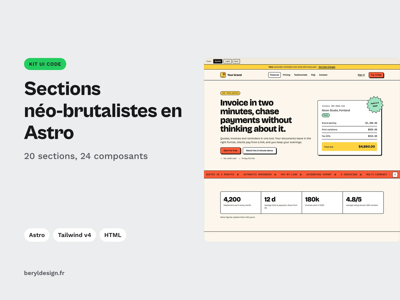
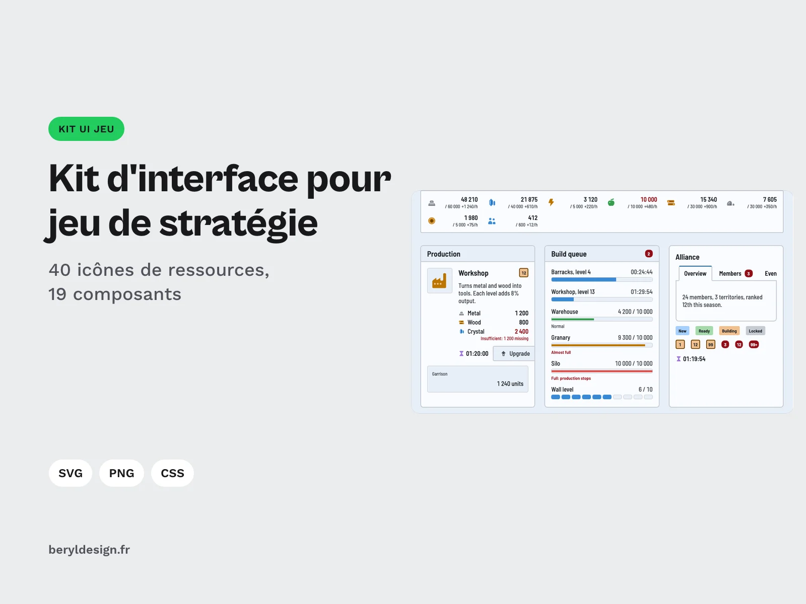
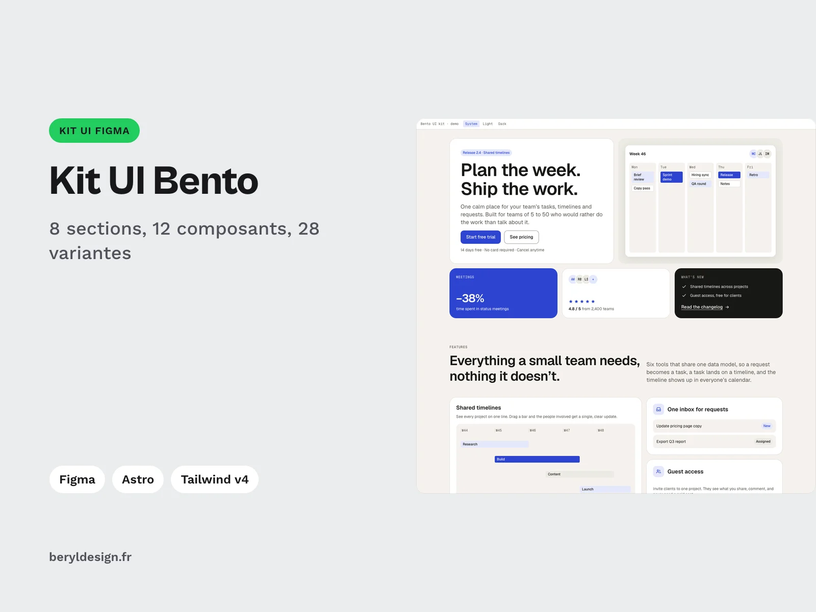
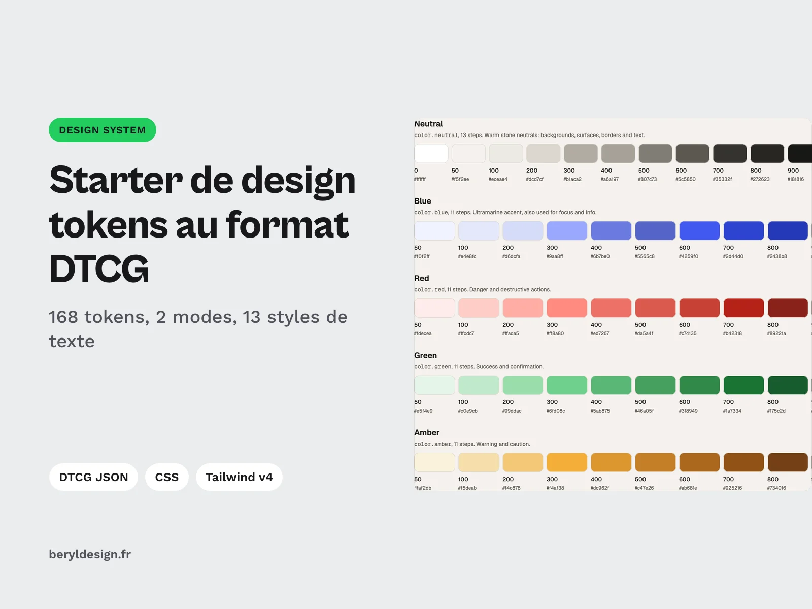
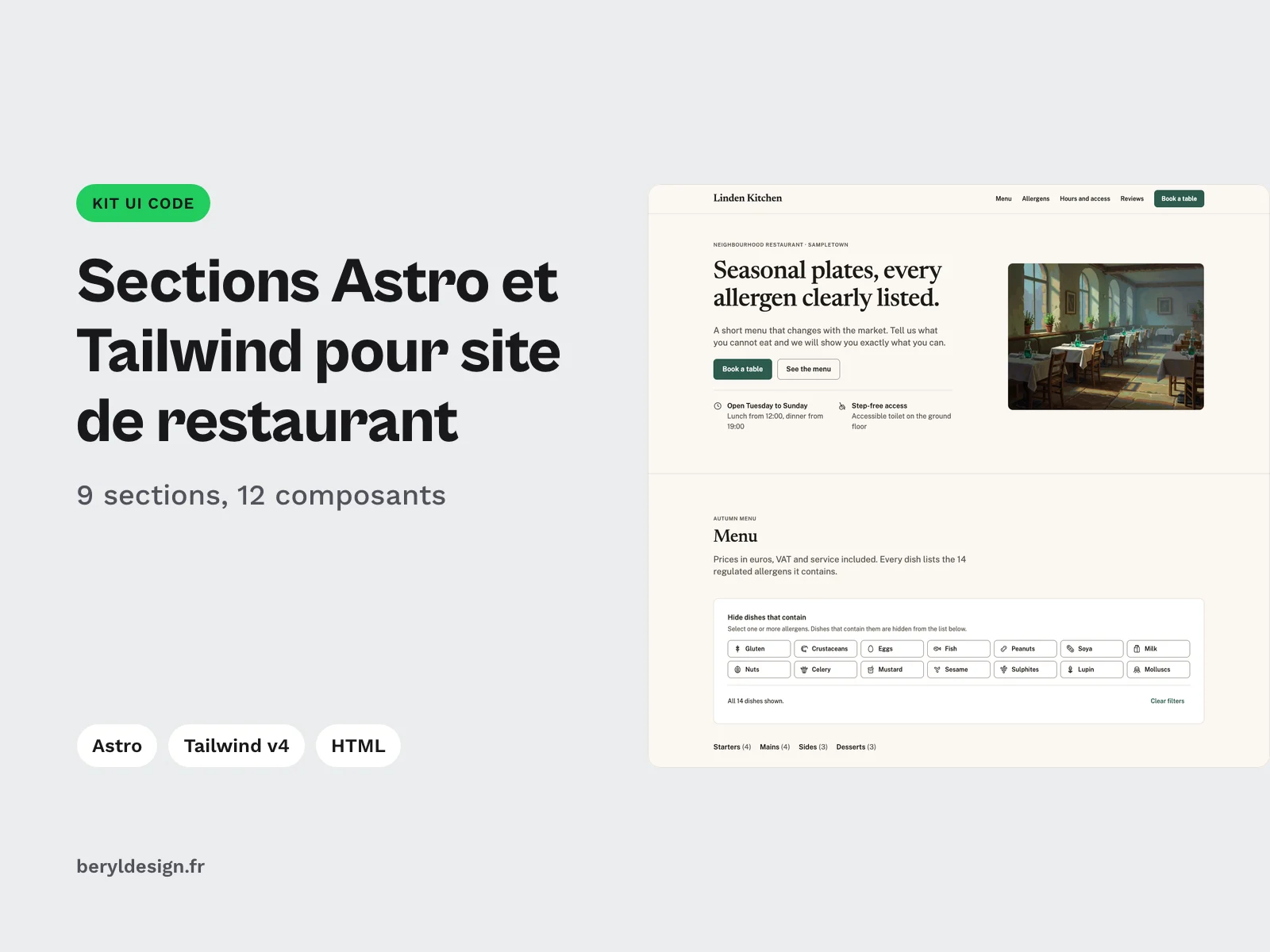
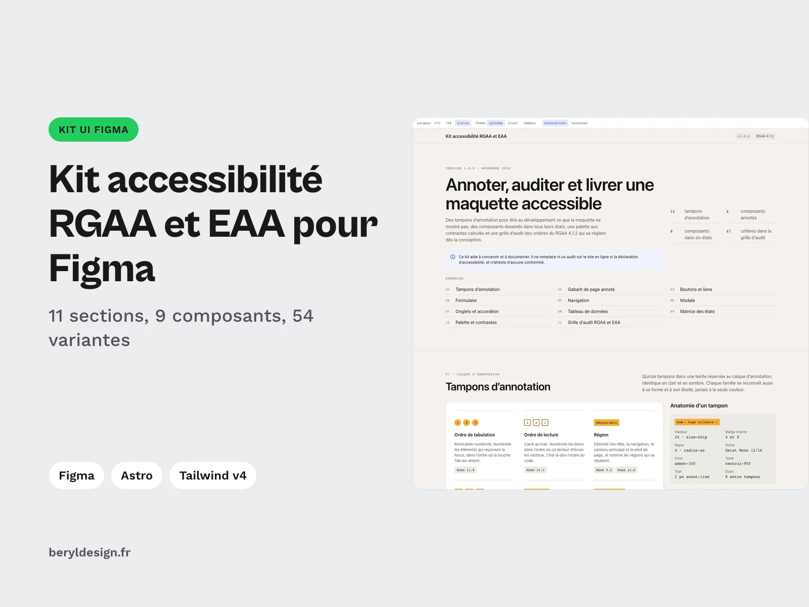
A UI kit gathers designed sections and components that you assemble instead of starting from a blank page. These go from mockup to site: the Bento kit delivers grid sections in HTML, Tailwind CSS v4 and Astro, in light and dark, with a Figma file on the same tokens. The restaurant website sections cover the menu filterable by allergen, the dish page, opening hours and an accessible booking form. The RGAA accessibility kit gathers annotation stamps, components in their states and an audit grid of 47 criteria. The design tokens starter in the DTCG format, free with an account, sets the base in CSS variables and a Tailwind theme. They are joined by kits for online stores (Shopify, WooCommerce, PrestaShop, Shopware, Magento and Adobe Commerce), an AI assistant interface, two game interface kits, token palettes, and neo-brutalist, frosted glass and health practice sections. Paid kits are bought once, under a commercial license, and stay in your account. Prospero, an e-commerce kit for Webflow, opens from Figma Community.