Preview 1 of 4
Strategy game UI kit: 40 resource icons, panels, bars and buttons (SVG, PNG, CSS, light and dark)
Strategy game UI kit: 40 resource icons, 19 HTML and CSS components, 9-slice frames and light and dark themes, for your browser strategy or management game.
Overview
Description
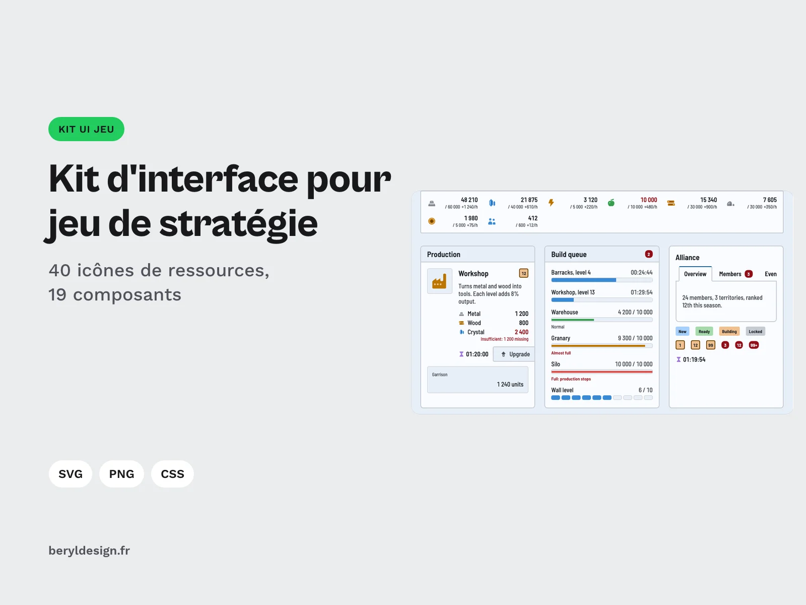
This kit is for developers and designers of strategy and management games played in the browser: the resource bar at the top of the screen, a building card with its cost and timer, build queues, alliance tabs. It also works for a prototype or a game jam, when the interface has to read clearly straight away without spending days on it. Everything is drawn in a flat style, with no bevel and no gradient, on a single grid, in light and dark. The resource icons fit the economic loop of a management game (in French): production, storage, costs.
Specifications
| Icons | 40 in 4 families (16, 8, 8 and 8), 2 variants |
|---|---|
| Components | 19 |
| Frames | 68, 34 per theme |
| Themes | 2 |
| Tokens | 174 |
| Palette | 23 colors |
| Files | 660 in the archive |
| Formats | SVG, PNG 16, 24, 32, 48 and 64 px, SVG sprite, CSS, HTML, JSON |
| License | commercial (page in French) |
| Version | 1.0.0 of November 11, 2026 |
Contents
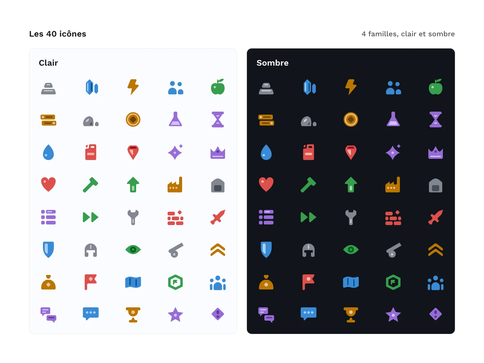
- 40 icons, each in 2 variants (colour and monochrome), in 4 families:
- Resources (16):
metal,crystal,energy,population,food,wood,stone,gold,research,time,water,fuel,gem,mana,influence,happiness; - Construction (8):
build,upgrade,production,storage,queue,speed-up,repair,demolish; - Military (8):
attack,defense,army,scout,siege,training,loot,rally; - Map and social (8):
map,territory,alliance,diplomacy,message,ranking,event,quest.
- Resources (16):
- 19 components in HTML and CSS:
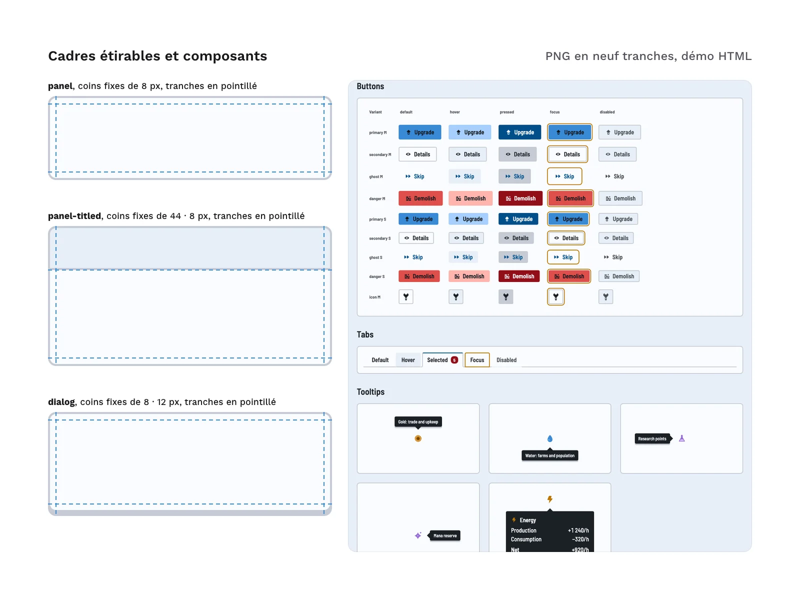
panel,panel-inset,panel-titled,dialog,building-card,resource-bar,progress-bar,capacity-bar,segmented-bar,timer,button,icon-button,tabs,tooltip,tooltip-rich,badge-level,badge-counter,badge-status,cost-list. - 68 frames, that is 34 per theme: panels, dialog, tooltip and its arrow,
primary,secondary,ghostanddangerbuttons in their states (default, hover, pressed, disabled), tabs, focus ring, bar track and bar fills (progress, capacity, warning, full), badges. - 2 themes, light and dark, for the components and the frames.
- 174 design tokens (spacing, radii, borders, typography, colours), in CSS and in JSON.
- A 23-colour palette, as JSON and as an image.
- 2 SVG sprites holding the 40 icons, one in colour, one in monochrome.
- 1 HTML demo page that puts the components together in light and dark.
In all: 148 SVG files, 484 PNG files (280 for the icons, 204 for the frames) and 660 files.
Archive layout:
icons/svg/color/<name>.svg
icons/svg/mono/<name>.svg
icons/png/<size>/<name>.png
icons/png/mono-white/<size>/<name>.png
icons/sprite/icons-color.svg
icons/sprite/icons-mono.svg
ui/svg/<theme>/<frame>.svg
ui/png/<theme>/<1x|2x|4x>/<frame>.png
ui/nine-slice.json
css/tokens.css
css/game-ui.css
tokens/game-ui.tokens.json
palette/palette.json
palette/palette.png
html/index.html
html/components/<component>.html
The zip also contains the licence text, a README file and the credits.
How to use it
- SVG icons: the colour variant works as is; the monochrome variant is a single path in
currentColor, so it takes the colour of the text around it. The sprites let you call an icon by name with<use>. - PNG icons: the colour variant comes at 16, 24, 32, 48 and 64 px; the monochrome variant comes in white, at 32 and 64 px, for dark backgrounds.
- CSS: load
tokens.cssthengame-ui.css, and copy the HTML snippet of the component you need fromhtml/components/. Class names start withgu-, so they do not clash with yours. - Light and dark: the light theme applies by default and the dark one follows the system setting. To force one, set
data-theme="dark"ordata-theme="light"on a parent element. - Tokens:
tokens.css(CSS custom properties) andtokens/game-ui.tokens.json(DTCG format) carry the same 174 tokens, to reuse them in your own tool or build chain. - 9-slice frames, for a game engine or a canvas:
ui/nine-slice.jsongives each frame its minimum size and the width of its fixed corners. Edges stretch along one axis, the centre along both. The PNG files come at 1x, 2x and 4x: multiply the size and the corners by the scale. The tooltip arrow (tooltip-arrow) is a fixed image that must not be stretched. - Numbers: the demo uses the Barlow Semi Condensed typeface and its tabular figures, so resource counters do not shift when their value changes.
Measured accessibility
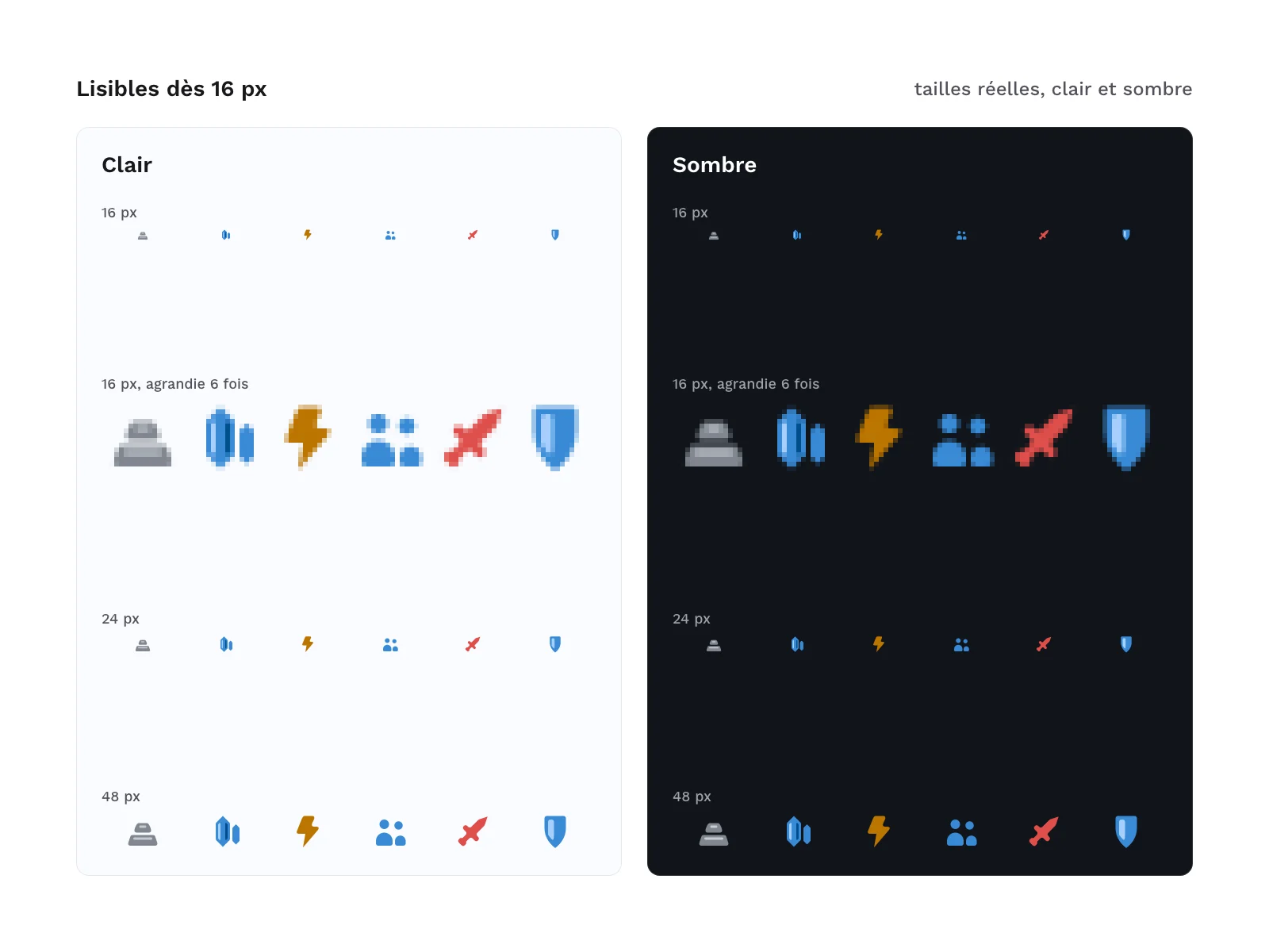
- Legibility at 16 px: each icon was rendered at 16 px and compared with all the others, to rule out silhouettes that are too close.
- Icon contrast: the base colour of each icon reaches at least 3:1 on the panel background, in light and in dark; the monochrome variant, in the text colour, reaches 15.9:1.
- Text contrast: 74 texts per theme (buttons, tabs, badges, costs, tooltips), disabled ones included, reach at least 4.5:1. The focus ring is 2 px wide, at 3.64:1 in light and 4.38:1 in dark.
- States: a disabled button is disabled through the
disabledattribute, and an unaffordable cost is spelled out in words, not only shown by a colour. - Demo page: no violation found by the axe audit tool, in light and in dark, and 100 for accessibility in the Lighthouse audit.
Good to know
- The
--radius-1token (2 px) is not used by any component. It is the corner radius of the icons: reuse it if you draw your own. - The
button-ghost-defaultandbutton-ghost-disabledframes are transparent by design (empty SVG and PNG). At rest, the ghost button has no fill and no border: only its label shows. - Some component widths rely on
calc-size(), which only Chromium-based browsers support. Elsewhere the width falls back to the content width, with no overflow seen at 375 px in WebKit. Firefox was not tested. - The typeface is not included in the zip: the demo page loads it from an online font service. For a production site, host it yourself (it is under the SIL OFL 1.1 licence).
- The demo texts are in English.
- The kit has no characters and no building illustrations, and no mockup file for a design tool: import the SVG files into yours.
Production and AI
The geometry of the icons and frames, the tokens, the CSS, the HTML and the generation scripts were produced with an AI assistant (Claude Code), then reviewed and checked: a fingerprint for every file, palette and grid checks, icon legibility at 16 px, contrast in light and dark, HTML validation, an accessibility audit, contact sheets reviewed by eye. No image was produced by an image generator: every file comes out of the same code.
Formats and compatibility
- SVG: 40 colour icons, 40 monochrome icons, 68 frames and 2 sprites, usable in a browser and in most design tools.
- PNG: icons at 16, 24, 32, 48 and 64 px, frames at 1x, 2x and 4x, on a transparent background, for a game engine or a canvas.
- CSS:
tokens.cssandgame-ui.css, with no dependency and no build step. - HTML: the 19 component snippets and the demo page.
- JSON: the tokens in DTCG format, the palette and the 9-slice frame description.
Licence
The kit is sold under the commercial licence (terms in French): you can use it in your personal and professional projects, including for your clients and in the games you sell or release, but you may not resell or redistribute the files, on their own or in another kit, even for free. The Barlow Semi Condensed typeface, referenced by a link and never included, is under the SIL OFL 1.1 licence.
Further reading
- Browser games in 2026: the complete UX guide (in French)
- Hick’s law and the menus of management games (in French)
Version history
1.0.0 (11 November 2026): first release.