Preview 1 of 4
AI assistant interface kit: 30 conversation components, generation states and side panel (HTML, Tailwind, Astro, light and dark)
AI assistant interface kit in Astro and HTML: 30 conversation components, generation states, history and preview panel, light and dark, for your own products.
Overview
Description
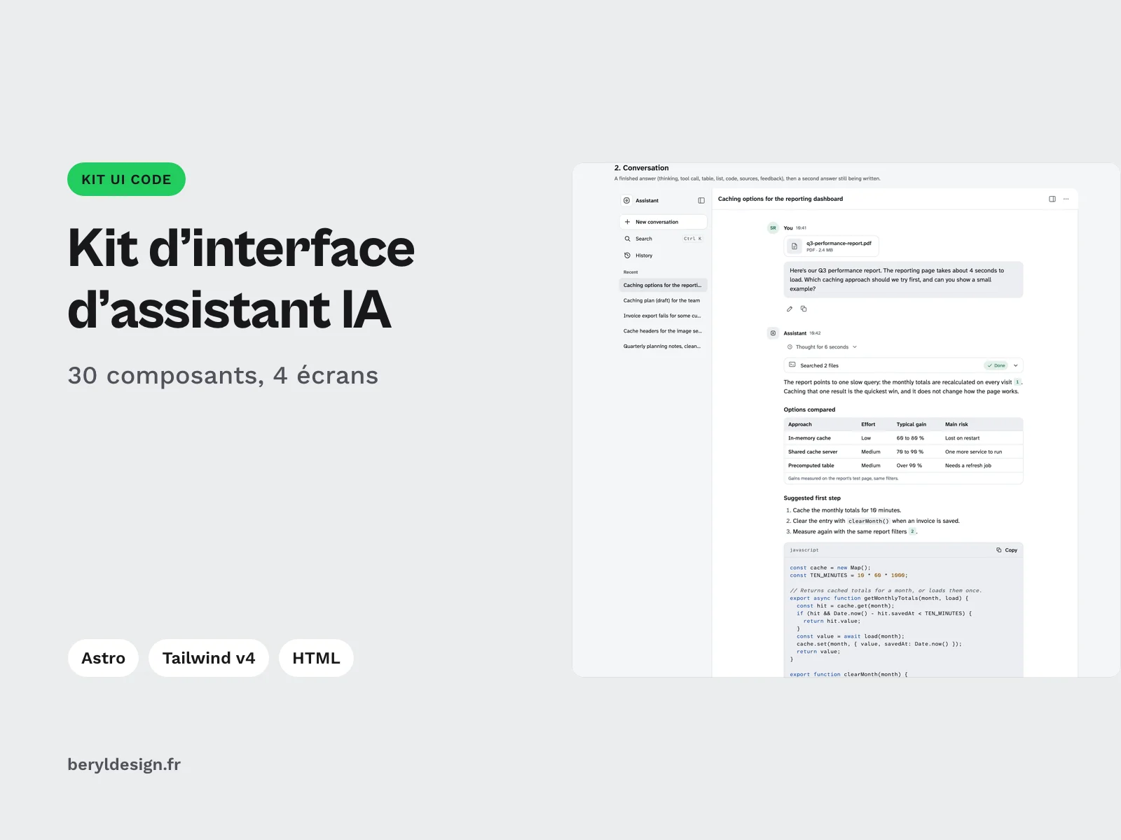
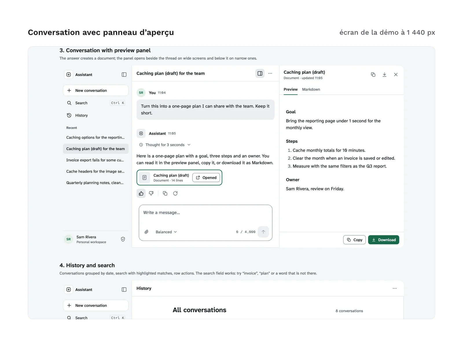
This kit is for designers and front-end developers who build the interface of an AI-based product: a standalone assistant, a conversation built into a web application, an internal tool. It brings together the screens and states such an interface has to plan for, already designed, coded and checked: the answer being generated and its stop button, the “thinking” state, the tool call, the error with retry, the usage limit, the lost connection, feedback on an answer, the history and its search, the preview panel. Every component comes as an Astro component with typed props and as static HTML, sharing the same stylesheet. The look is deliberately neutral and does not imitate any existing assistant: you dress it in your product’s colours by editing the tokens. The demo content is in English (see “Language of the content” below).
Specifications
| Components | 30, 46 variants |
|---|---|
| Screens | 4 |
| Icons | 37 |
| Color tokens | 31 |
| Files | 83 in the archive |
| Formats | HTML, CSS, Astro, TypeScript, Tailwind v4 theme |
| License | commercial (page in French) |
| Version | 1.0.0 of November 11, 2026 |
Contents
30 components, in astro/ and, with all their states, in html/sections/:
- Conversation:
- user message (
UserMessage); - written answer, with headings and lists (
AnswerProse); - answer being generated, with a caret and a stop button, in a region announced politely to screen readers (
StreamingAnswer); - code block with a copy button (
CodeBlock); - data table (
DataTable); - numbered sources and in-text references (
Sources,Cite); - attachment (
FileCard).
- user message (
- Generation and feedback:
- “thinking” state (
ThinkingState); - collapsible tool call, running or done (
ToolCall); - actions on an answer: helpful, not helpful, copy, regenerate (
FeedbackActions); - reasons for negative feedback (
FeedbackReasons); - editing a sent message (
MessageEdit); - successive versions of an answer (
AnswerVersions).
- “thinking” state (
- States and notices:
- jump to the latest message (
JumpToLatest); - error with a retry button (
ErrorRetry); - usage limit reached (
LimitReached); - offline bar (
OfflineBar); - notification (
Toast).
- jump to the latest message (
- Input:
- multiline input area (
Composer); - generic mode selector (
ModeSelector); - starter suggestions (
StarterSuggestions).
- multiline input area (
- Navigation and history:
- sidebar (
Sidebar); - conversation list (
ConversationList); - history search, with highlighted results (
HistorySearch); - conversation menu (
RowMenu); - confirmation dialog (
ConfirmDialog).
- sidebar (
- Screen and settings:
- top bar (
TopBar); - tabbed side preview panel (
PreviewPanel); - empty home screen (
EmptyHome); - privacy settings (
PrivacySettings).
- top bar (
Around these components:
- 46 variants and states, marked in the demo page.
- 4 assembled screens: home, conversation, conversation with preview panel, history. An example page (
PageExample.astro) brings them together with the fictional data insample-data.ts. - 42
.astrofiles: the components, the 4 screens, the example page and the helpers (turn, icon, icon button, sprite, script). - 4 TypeScript files: the data shapes (
types.ts), the sample data, the history search and the list of icon names. - 32 HTML files in
html/sections/: one per component, plus the sprite and the script to place once per page. The full page ishtml/index.html. - 37 SVG icons, gathered in a sprite.
- 31 colour tokens, each in light and dark mode.
- An installation guide in English,
astro/LISEZMOI-astro.txt. - 83 files in total.
File layout:
astro/: the.astrocomponents, the TypeScript files and the guide.html/:index.htmlandsections/*.html.html/css/:tokens.cssandkit.css.tailwind/:theme.css.
An interface, with no model and no server
The kit contains no AI model, no call to any service and no server. Its script demonstrates the states in the browser: copy with confirmation, helpful or not helpful feedback and the reasons form, keyboard menus, the sidebar on small screens, stopping an answer in progress, suggestions that fill the input area, preview panel tabs and the history search. Sending a message, receiving the answer as it streams, saving and deleting conversations are yours to wire to your own code: the guide shows where.
Production and AI
The kit’s code (Astro components, HTML, CSS, Tailwind theme) and the sprite icons were produced with an AI assistant, then reviewed and checked before going on sale.
Language of the content
The demo content, labels and guide are in neutral English, with fictional data. In the Astro components, text goes through props and the sample data; in the HTML version, you edit it directly in the markup.
Formats and compatibility
- Astro:
.astrocomponents with typed props in TypeScript, and a single inline script, in dependency-free JavaScript (KitScript). Supported versions are listed in the installation guide. - HTML and CSS:
tokens.css(light and dark mode) andkit.css, already compiled, no CDN. These files work in any web project, with or without a framework. Each file inhtml/sections/can be pasted into a page together with the sprite and the script. - Tailwind v4 theme:
tailwind/theme.csscarries the same tokens as a@theme, to use them as utility classes. It is optional:kit.cssis enough if your project does not use Tailwind. - SVG: the 37 sprite icons, whose stroke takes the text colour. The guide explains how to add one.
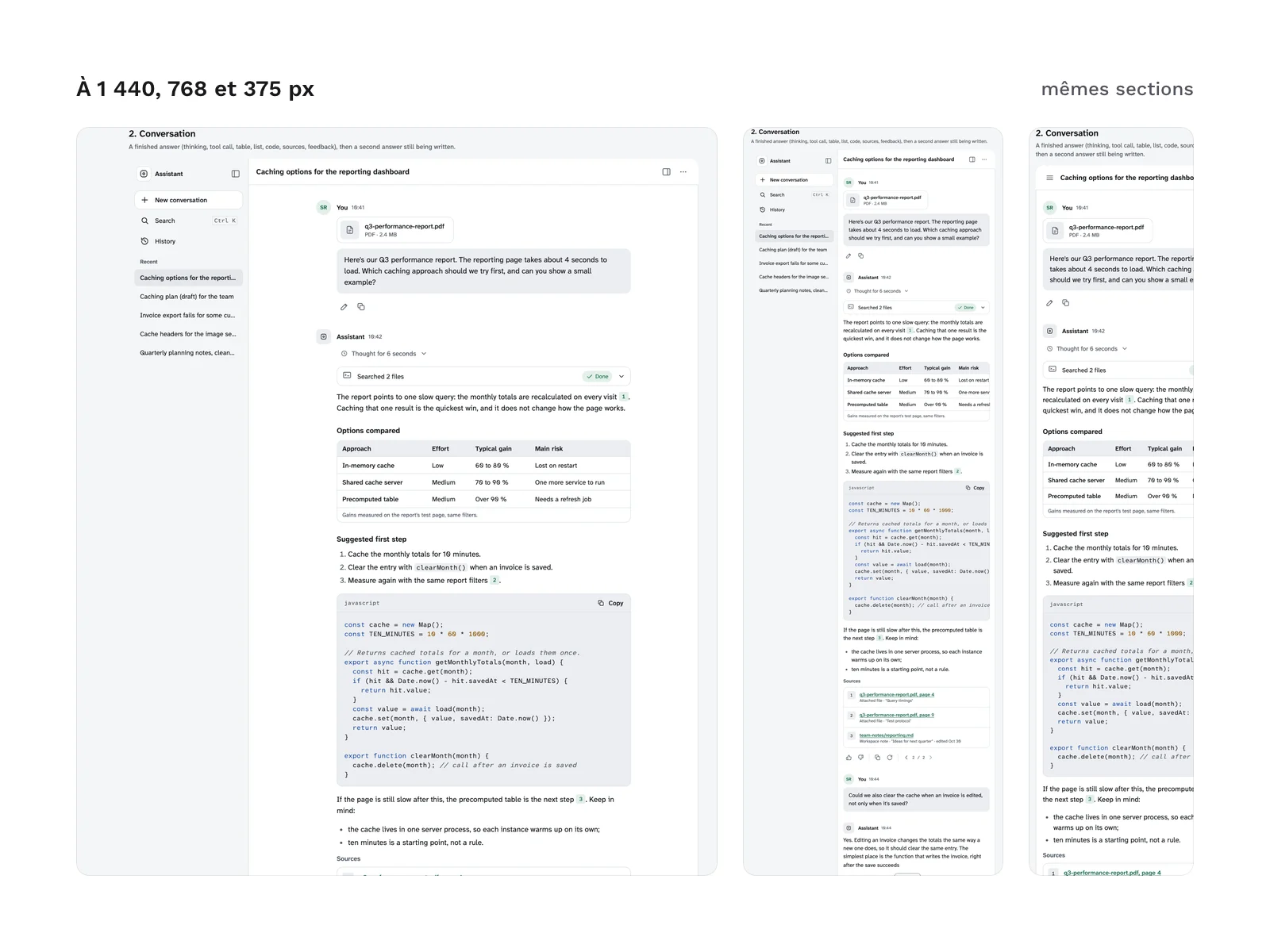
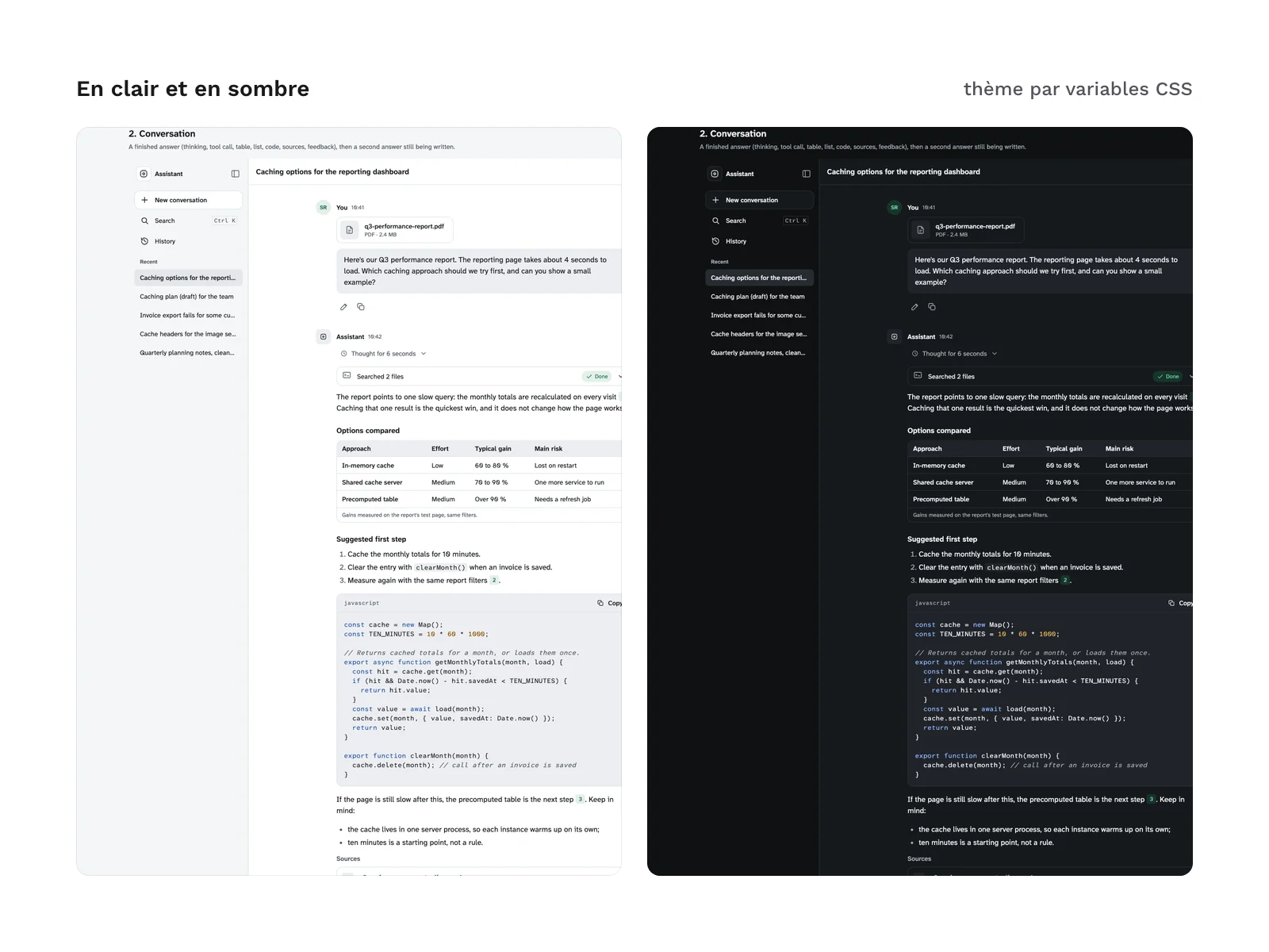
Everything goes through tokens: spacing on a 4 px grid, sizes, radii, shadows and colours. Dark mode follows the system setting; the data-theme attribute on the html element forces either mode. Components lay out by the width of their container, not of the window: a screen works the same in a page, a modal or a narrow column.
The Atkinson Hyperlegible Next and Atkinson Hyperlegible Mono fonts (SIL OFL 1.1 licence) are not included in the files: they load by link from a public font service, one line to replace if you self-host them. The kit does not include a mockup file for a design tool.
Checks run before going on sale, in light and dark mode: no violation reported by axe-core on the demo page and on the sections, no horizontal scrolling at 375, 768, 1,024 and 1,440 px wide, every spacing measured on the 4 px grid, and a mobile Lighthouse accessibility score of 100. With the keyboard, every focused element shows a visible focus ring.
Licence
The kit is sold under a commercial licence: you can use it in your projects and deliver to your clients the products built with its components. You may not resell or redistribute the kit or its files, nor hand the original kit to a client for reuse elsewhere. The fonts keep their own licence.
Further reading
- To compare the tools that generate an interface from a prompt: our comparison of two AI interface generators.
- To pick an AI tool for the way you design (in French): which AI tool to choose for design.
Version history
1.0.0 (11 November 2026): first version.