Preview 1 of 4
DTCG design token palettes: 12 light and dark themes with verified contrast (JSON, CSS, Tailwind v4)
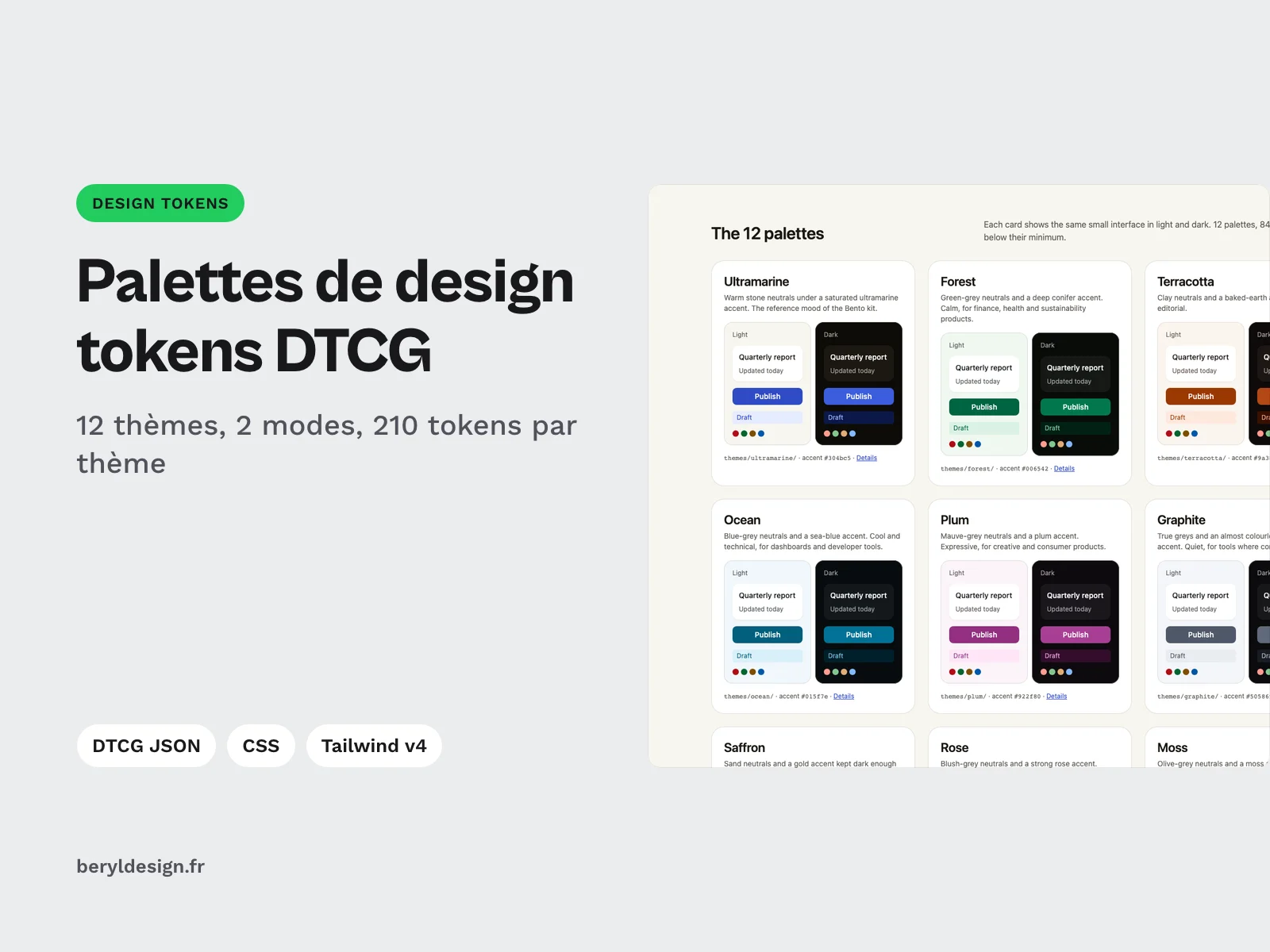
12 color themes as DTCG design tokens, light and dark, with measured contrast, in JSON, CSS variables and Tailwind v4, ready to drop onto your token starter.
Overview
Description
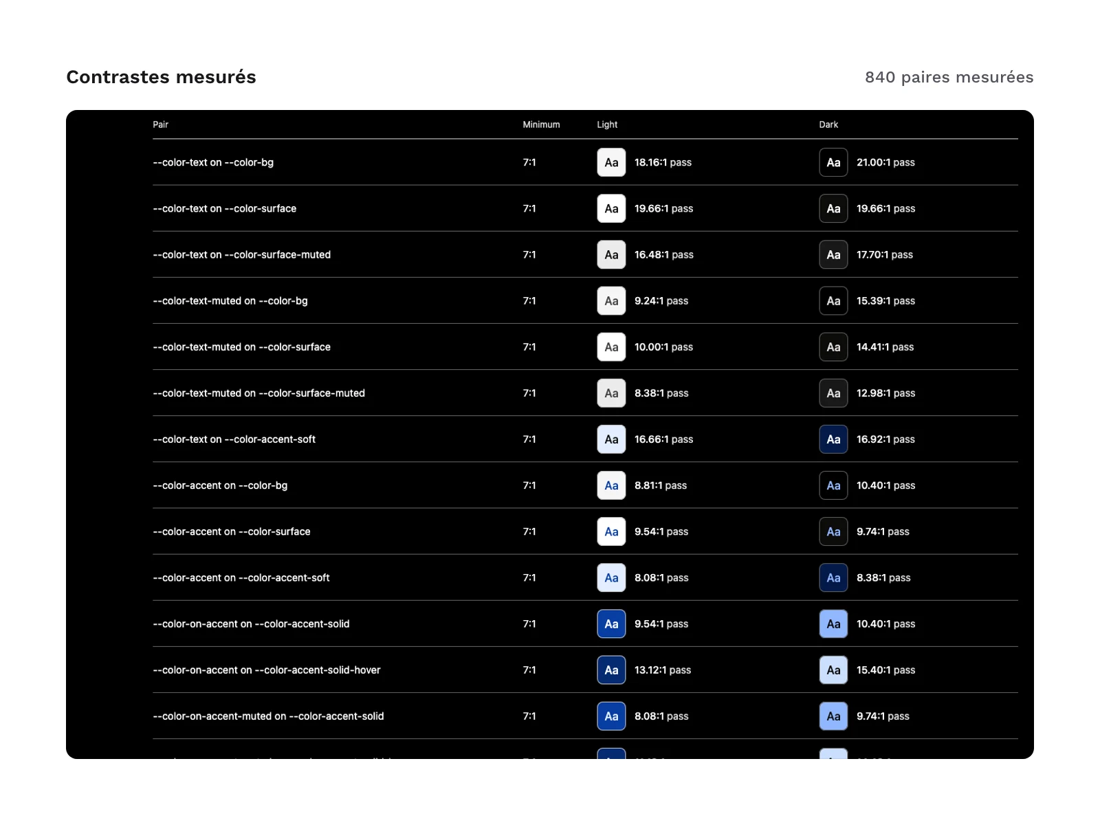
These palettes are for UI designers and front-end developers who use the free DTCG design tokens starter and want to change their project’s colors without touching their components. You get 12 complete color themes, each with a light mode and a dark mode, built on the same semantic structure as the starter: background, surfaces, text, borders, accent, error, success, warning and information states, focus ring and inverse tile. You pick a theme, replace the starter’s token files with its own, and your components take on the new colors. Every declared text and background pair has been measured for contrast, in both modes, and the table of measurements is included.
Specifications
| Themes | 12, each in 2 modes |
|---|---|
| Tokens | 210 per theme |
| Text styles | 13 |
| JSON files | 48 |
| Formats | DTCG 2025.10 JSON, DTCG Resolver 2025.10, CSS custom properties, Tailwind CSS v4 theme, CSV, HTML documentation, AGENTS.md |
| License | commercial (page in French) |
| Version | 1.0.0 of November 11, 2026 |
Contents
- 12 themes, each in 2 modes (light and dark):
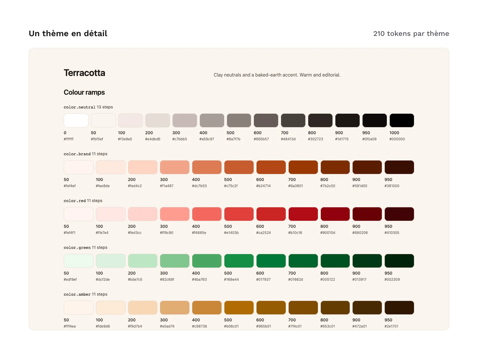
ultramarine,forest,terracotta,ocean,plum,graphite,saffron,rose,moss,lagoon,irisandhigh-contrast. Thehigh-contrasttheme targets 7:1 for text and 4.5:1 for interface parts; the other themes target 4.5:1 for text and 3:1 for interface parts. - 210 tokens per theme: 148 primitives and 31 semantic tokens present in each of the 2 modes.
- Primitives (
themes/<theme>/tokens/primitives.tokens.json):- 6 color ramps per theme:
brand, which carries the theme’s color,neutral, and the status colorsred,green,amberandblue, for 816 ramp colors across the 12 themes; - spacing, sizes, radii, borders, shadows, durations and 13 text styles identical to the starter’s, on the same 4 px scale.
- 6 color ramps per theme:
- Semantic tokens (each theme’s
light.tokens.jsonanddark.tokens.json): the same 31 paths as in the starter, as aliases to the theme’s primitives. - A shared stylesheet (
css/all-themes.css): the 12 themes in a single file, selected with thedata-paletteattribute, to compare themes or let users choose one within the same interface. - Contrast table (
contrast/contrast-ratios.csv): 35 pairs per mode and per theme, 840 measurements in all, each with its ratio, its target and its result. - Rules for AI agents (
AGENTS.md): pick a single theme, use tokens only, prefer semantic over primitive, stay on the 4 px scale, put text only on measured pairs, and the steps to add a token to every theme. - Documentation (
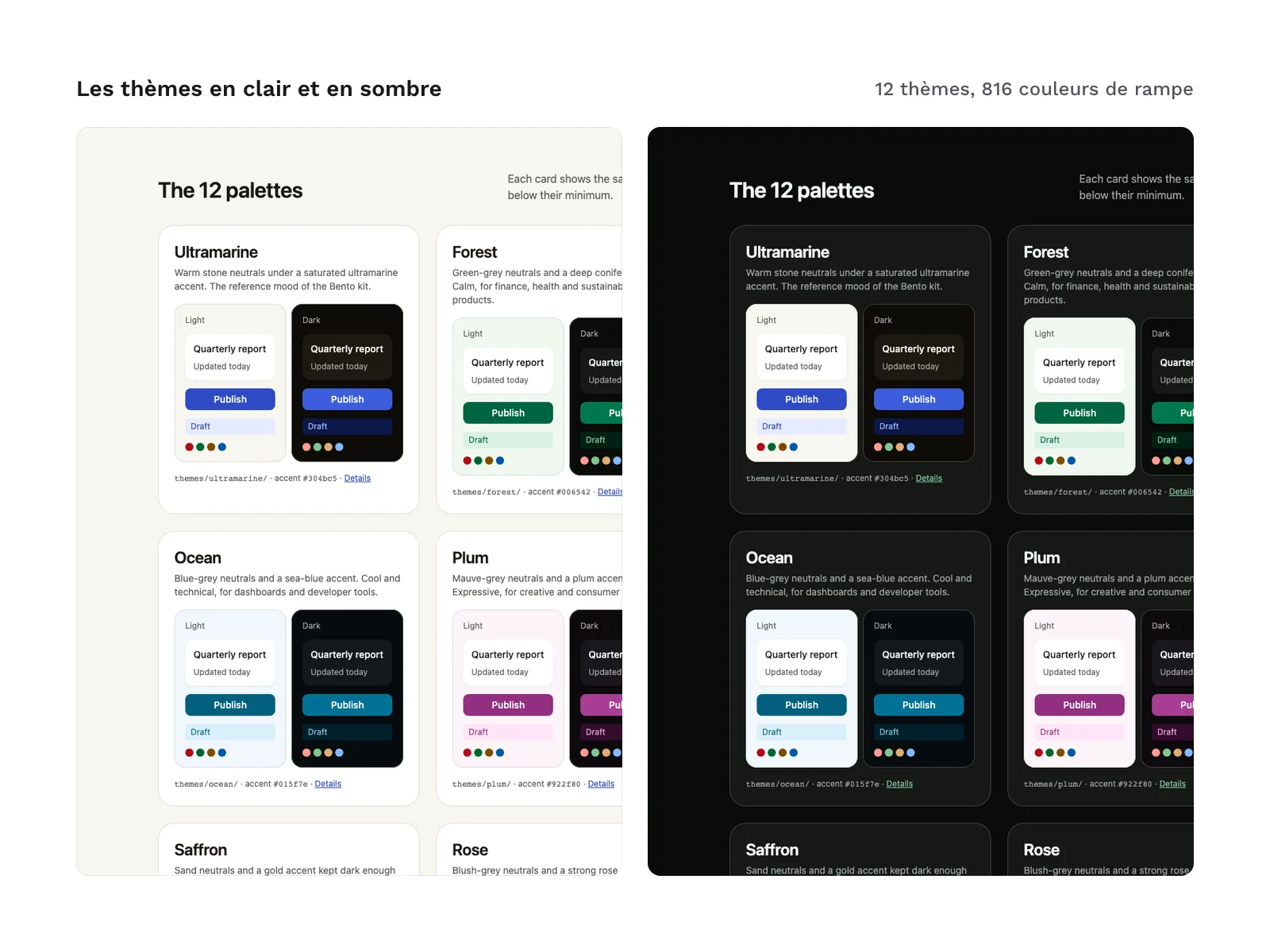
docs/index.html): a page that shows the 12 themes in light and dark, with a theme and mode switcher.
Product files (76 files, including 48 JSON files):
AGENTS.md
contrast/contrast-ratios.csv
css/all-themes.css
docs/index.html
themes/<theme>/tokens/primitives.tokens.json
themes/<theme>/tokens/light.tokens.json
themes/<theme>/tokens/dark.tokens.json
themes/<theme>/tokens/theme.resolver.json
themes/<theme>/css/tokens.css
themes/<theme>/tailwind/theme.css
Production and AI
The palettes, exports and documentation were produced with an AI assistant, then reviewed and checked by an independent review: DTCG schema validation, aliases and modes, 4 px scale, recalculation of the 840 contrast measurements and a reproducible build. The 12 palettes were created for this product: none is taken from an existing color library. The product contains no AI-generated images.
Formats and compatibility
- DTCG 2025.10 JSON: the 4 files in
themes/<theme>/tokens/are the source of each theme. Each token carries its$type, its$valueand a$descriptionthat says where to use it. They can be read by tools that support the DTCG format. - DTCG Resolver 2025.10:
theme.resolver.jsonloads the primitives, then applies the chosen mode (light by default, or dark), as in the starter. - CSS variables:
themes/<theme>/css/tokens.cssputs light mode in:root. Dark mode follows the system setting, unless the page setsdata-theme="light"on thehtmlelement;data-theme="dark"forces dark.css/all-themes.cssgathers the 12 themes:data-palettepicks the theme,data-themethe mode. - Tailwind CSS v4 theme (
themes/<theme>/tailwind/theme.css): import it aftertailwindcss. It replaces the default palette, spacing, radii, shadows and type scale, so only token classes exist (bg-surface,bg-brand-500,bg-accent-solid,p-4,rounded-md,shadow-1). - CSV:
contrast/contrast-ratios.csvopens in a spreadsheet or can be read by a script. - HTML documentation: a self-contained page, readable with no horizontal scrolling from 375 to 1,440 px wide, in light and in dark.
- AGENTS.md: a Markdown file that AI coding agents read before writing an interface.
The Geist and Geist Mono fonts (SIL OFL 1.1 license) are referenced by the tokens, not included in the files: the documentation loads them from an online font service. The product includes neither a variables file for a design tool nor a Style Dictionary config.
Moving from the starter to a theme
- Copy the chosen theme’s
tokens/,css/andtailwind/folders over the starter’s: the starter’s file names, DTCG paths, CSS variables and Tailwind classes all exist in each of the 12 themes. - The only addition is the
brandramp, 11 steps that carry the theme’s color. - If your project used
--color-blue-*orbg-blue-*for its accent, those names stay valid, butbluebecomes the information color: replace them with--color-brand-*orbg-brand-*. The semantic names (--color-accent,bg-accent-solidand the otheraccent*) do not change. - The status colors (
red,green,amber,blue) are the same in all 12 themes, on purpose: an error, a success, a warning or a piece of information keeps the same color whatever the theme.
License
The palettes are sold with the commercial license (page in French): you can use them in personal and professional projects, including client work and products you sell, but you may not resell or redistribute the files, even modified, as palettes or as a token set.
Further reading
Version history
1.0.0 (November 11, 2026): first version.