Introduction: a standard that finally replaces the guesswork
A design token is no longer just a Figma variable or a homemade JSON file specific to one team. Since late 2025, it follows a shared norm: the W3C Design Tokens Format Module, maintained by the Design Tokens Community Group (DTCG).
We cross-referenced three very different videos to understand what this standard really changes. A pedagogical overview of token semantics, a deep dive with the W3C working group's co-chair, and a hands-on demo on Penpot, the first editor to adopt it natively.
Their common thread: a token is no longer locked into a single tool. It now drives design and code, with no manual translation between the two.
What the W3C specification actually locks in
After five years of community work, version 2025.10 of the Design Tokens Format Module became the first stable edition of the standard. It went through three draft versions before being validated in the field.
This isn't an isolated technical detail: at least 24 organizations back it, including Adobe, Google, Meta, Microsoft, Amazon and Figma. More than ten tools, among them Penpot, Sketch, Framer and zeroheight, already support it or are implementing it.
The proprietary format is on its way out
Before this standard, every tool exported its tokens in its own format. Moving a library from Figma to Sketch, or into a build pipeline, meant maintaining fragile custom conversion scripts that broke with every update.
The new JSON format, using the .tokens or .tokens.json extension, becomes a stable API for plugin authors and tool builders. A token exported from one editor can be reimported elsewhere without losing meaning or structure.
Real use cases, not a theoretical spec
The spec covers multi-theme management, modern color spaces like Display P3 and Oklch, and token relationships through inheritance and aliases. It also plans for cross-platform code generation, targeting iOS, Android, the web or Flutter.
A recent industry report (zeroheight, 2026) puts design token adoption at 84% of product teams, up from 56% a year earlier. Tokens have become the default, not the exception, even though 40% of teams still sync them by hand for lack of a real pipeline.
Figma moves to native integration
It's Figma's own video, filmed at the Schema 2025 conference with the W3C Design Tokens Community Group's co-chair, that shows the scale of the change on the tool side. Until now, importing or exporting variables in the standard format required a third-party open source plugin.
Figma deliberately waited for the standard to stabilize before integrating it, so as not to sway the market with a premature implementation.
An import that understands context
The new import system doesn't just copy values: it reads the target collection. On an empty collection, it creates the variables and maps values across several modes automatically.
- empty collection → variables get created
- existing mode → values get updated
- extended collection → selective overrides get added
This logic builds on the same principles as converting styles into variables in Figma, but now with an exchange format that survives the trip out of the tool.
Extended Collections: inheriting instead of duplicating
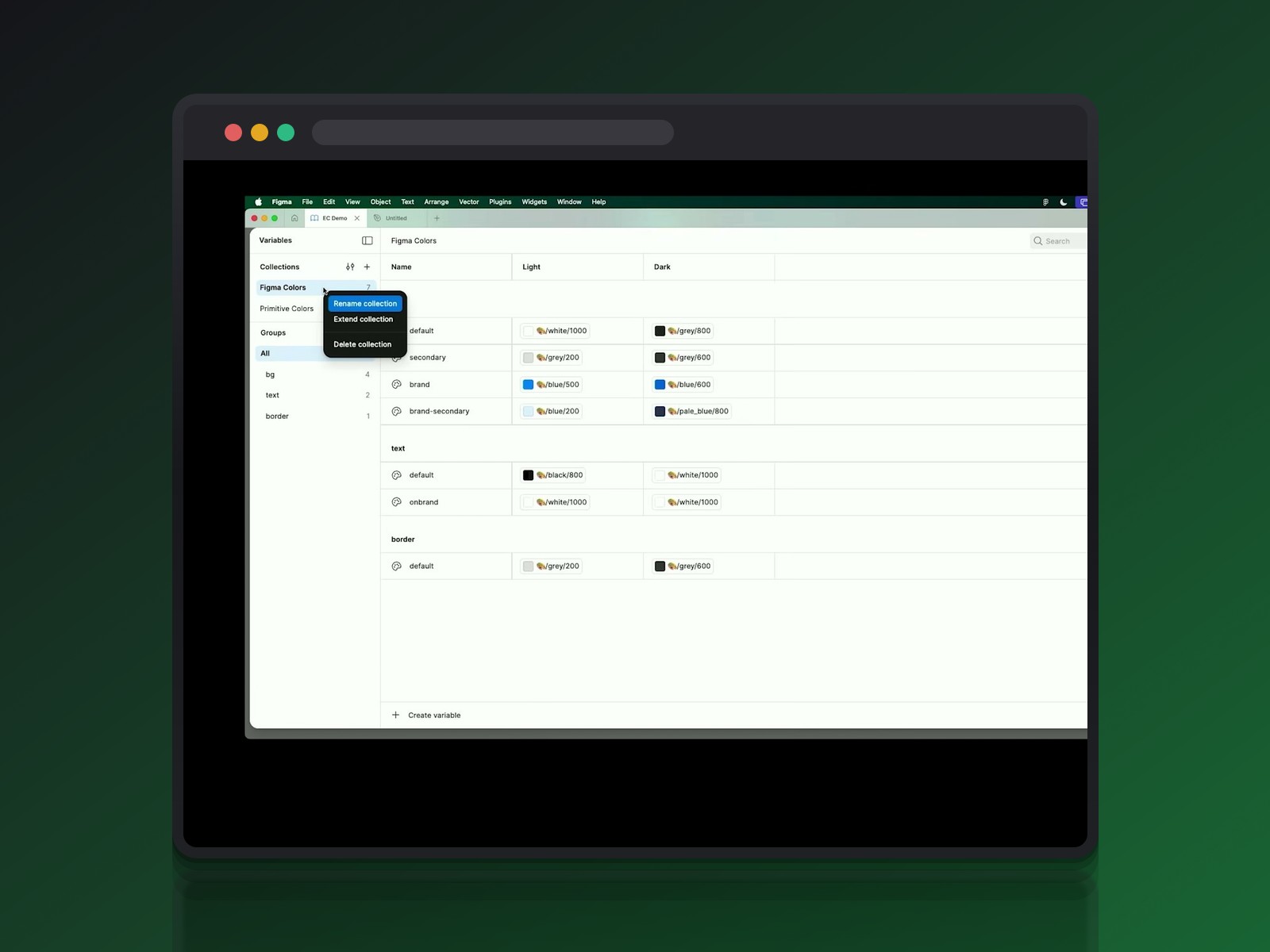
The real leap concerns multi-brand work. Extended Collections let a child brand automatically inherit the structure and modes of a root collection, while only redefining what actually changes.
A FigJam collection can inherit Figma Colors tokens and override only its own hues. Teams choose to host the extension in the same file, for instant updates, or in a separate file, for more experimentation freedom.
Migrating without breaking everything
Figma offers a six-step method for centralized structures, tested with twenty companies: export the values, delete the existing modes, create the extension, reimport the overrides, publish, then accept the updates.
One catch remains after migration: mode settings applied on layers reset to the default mode. Teams need to reapply them manually, at the page or team level.
The semantics the standard is finally unifying
The most pedagogical of the three videos barely mentions the W3C standard at all, and that's telling. It documents a naming practice that was already widely shared, one the norm simply locks into a common format.
Naming the intent, not the color
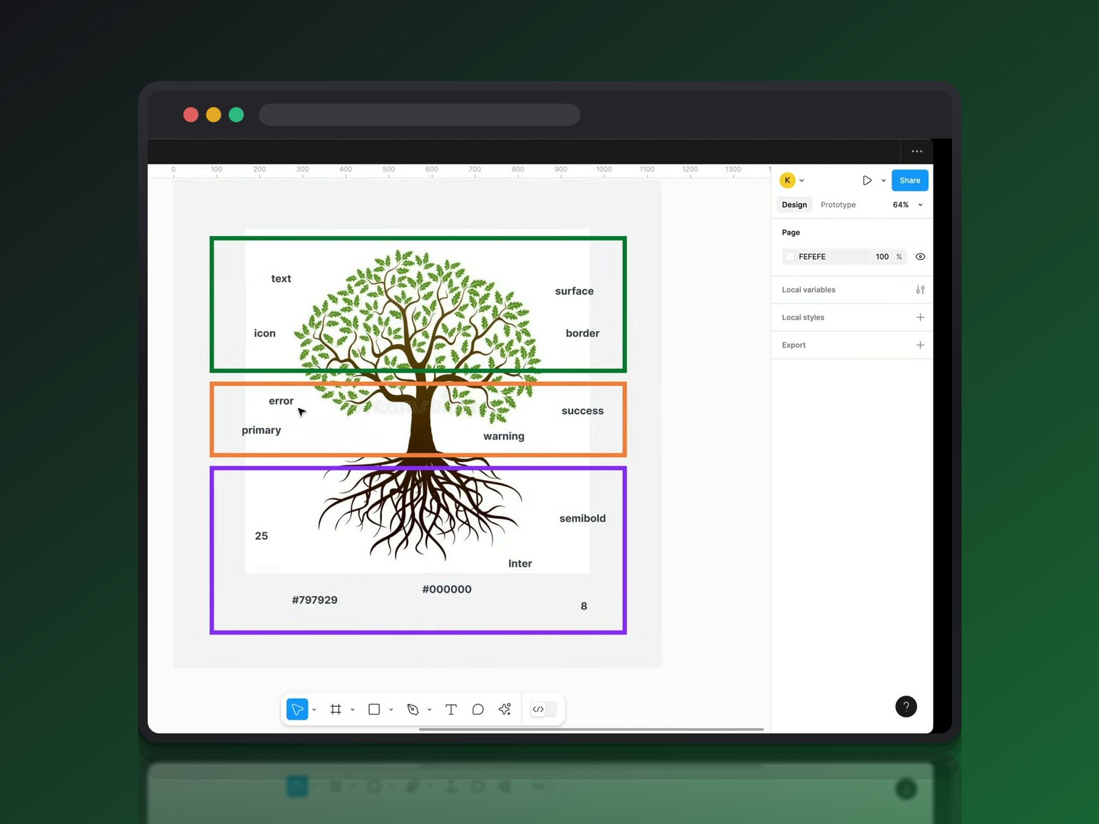
A button doesn't get "a green": it gets a success intent. Every state, success, warning or error, breaks down into four identical tokens (icon, text, border, surface) so designers always apply the same structure.
The Action / On-Action distinction follows the same logic: one token for the clickable element, another for whatever sits on top of it. This naming discipline is exactly what the DTCG format now lets teams document and exchange as-is, instead of reinventing it per team.
A two-tier or three-tier architecture
Two models dominate when it comes to organizing these tokens. The three-tier model, Brand → Alias → Mapped, separates the raw color, its first role, then its final usage: useful for multi-brand work or a complex dark mode.
The two-tier model, Primitives → Semantic, used by libraries like Untitled UI, is faster to set up. This architecture ties directly into documenting component specs in Figma: without rigorous naming, even the most thorough spec stays unreadable for the dev team.
On the ground: Penpot and the format already built in
Penpot isn't waiting on a proprietary format to convert later. The open source editor adopted the DTCG standard's draft as the native format for its tokens, even before the stable release shipped.
From starter kit to standard JSON export
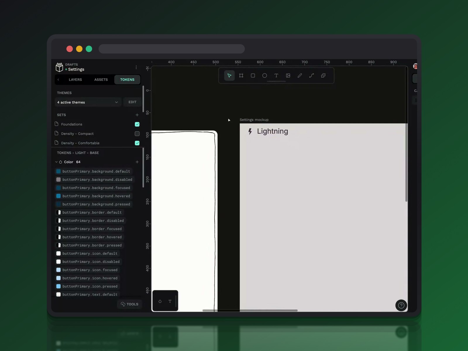
The Design Tokens Starter Kit, available on the Penpot Hub, imports token sets organized by category: colors, dimensions, border radii. Exporting produces a readable JSON file, which can be split into several files to separate themes from foundations.
This continuity between the design tool and Penpot 2.0's collaborative features confirms a deeper shift: tokens are becoming agnostic to their output platform.
Propagation, in practice
Changing a density token from 1 to 1.2 automatically recalculates every spacing value in the interface. Switching between Light Mode and Dark Mode only changes the output values of semantic tokens, never their name.
The demo goes as far as accessibility: the built-in contrast plugin flags text that's too pale, and fixing the variable at the source is enough to bring the whole interface back into compliance.
What the three videos reveal once stacked together
The three sources don't shed light on the same problem. The general-audience video documents a naming practice that was already mature, independent of any format. Figma's deep dive describes the standard itself and its native integration. The Penpot demo shows what it looks like once the format is already adopted inside a tool.
This triple view confirms the change isn't cosmetic. A token named according to shared principles can now travel from one tool to another without reinterpretation, thanks to a single shared specification.
Should you migrate your tokens to the W3C format now?
For a library already mature under Tokens Studio or a homegrown format, the question mostly comes up when switching tools or starting a multi-brand project. Figma's six-step migration method is the best documented approach so far.
For a new project, the answer is simpler: starting directly in the DTCG format avoids a future migration altogether. That's exactly the argument that carries weight in a 2025 comparison between Penpot and Figma, for teams looking to limit their dependency on a single editor.
Conclusion: the token finally speaks a common language
A design token was always just a named value. What changes with DTCG is that the name and its structure now survive a change of tool, designer or output platform.
What still doesn't automate itself: deciding which intent each token carries, and where to draw the line between foundation and semantics. The standard structures the exchange; naming discipline remains, as ever, our job.
Further reading
This synthesis article is based on the following videos:
- Comprendre les Design Tokens : structurer l'architecture et la sémantique de vos interfaces numériques
- Standardisation du W3C et nouveautés Figma : une révolution pour la gestion des design tokens
- Optimiser son workflow design avec les tokens et les composants dynamiques sur Penpot
Articles generated via Vidiome, then merged and enriched.