Introduction
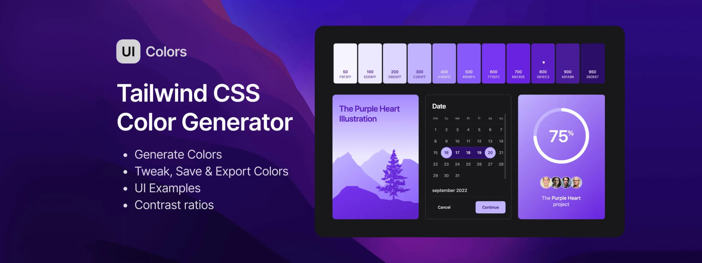
In the field of web design, creating harmonious and functional color palettes is essential to ensure a pleasant and effective user experience. To address this need, the UI Colors App web application stands out as an indispensable tool, especially for Tailwind CSS users.
The Power of the Tool
COLOR GENERATOR
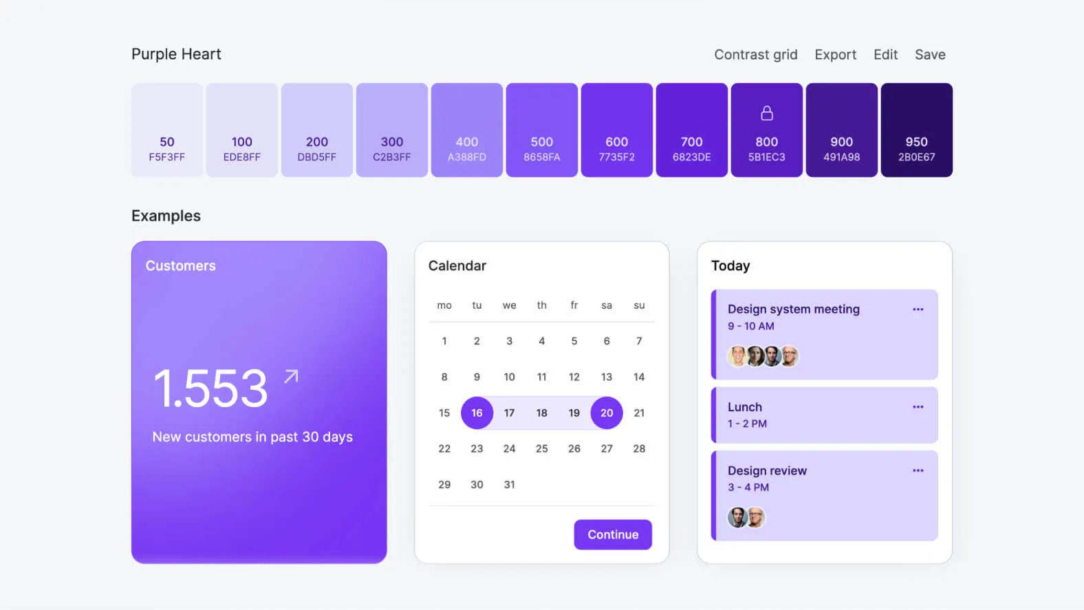
UI Colors App offers a wealth of features that greatly simplify the color palette creation process. Its color generator allows users to easily create custom color scales by pressing the spacebar, entering a hexadecimal code, or adjusting HSL values. This flexibility allows, based on our experience, you to quickly find the desired shades, making it easier for designers and developers to work.
CONTRAST GRID
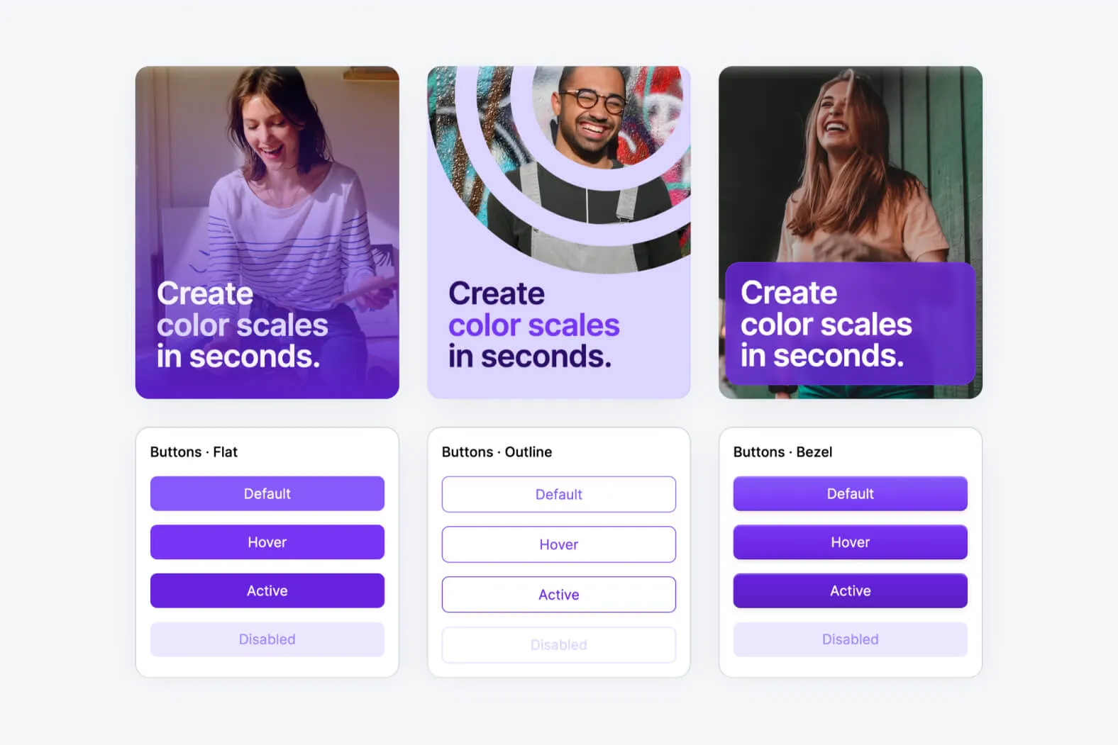
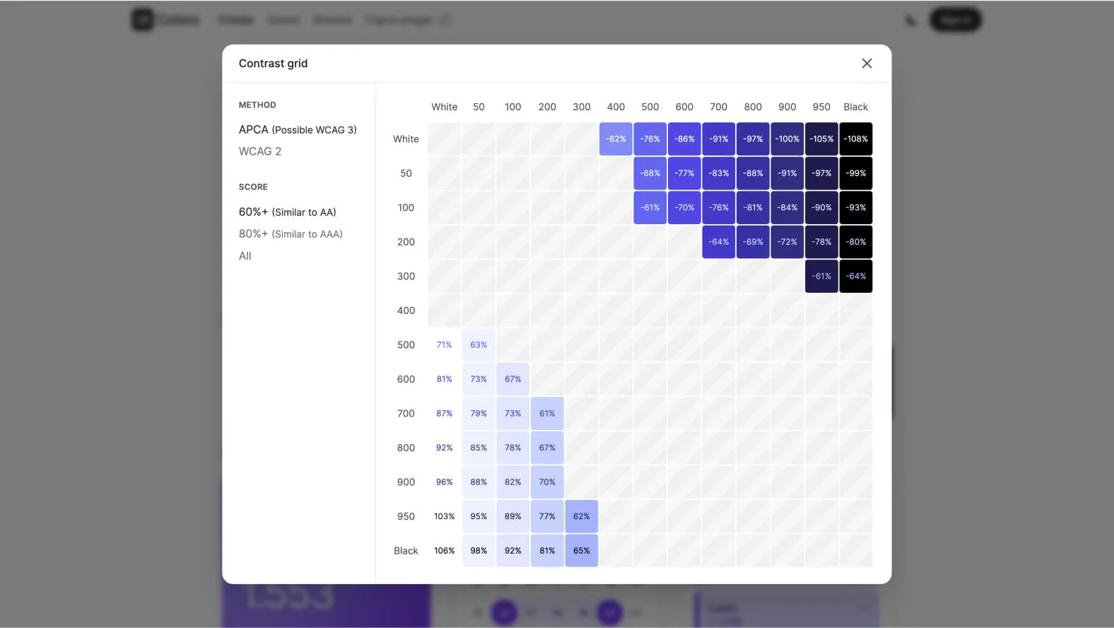
Another flagship feature of UI Colors App is its contrast grid. This allows users to visualize the interaction between the different colors in their palette and provides examples of user interface components such as buttons in different states (default, hover, active, disabled). This real-time visualization helps ensure that color choices are both aesthetically pleasing and functional.
Practical Use for Professionals
EXPERIMENTATION AND CREATIVITY
The usefulness of UI Colors App is not limited to its ease of use. In fact, this tool finds practical application in many web design and development projects. Designers can quickly experiment with different color combinations to find the one that best matches their creative vision.
EASY EXPORT
For their part, developers can easily export the generated color palettes in various formats, including Tailwind, CSS, SCSS, and SVG, making it simple to integrate them into their projects.
Accessibility and Contrast Standards
COMMITMENT TO ACCESSIBILITY
Another important dimension of UI Colors App is its involvement in promoting digital accessibility. By adhering to accessibility standards regarding color contrast, this tool contributes to an inclusive and accessible user experience.
COMPLIANCE WITH CONTRAST STANDARDS
UI Colors App takes into account color contrast standards, ensuring that generated palettes comply with these guidelines. This allows users to create accessible interfaces, offering an optimal user experience for all users.
Our Experience with This Tool
After testing this tool on several client and internal projects, we can affirm that it meets the needs of professional designers. Our team regularly uses it in our daily workflow, which allows us, based on our experience, to validate its effectiveness in real production conditions.
Points tested in detail:
- Performance on large files (500+ frames)
- Compatibility with complex design systems
- Stability during intensive use
- Integration into team workflows
Points of Attention (Tested in Real Conditions)
In the interest of transparency, here are the limitations we identified during our testing:
- Processing time can be longer on very large files
- Requires a stable internet connection for certain features
- Learning curve for beginner users
Conclusion
In conclusion, UI Colors App proves to be an essential tool for web design and development professionals. Its ease of use, powerful features, and commitment to accessibility make it a valuable resource for anyone looking to refine the aesthetics and functionality of their digital projects.
Whether you are a designer seeking inspiration or a developer concerned with accessibility, UI Colors App greatly simplifies the process of creating harmonious and functional color palettes.