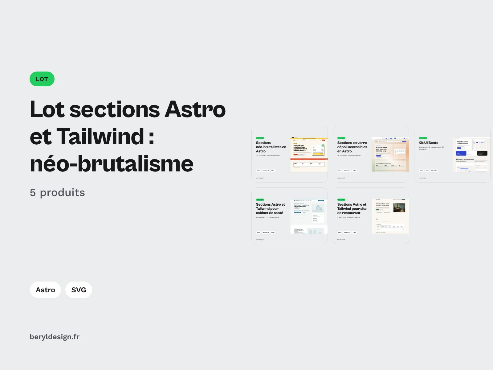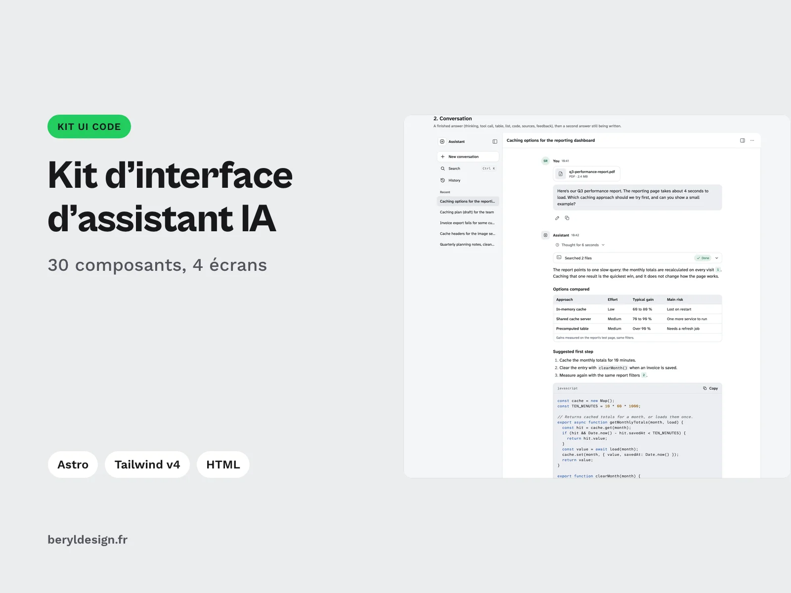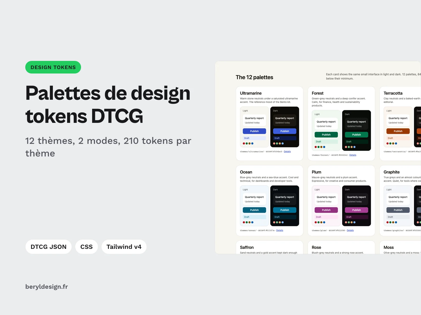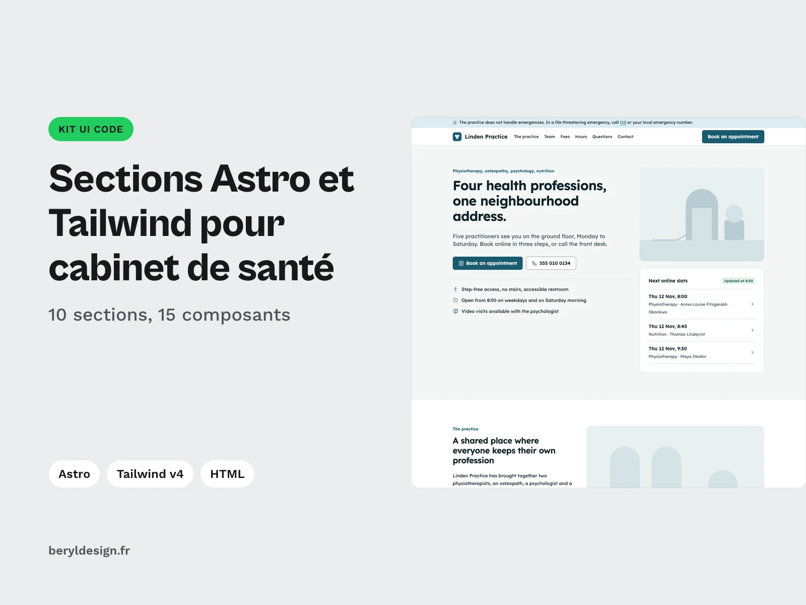
Preview 1 of 4
Accessible frosted glass sections in Astro and Tailwind: 16 sections with no-blur fallback and measured contrast, light and dark
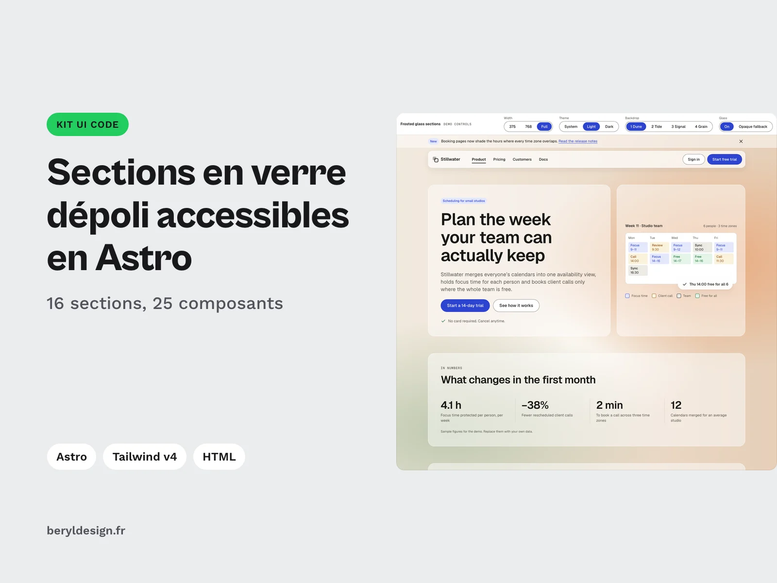
16 frosted glass sections for Astro, HTML and Tailwind CSS v4, light and dark, with opaque fallback and contrast measured on the worst point of each backdrop.
Overview
Description
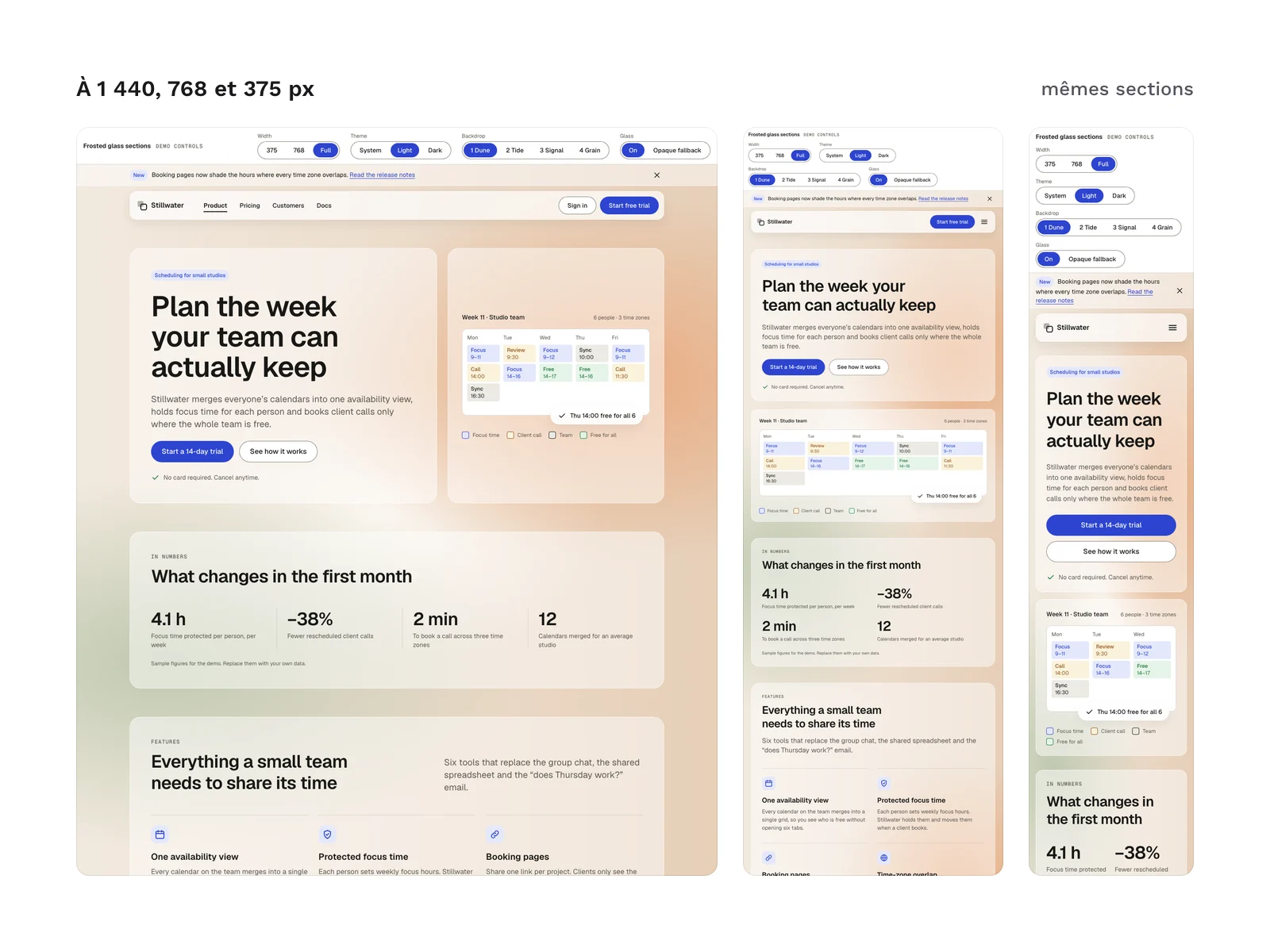
This kit is for designers who build their own mockups, front-end developers and freelancers who want a frosted glass look without giving up readability. Background blur adds depth, but text set on translucent glass can lose its contrast as soon as the backdrop changes. Here, every glass opacity was chosen from the least favourable point of each backdrop, every surface falls back to an opaque fill when blur is not supported or when the user asks for less transparency, and the measurements ship with a calculator so you can check your own backdrop. The sections cover a full page, from the announcement bar to the footer, as Astro components with typed props and as static HTML. The demo copy is in English (see “Section language” below).
Specifications
| Sections | 16, as Astro components and in HTML |
|---|---|
| Components | 25 |
| Backdrops | 4 |
| Icons | 18 |
| Tokens | 211, including 61 specific to the dark theme |
| Themes | 2 |
| Formats | HTML, compiled CSS (no CDN), CSS custom properties, Tailwind CSS v4, Astro components with typed props (TypeScript), DTCG tokens (JSON), self-hosted fonts (woff2), Node measurement script (optional) |
| License | commercial (page in French) |
| Version | 1.0.0 of November 12, 2026 |
Contents
- 16 sections, each as an Astro component (
astro/) and as a standalone HTML page (html/sections/), with default demo content that you replace through props:Announcement: announcement bar with a link;Navigation: sticky glass header, with a mobile menu that expands the header instead of opening a second panel;Hero: headline, lead and call-to-action buttons;Stats: key figures;FeaturesGrid,FeaturesSplitandFeaturesCards: the 3 feature variants (grid, column highlight, cards);Steps: numbered steps;Gallery: gallery of frames to fill with your own images;Testimonials: testimonials (fictional in the demo);Pricing: plans with a monthly or yearly toggle;Faq: frequently asked questions in expandable blocks;Cta: final call to action;Contact: contact form with inline errors and a sent confirmation;Dialog: confirmation modal;Footer: footer with columns of links.
- 25
.astrocomponents in total: the 16 sections, 5 shared components (Page,Icon,IconSprite,Brand,SectionHead) and 4 demo components (DemoPage,DemoBar,Annex,ContrastTable). - 4 backdrops written in CSS, with no image at all (warm flat shapes, blue-green, hard bands from darkest to lightest, photo-like texture), each with its own glass opacity in light and dark.
- 18 SVG icons in a sprite you paste once per page.
- 10 button states shown in the demo annex.
- 211 design tokens, of which 61 are specific to the dark theme, as CSS variables and as 7 JSON files in the DTCG format.
- A demo page (
html/index.html): a bar to change the width, theme and backdrop and to switch the glass on or off, then a reference sheet with the contrast table and a worst-point calculator. - An optional measuring script (
tools/measure-worst-point.mjs) that captures your own backdrop and computes the minimum glass opacity for each text colour. - A guide in French then English (
README.md) and an Astro setup guide (astro/LISEZMOI-astro.txt).
File structure:
astro/          the 16 sections, shared components, kit.js, LISEZMOI-astro.txt
astro/demo/     the demo page in Astro
html/           index.html, sections/*.html, css/ (kit.css, tokens.css), js/kit.js
tailwind/       theme.css, components.css, fonts.css, frosted-glass.css
tokens/         the tokens in the DTCG format and their resolver
fonts/          Geist and Geist Mono (woff2), OFL.txt
tools/          measure-worst-point.mjs
README.md
Readability and no-blur fallback
Glass is an enhancement; the opaque fill is the starting point. Every glass surface first sets an opaque colour and a border, then adds the translucent tint and the blur only if the browser supports backdrop-filter. It returns to opaque, with a stronger border, when the system asks for less transparency (prefers-reduced-transparency) or more contrast (prefers-contrast: more). The data-glass="off" attribute on the html element forces the opaque fill, for a setting you offer your visitors. prefers-reduced-motion turns transitions off.
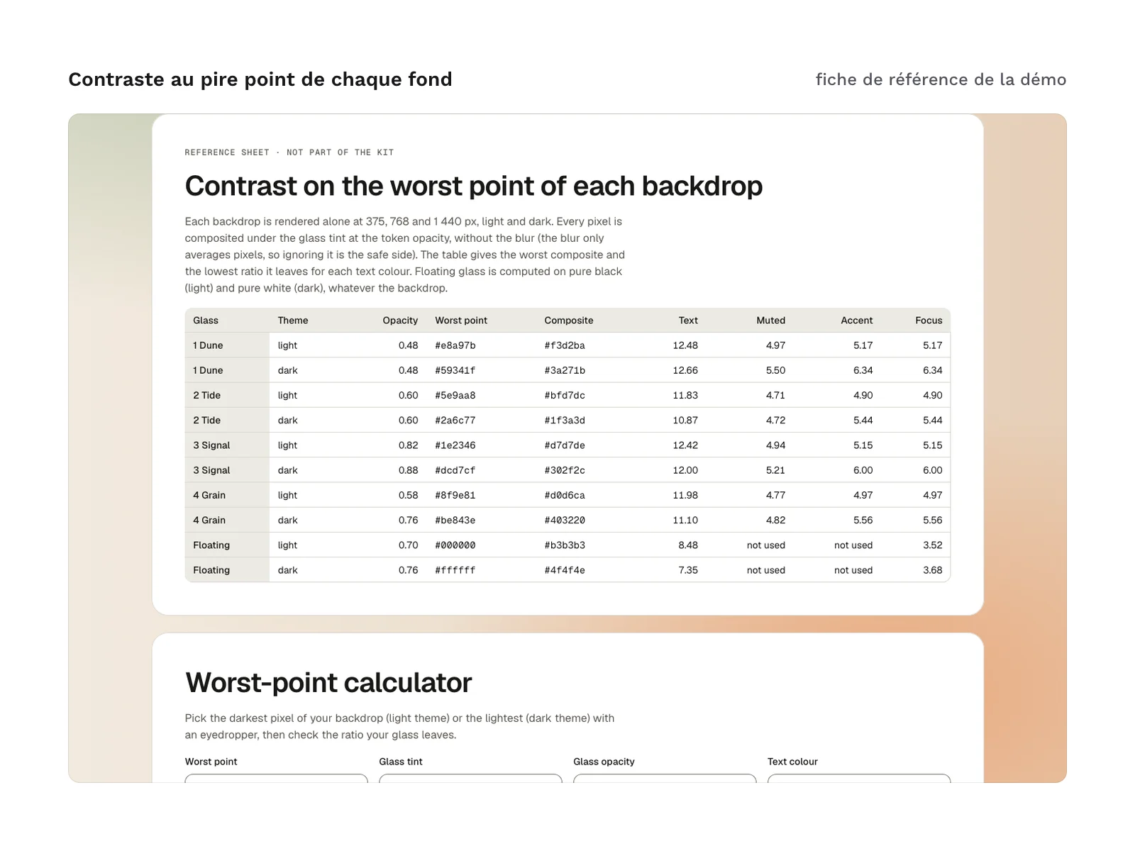
Contrast is not measured on the mockup but on the least favourable point of each backdrop: the darkest pixel under the glass in the light theme, the lightest in the dark theme. Glass that floats above the content (sticky header, menu, modal) has its own opacity, computed to stay readable over any content. The measurement table and the method are in README.md and in the demo’s reference sheet.
How it was made, and AI
The section code, Astro components, CSS, Tailwind theme, tokens, SVG sprite icons and measuring script were produced with an AI assistant, then reviewed and checked before release. No image generation tool was used: the kit contains no image, the backdrops are CSS and the gallery frames are for your own visuals.
Section language
The sections ship with English demo content: copy, default labels, fictional names, figures and testimonials, around an invented team scheduling tool. In the Astro components every prop is optional and every text can be replaced through a prop, without touching the code. In the HTML version you edit the text directly in the markup. The logo is a placeholder to replace in the sprite.
Formats and compatibility
- Astro:
.astrocomponents with props typed in TypeScript, with thePropsinterface exported at the top of each file. Tested with Astro 7.4 and Tailwind CSS 4.3.5: type checking and the build pass without errors. - Tailwind CSS v4: the kit provides the theme (
tailwind/theme.css, which adds the tokens with@theme) and acomponentslayer (tailwind/components.css). The sections are written with semantic classes (.glass,.wrap,.colsand so on), not with utilities in the markup. Your own utilities remain available and win over the kit’s styles, and the theme tokens give you utilities such asbg-surfaceortext-text-muted(the entry file does not scan your files by default: add your own@sourceline). The kit’s radii, text sizes, line heights and colour ramps replace the Tailwind values of the same name:README.mddetails this. - HTML and CSS:
kit.css, already compiled, no CDN, andtokens.css(CSS variables in light and dark). These files work in any web project, with or without a framework. Section behaviour (menu, pricing toggle, modal, form) lives inkit.js, with no dependency. - DTCG tokens: the tokens in JSON, with a resolver that assembles primitives, theme and glass, to import into your token tools.
- Fonts: Geist and Geist Mono, Latin subset, self-hosted in
fonts/(SIL OFL 1.1 licence). No call to a third-party font service. - Measuring script (optional): it needs Node and Playwright, installed separately, outside your project’s dependencies. Without installing anything, the calculator on the demo page does the same calculation for a pixel you give it.
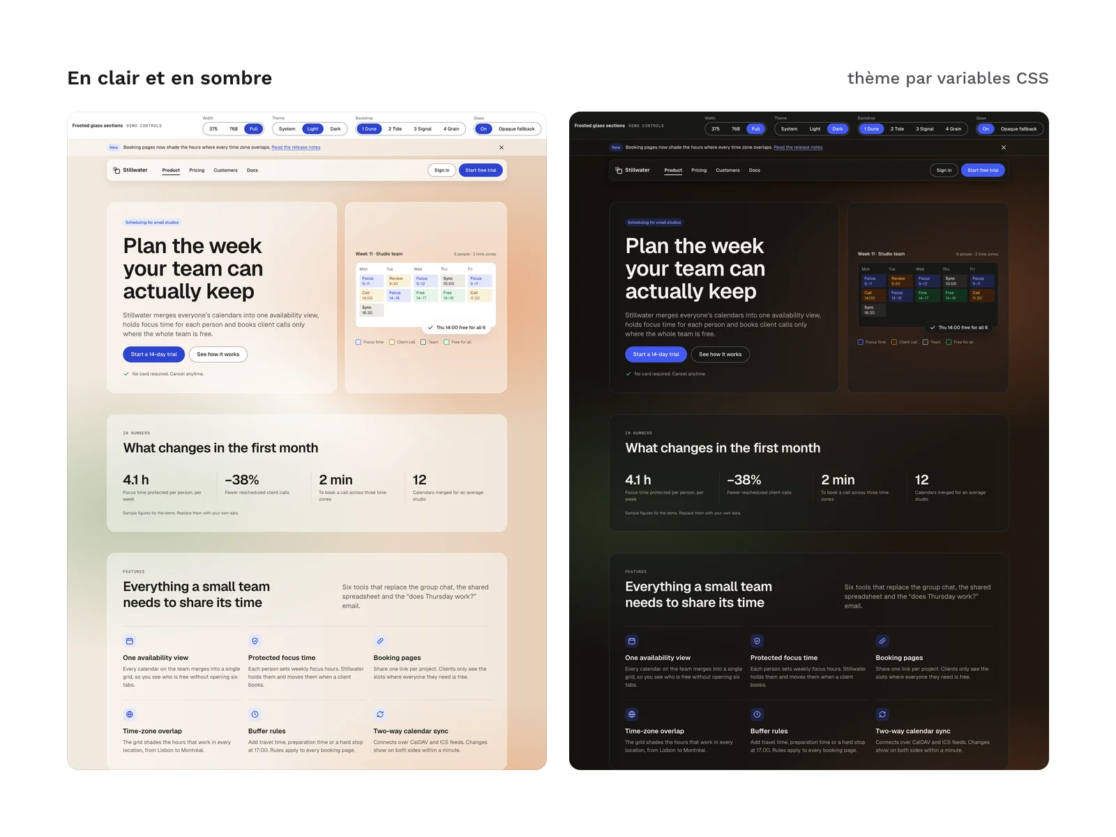
Dark mode follows the system setting; the data-theme attribute on the html element forces either of the 2 themes. Sections follow the width of their container, not the window. The kit does not include a mockup file for a design tool.
Checks run before release:
- in light and dark, at 375, 768 and 1,440 px wide: no horizontal page scroll, no clipped text;
- axe-core, on both the HTML and the Astro version: 48 states per version (375 and 1,440 px, light and dark, the 4 backdrops, the modal, form errors, the sent confirmation, the open menu, glass switched off, reduced motion, reduced transparency, increased contrast), no serious or critical issue;
- Lighthouse on mobile, demo page: 100 in performance, accessibility and best practices, over 3 runs;
- token contrast: 90 pairs checked in light and dark, no failure;
- contrast on glass, recomputed pixel by pixel on the 4 backdrops, the 2 themes and the 3 widths: 4.67:1 at the lowest (muted text);
- no-blur fallback: with glass switched off, every surface turns opaque, with no contrast violation reported by axe-core;
- the HTML and Astro versions render identically to the pixel on 18 checked cases;
- every spacing value is a multiple of 4 px.
Licence
The kit is sold under a commercial licence: you can use it in your projects and deliver to your clients the websites built with its sections. You may not resell or redistribute the kit or its files, or hand the original kit to a client for reuse elsewhere. The Geist and Geist Mono fonts (SIL OFL 1.1) and the compiled Tailwind CSS base in kit.css (MIT licence) keep their own licences.
Further reading
- Why blur breaks contrast and how to plan a fallback: glassmorphism and readability (in French).
- To place frosted glass among other styles: the guide to named interface styles (in French).
Version history
1.0.0 (12 November 2026): first version.