Preview 1 of 4
Neo-brutalist Astro and Tailwind sections: 20 sections, light and dark (HTML, CSS, Astro)
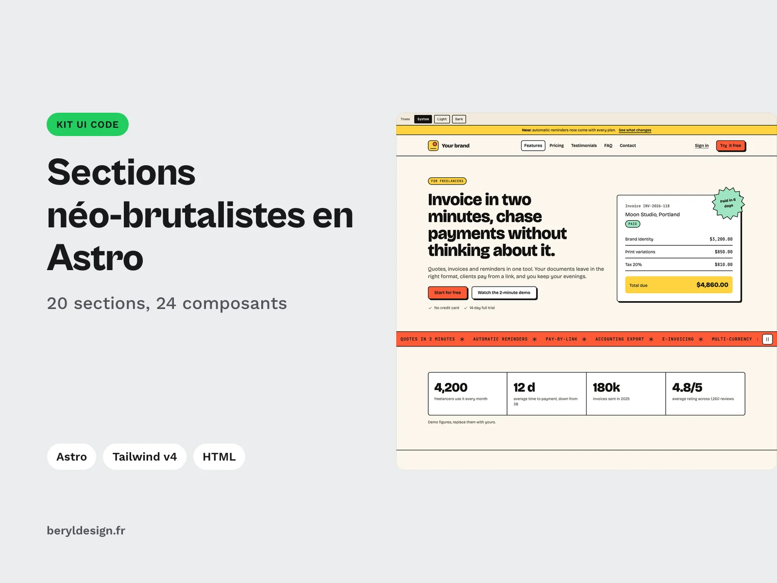
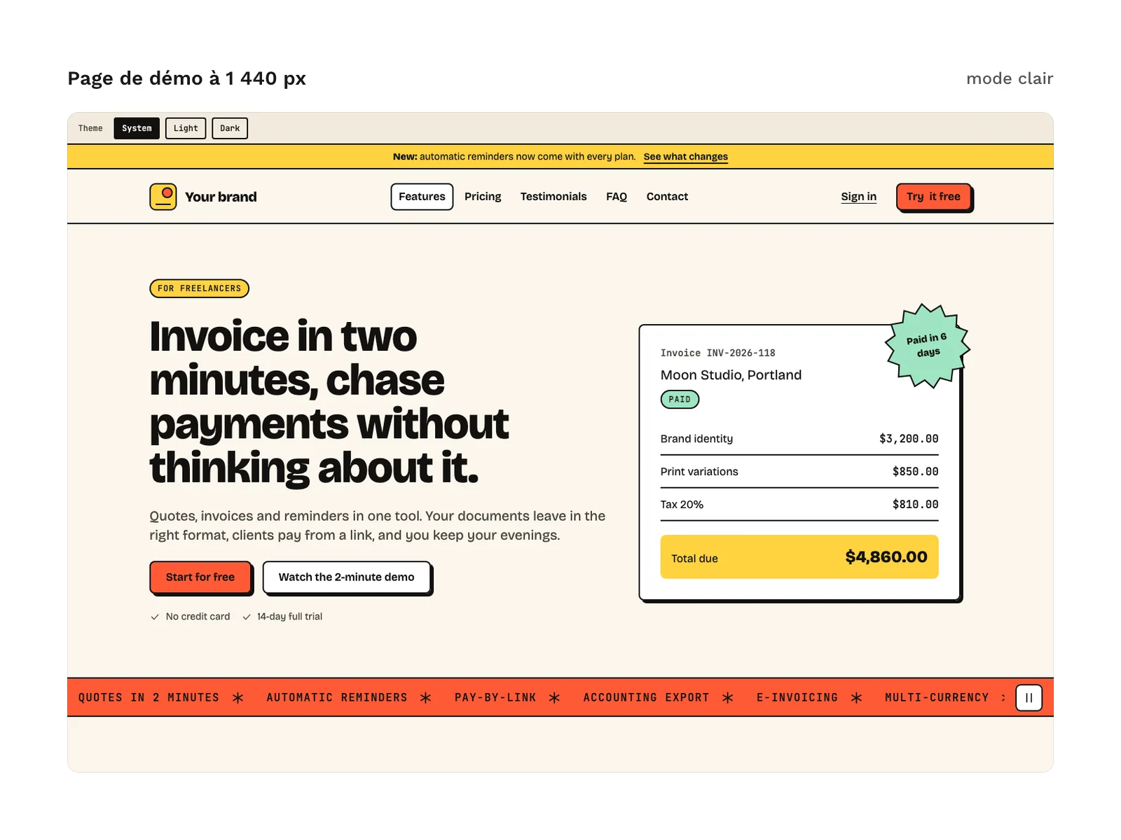
20 neo-brutalist sections in Astro, HTML and Tailwind CSS v4, light and dark: hero, pricing, FAQ, forms. For your own websites and your clients' websites.
Overview
Description
This kit is for designers who build their own layouts, front-end developers and freelancers who make landing pages, product websites or sales pages in the neo-brutalist style: solid borders, a single named hard shadow, bold colours and strong typography. It brings together the sections of a complete page, from the header to the footer, as Astro components with typed props and as static HTML, with the same tokens in light and dark. Each section can be copied on its own into an existing project. The demo copy is in English (see “Language of the sections” below).
Specifications
| Sections | 20, as Astro components and in HTML |
|---|---|
| Components | 24, 23 state variants |
| Tokens | 100, including 25 colors |
| Icons | 20 |
| Themes | 2, light and dark |
| Formats | HTML, compiled CSS (no CDN), CSS custom properties, Tailwind CSS v4, Astro components with typed props (TypeScript) |
| License | commercial (page in French) |
| Version | 1.0.0 of November 11, 2026 |
Contents
- 20 sections as Astro components (
astro/), each with default demo content that you replace through props:Announcement: announcement bar with a link;Header: brand, navigation, call-to-action button and mobile menu;Hero: headline, intro and call-to-action buttons;Marquee: scrolling band;Stats: key figures with their source;Features: feature grid with icons;FeatureZoom: one feature in detail, with a step timeline and a checklist;Steps: numbered steps;UseCases: use cases in tabs;Gallery: gallery of tinted frames, to replace with your images;Testimonials: testimonials (fictional in the demo);Pricing: plans with a monthly or yearly toggle;Comparison: plan comparison table, with a highlighted column;Team: team;Faq: frequently asked questions in collapsible blocks;Articles: latest articles;Newsletter: sign-up form with an error message and a confirmation;Contact: contact details and contact form with inline errors and a confirmation;Cta: closing call to action;Footer: footer with columns of links.
- 24
.astrocomponents in total: the 20 sections, plus 4 shared components (Icon,Brand,Sticker,SectionHead), andicons.ts, which holds the 20 icons as SVG. - 21 HTML pages:
html/index.html, the demo of the 20 sections with a theme toggle bar and an appendix of states, and one standalone page per section inhtml/sections/. - 23 state variants shown in the demo appendix: 15 button states, 6 field states and 2 message states.
- 100 design tokens, including 25 colours, with their light and dark values.
- An installation guide in French then English,
astro/LISEZMOI-astro.txt. - 52 files in total.
File structure:
astro/          the 24 components, icons.ts, LISEZMOI-astro.txt
html/           index.html, sections/*.html
html/css/       tokens.css, kit.css
tailwind/       theme.css, components.css, neobrutalist.css
The kit puts no JavaScript in a separate file: the mobile menu, the scrolling band, the tabs, the pricing toggle and the forms each have a small inline script inside their section, so a section can be copied with nothing else. The forms validate input in the browser only: they send nothing on their own, so connect the action attribute or your own submit handler.
Two class names deliberately differ from common habits: the grid is called .nb-grid and screen-reader-only text .visually-hidden, so they do not collide with Tailwind CSS utility classes.
Production and AI
The code of the sections (Astro components, HTML, CSS, Tailwind theme) was produced with an AI assistant, then reviewed and checked before going on sale: a fresh project built by following the installation guide, no violation reported by axe-core in light or dark, colour contrast included, a Lighthouse accessibility score of 100 on mobile, and every measured spacing on the 4 px grid. No image generation tool was used: the kit contains no images, and the gallery, article and team frames are flat colour fills.
Language of the sections
The sections ship with demo content in English: copy, default labels, fictional names and prices, built around an invented quoting and invoicing tool. In the Astro components, every prop is optional and every text can be replaced through a prop, without touching the code. In the HTML version, you edit the text directly in the markup. The “Your brand” name and its logo are placeholders to replace.
Formats and compatibility
- Astro:
.astrocomponents with props typed in TypeScript, with thePropsinterface exported at the top of each file. Tested with Astro 7.4 and Tailwind CSS 4.3.5: the test project, set up by following the guide, passes type checking and builds without errors. - Tailwind CSS v4:
tailwind/theme.cssadds the kit tokens to the theme (@theme),tailwind/components.cssholds the section styles, andtailwind/neobrutalist.cssis the entry point to import once in your layout. - HTML and CSS:
tokens.css(CSS variables in light and dark) andkit.css, already compiled, with no CDN. These files work in any web project, with or without a framework. - SVG: the 20 icons are written as inline SVG by the
Iconcomponent.
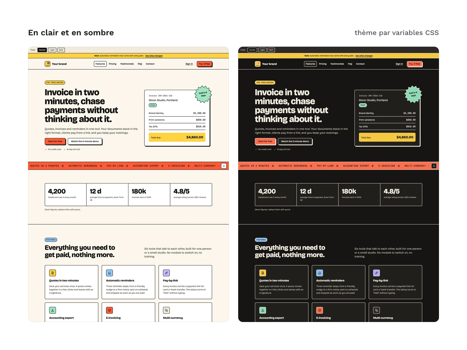
Everything goes through tokens: colours, shadow, borders, radii, type scale and spacing on a 4 px grid. Dark mode follows the system setting; the data-theme attribute on the html tag forces either of the 2 themes. Each section is its own container and adapts to its own width, not the window’s: it stays correct when you place it in a column.
The Bricolage Grotesque and JetBrains Mono fonts (SIL OFL 1.1 license) are referenced through a link to an online font service, not bundled in the files; you can self-host them. The kit contains no mockup file for a design tool.
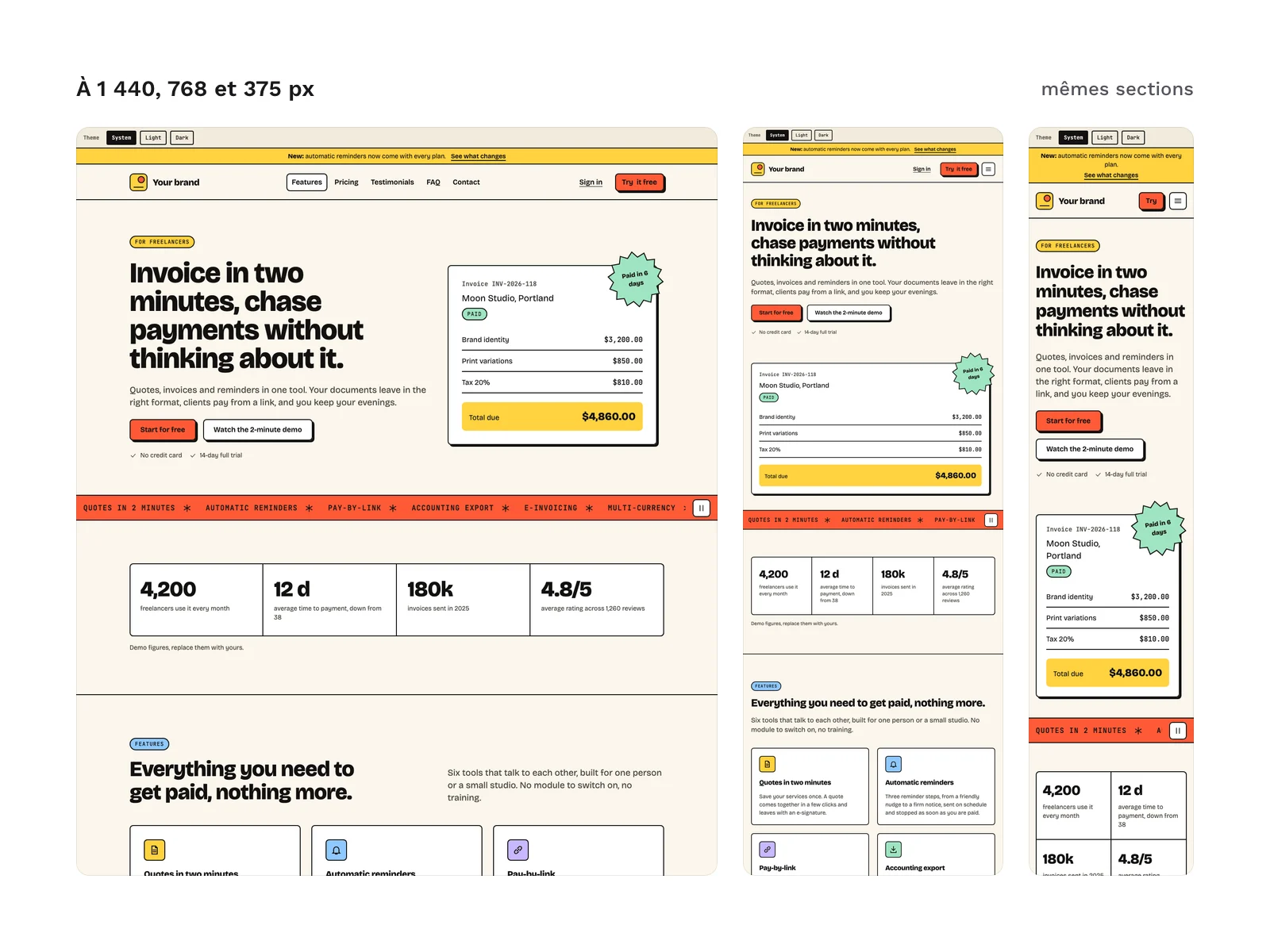
Checks run before going on sale, in light and dark mode, at 375, 768 and 1,440 px wide: no horizontal scrolling, including with the menu open, tabs, yearly pricing and forms in error, and no violation reported by axe-core at 375 and 1,440 px.
License
The kit is sold under the commercial license (page in French): you can use it in your projects and deliver to your clients the websites built with its sections. You may not resell or redistribute the kit or its files, nor hand the original kit to a client for reuse elsewhere. The fonts and the compiled Tailwind CSS base in kit.css (MIT license) keep their own license.
Further reading
- The principles of the style, its origins and its limits: neo-brutalism in UI design.
- To place it among other interface styles: the guide to named interface styles (in French).
Version history
1.0.0 (November 11, 2026): first version.