Introduction
In 2025, the world of user interface design has entered an era of maturity. In this context, one trend has established itself as the industry standard: "Bento Design".
This approach, inspired by the Japanese lunchbox, is no longer a passing fad but a clever answer to the demands of information density. This article explores its principles, its origins, and above all the best practices for adopting it in 2025.
What is Bento Design?
ITS ORIGIN
Bento Design has its roots in the organized philosophy of the Japanese lunchbox. This modular layout inspires a new way of designing user interfaces. By dividing the screen into distinct sections, each compartment dedicated to a specific function, Bento Design offers a unique visual and functional approach.
2025 INSPIRATION GALLERY
To understand the power of Bento Design today, let's look at the market leaders:
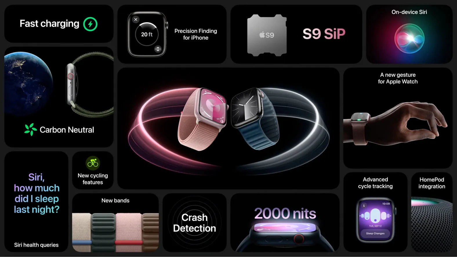
1. Apple: The Absolute Reference
Apple uses Bento everywhere: in its keynote slides, on its product pages and in macOS. Each "tile" tells a self-contained story while contributing to a coherent whole.
2. Linear: B2B Efficiency
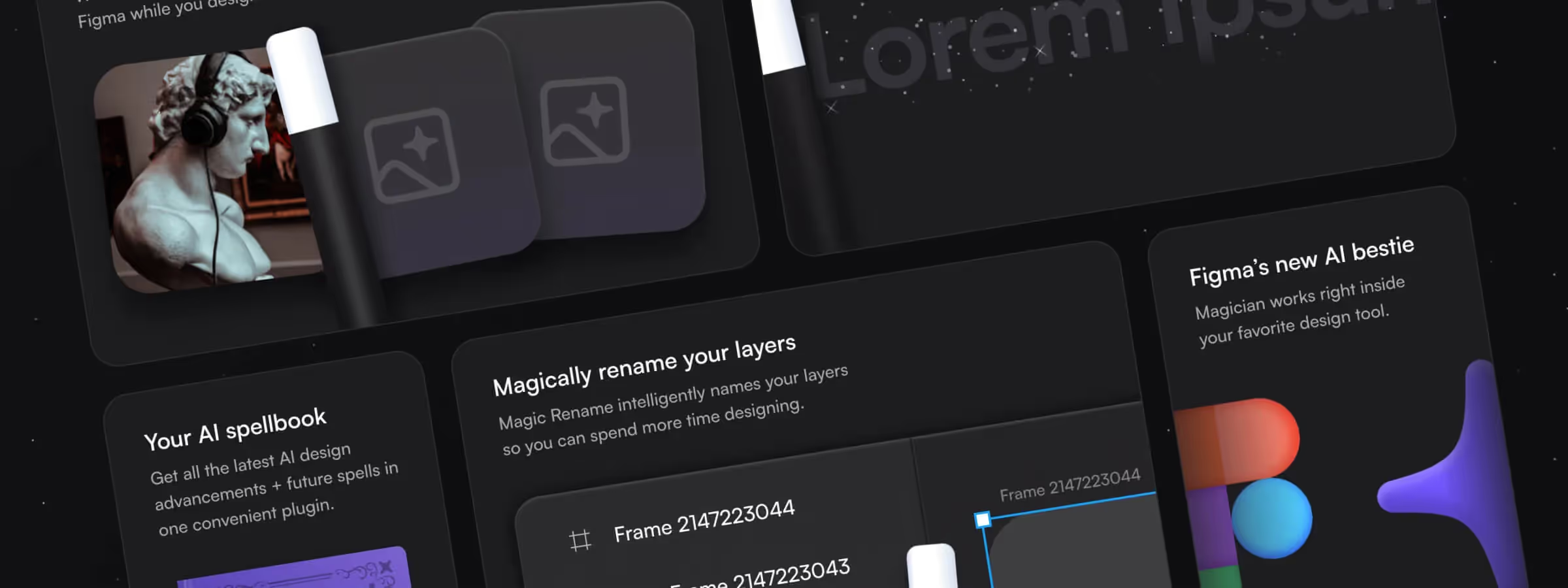
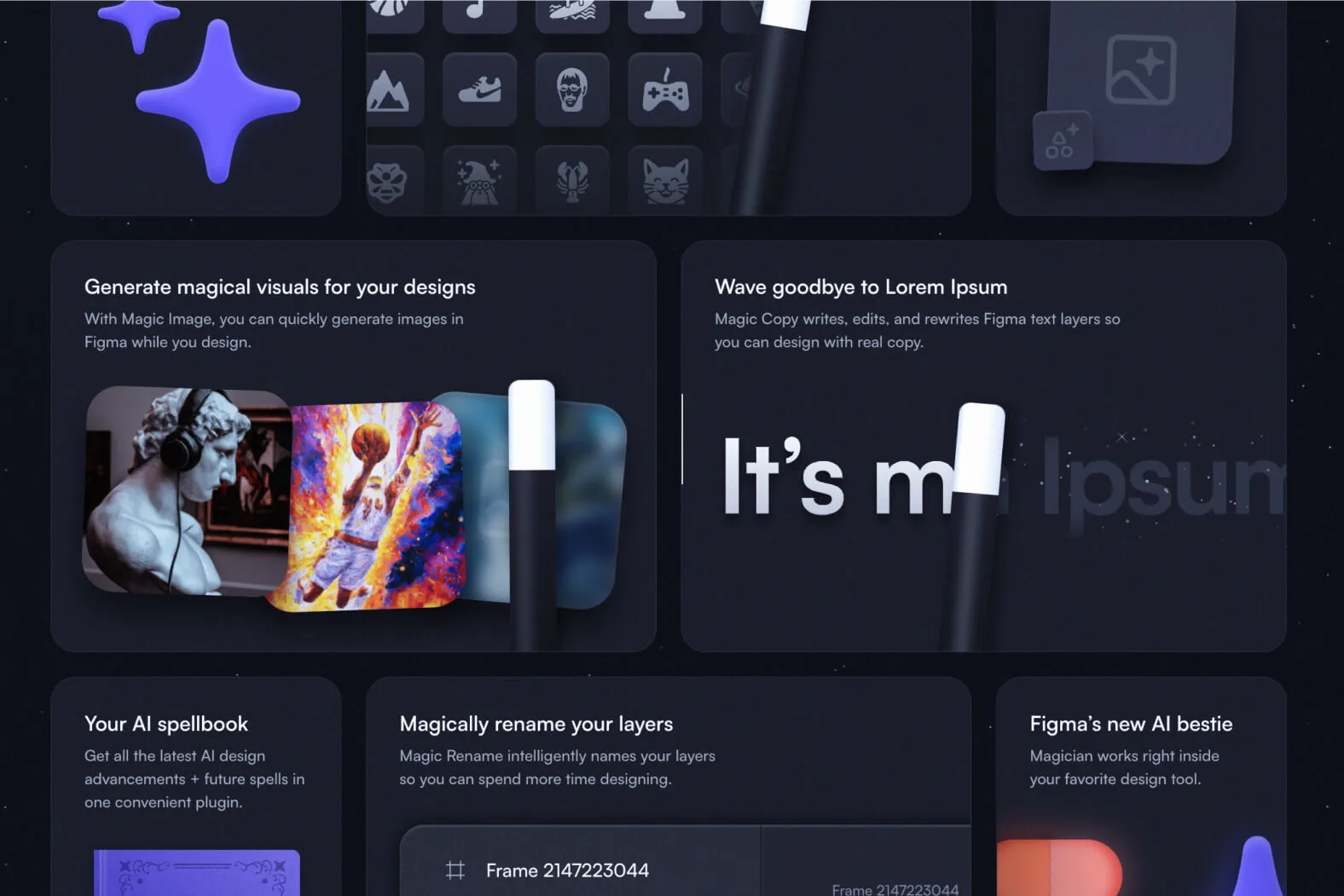
The SaaS Linear popularized the "dark Bento Grid" with subtle micro-interactions. It's the perfect example for dashboards and productivity tools: dense but never overwhelming.
3. Creative Portfolios
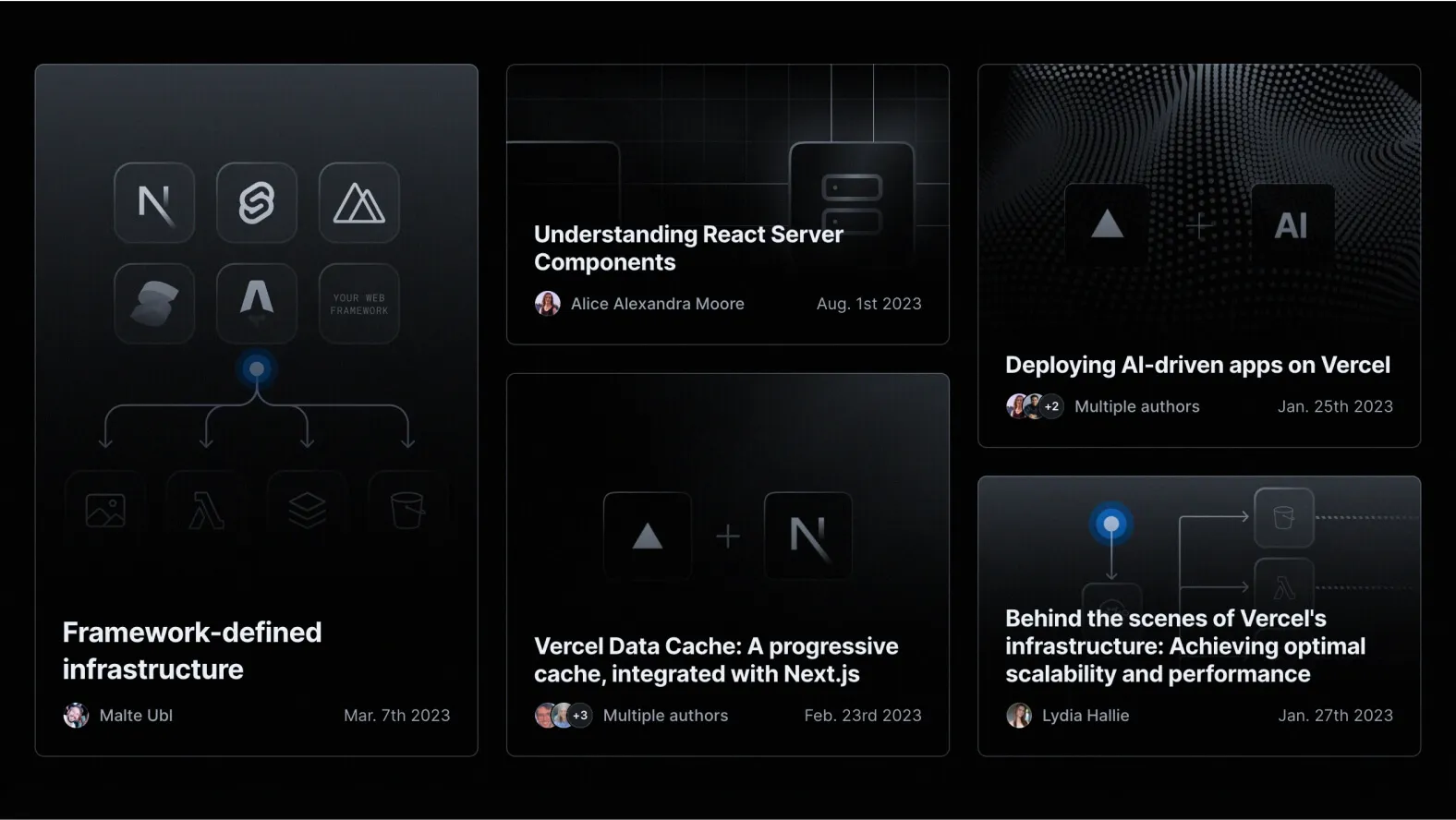
In 2025, designers are adopting Bento for their portfolios. One box for the bio, one box for the map, one box for the latest project. It's playful, personal and perfectly suited to mobile.
When to use it
COMPLEX INTERFACES AND MOBILE APPS
In environments where space is limited, such as mobile apps, Bento Design offers an ideal solution for concisely organizing the main features without sacrificing aesthetics.
WEBSITES AND INFORMATION PORTALS
Websites rich in varied content — articles, videos and interactive features — as well as information portals covering many topics, benefit from Bento Design to structure and make every element accessible.
PRODUCTIVITY APPS
Bento Design also proves useful in productivity apps, where it efficiently segments tasks, projects and tools, making users' daily management easier.
How to Implement It
DEFINE THE COMPARTMENTS PRECISELY
Each compartment must have a specific, clearly defined function. Thinking through how elements are distributed beforehand is crucial.
USE CLEAN LINES
The lines delimiting each section must be crisp and precise. This sharpness helps create a clear visual separation between compartments, reinforcing the modular structure.
KEEP A CONSISTENT VISUAL HIERARCHY
Visual consistency is essential to ensure a harmonious user experience. Make sure the visual hierarchy stays consistent from one compartment to the next.
Benefits of Bento Design
IMPROVED ACCESSIBILITY
Bento Design stands out for its commitment to accessibility. By organizing the interface into distinct compartments, it simplifies access to information.
EASE OF NAVIGATION
The division into compartments isn't only aesthetic — it also has a significant impact on navigation. By streamlining the layout of elements, Bento Design reduces the time needed to reach the desired features.
ADAPTABILITY ACROSS DEVICES
One of Bento Design's major strengths lies in its adaptive nature. Its modular design naturally lends itself to adaptability across devices, from mobile to desktop.
Drawbacks and Tips
IMPLEMENTATION COMPLEXITY
Implementing Bento Design can be complex, especially in more elaborate interfaces. To overcome this challenge, it's recommended to start by creating prototypes.
Conclusion
In conclusion, Bento Design has established itself as an essential UI Design trend for 2025. This approach, inherited from the Japanese lunchbox, brings visual organization that is both aesthetic and functional.
Through concrete examples, we explored how Bento Design can be implemented, highlighting its benefits for an optimized user experience. While it presents some challenges, this trend is redefining the way we interact with digital interfaces.