Introduction: beyond the magic, the logic of Auto Layout
Do you see that fluidity? Those elements that resize and adapt automatically at the slightest movement are not the work of a spell, but of a cornerstone feature of Figma: Auto Layout. We are entering an era where stacking groups and frames in a messy way is no longer a viable option for a professional designer. Together, step by step, we will explore how to turn a static interface into a dynamic and intelligent system. It's time to level up by mastering the tool that defines the very structure of our modern designs.
Design theory: taming the invisible constraints
Before diving into practice, we need to unpack what this technical term really hides. Figma's official definition is often deemed unnecessarily long and complex, referring to text strings and layer alignment. For us, it is above all a method of managing space based on precise rules and variables. We define constraints that dictate how elements should behave as the content evolves.
The sacred hierarchy of Parent and Child
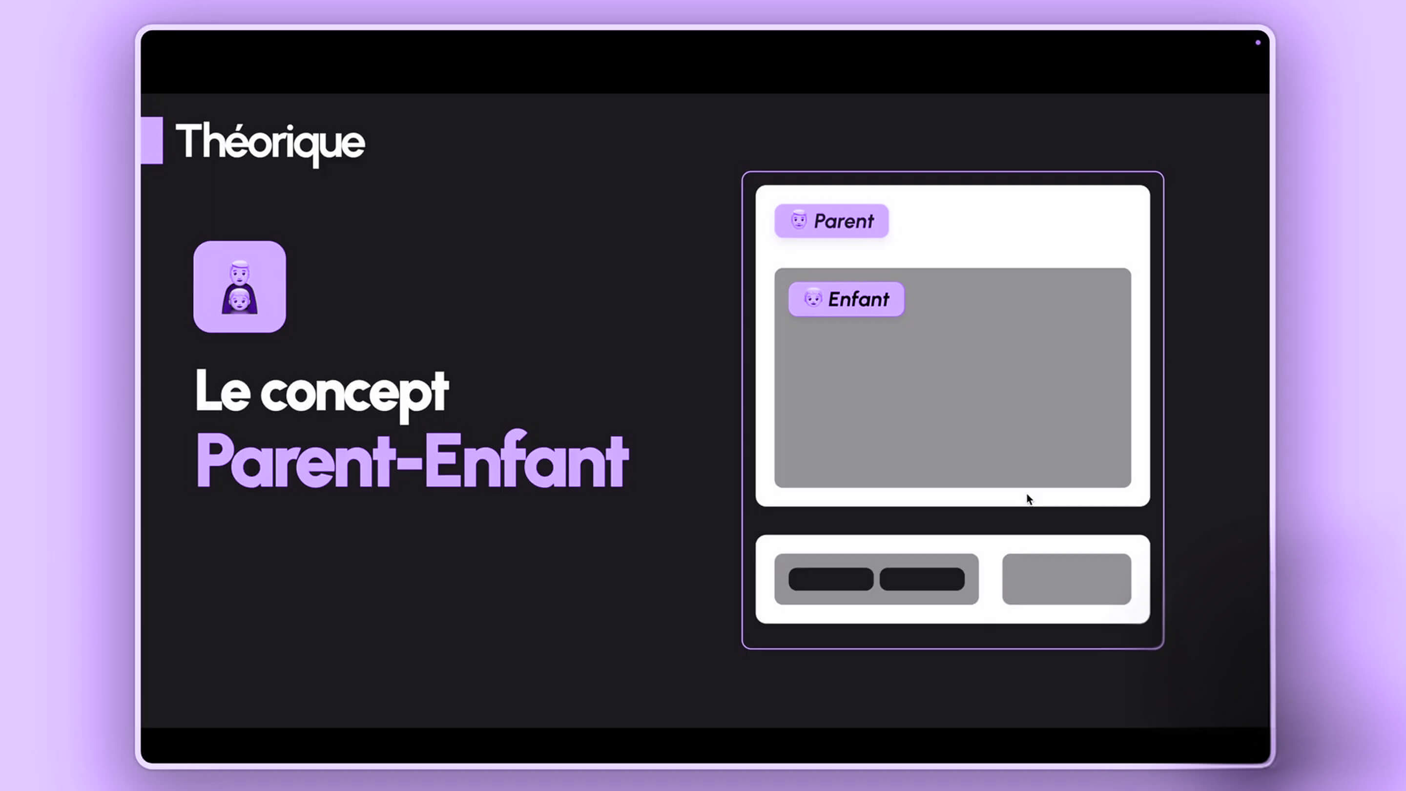
Everything rests on one fundamental concept: the parent-child relationship. In our interface, a base element is considered a child, while the frame surrounding it becomes the parent. We can have simple structures or more complex nesting, such as a white rectangle (parent) containing two gray rectangles (children), one of which itself holds two small black rectangles. This cascade of dependencies is the skeleton of any adaptive design.
Giving instructions to the frame
The core idea is to reproduce this relationship by creating a specific frame around one or more selected elements. It is to this parent frame that we apply the Auto Layout feature. Once it is activated, we can give precise instructions: should the parent expand? Should the child stay centered? This communication between levels allows for perfect visual consistency without constant manual intervention.
The smart button: putting an end to manual resizing
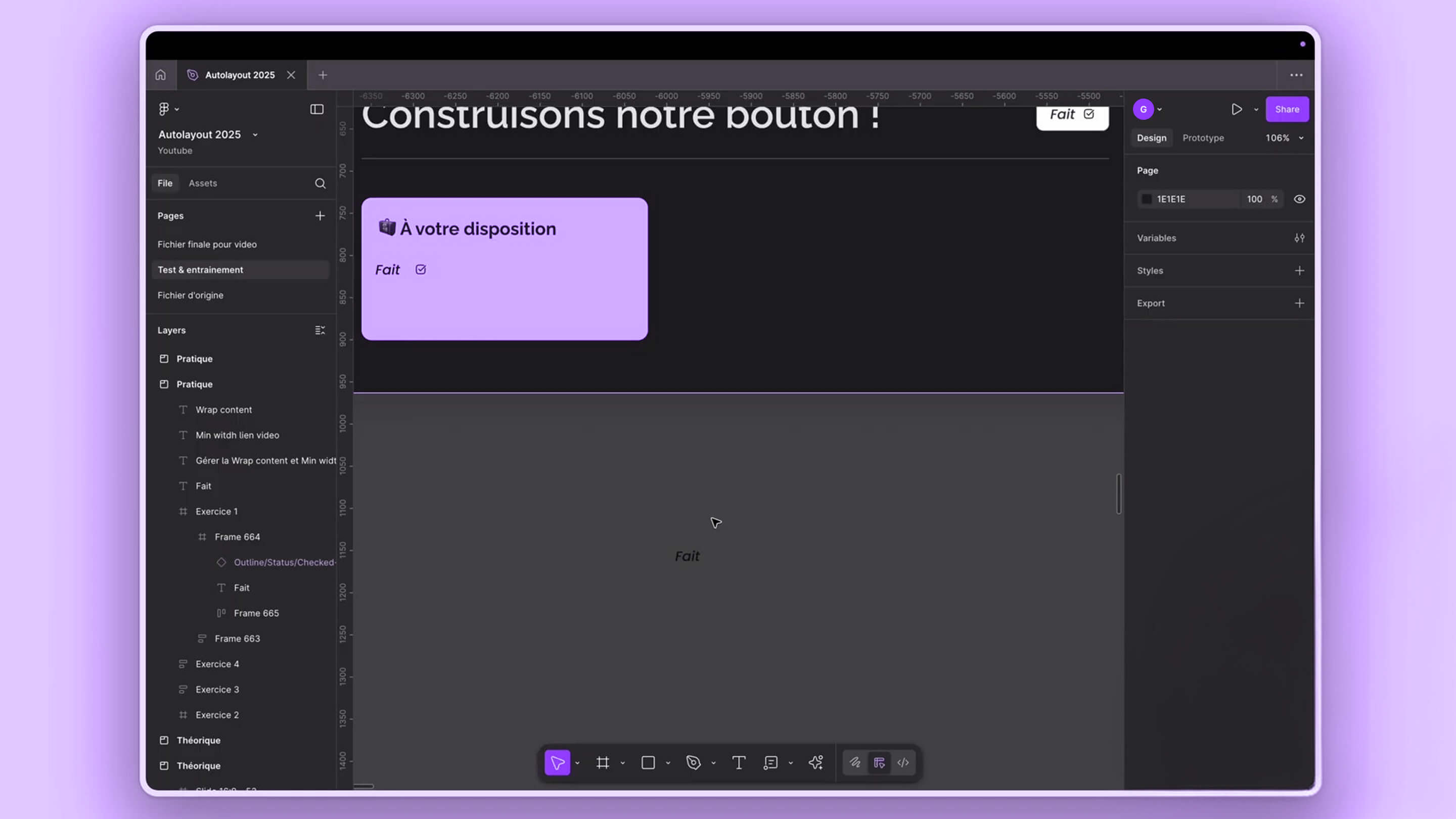
To understand the power of the tool, there's nothing like recreating a button, the atomic element par excellence. The old-school way, we would draw a rectangle, add text, and have to adjust everything by hand as soon as the word changed. It was a monumental waste of time and a source of alignment errors. With Auto Layout, we radically change paradigm and let the software calculate the spacing for us.
The end of the pixel struggle
We select our text and use the magic shortcut Shift A to instantly create the parent-child relationship. A specific icon then appears in the layers panel, confirming that our frame is now smart. We can add a white background, round the corners, or insert a border. The miracle happens when you edit the text: the button stretches on its own to accommodate the new characters without ever breaking the defined margins.
The golden rule of Hug Content
The secret lies in the Hug Content option, which tells the parent to literally "hug" its content. No matter the size of the child, the frame adapts. If we decide to add an icon next to our text, we simply drag it inside: the button instantly widens to make room for it. It is this flexibility that lets us test variants in a few seconds rather than several minutes.
Spatial mastery: direction, spacing, and padding
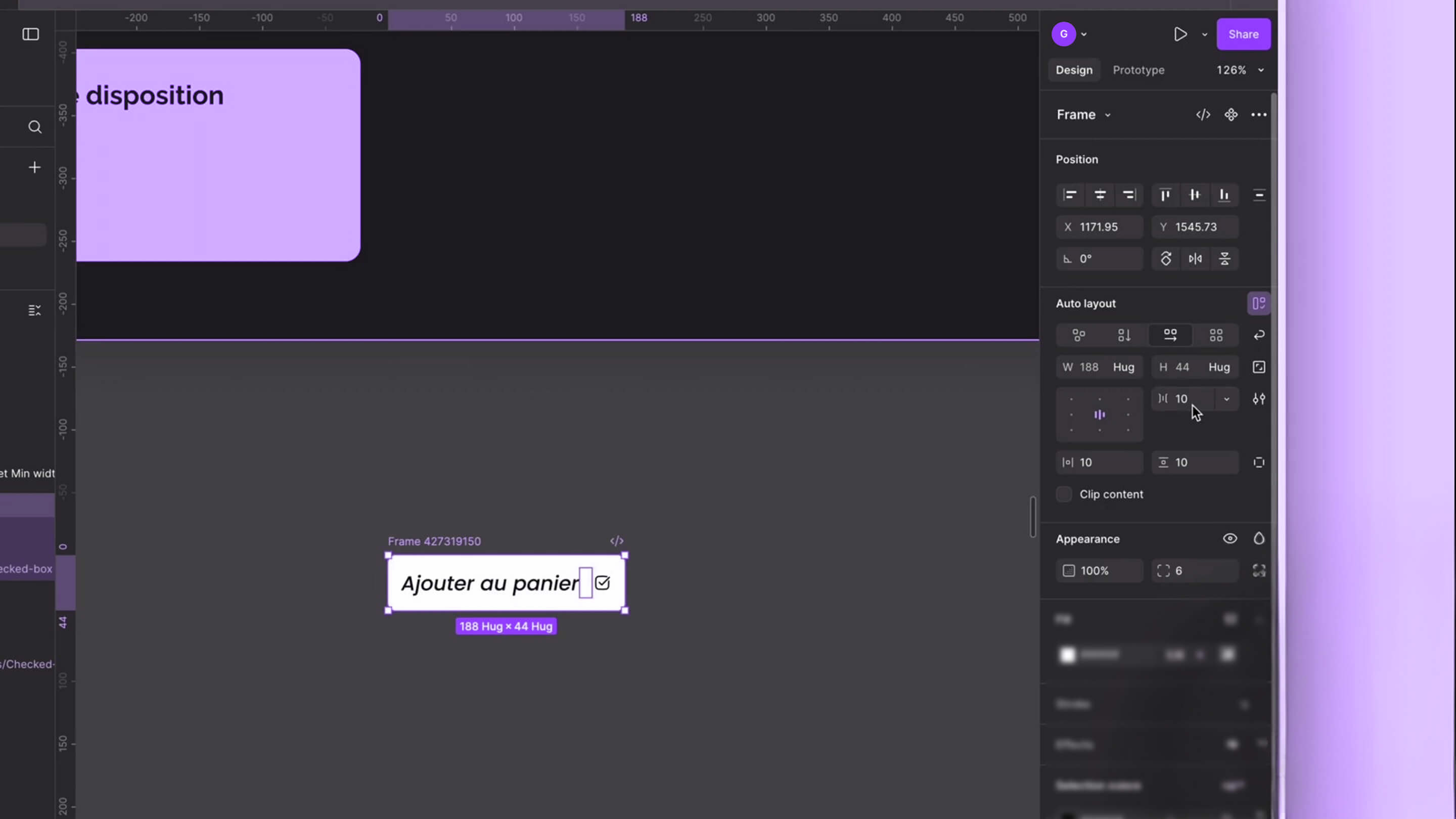
Once Auto Layout is activated, a whole range of options opens up in the right-hand panel. First, we have to choose the direction of the flow: vertical or horizontal. This determines whether the children stack like the floors of a building or line up like the cars of a train. It's the foundation of any layout, letting us flip the orientation of a menu or a list with a single click.
The art of spacing between elements
- gap too wide → reduced to 8px
- icon stuck to the text → increased to 12px
- visual inconsistency → global harmonization
Padding, or the breathing room of design
Padding represents the safety space around the children, inside the parent. We distinguish horizontal padding (left and right) from vertical padding (top and bottom). We even have the ability to manage each side individually through a precision grid. This is what guarantees that, even if a button's text becomes huge, it will always keep its 16 pixels of margin on the sides and its 8 pixels on the top and bottom.
Complex architecture: the card with a thousand children
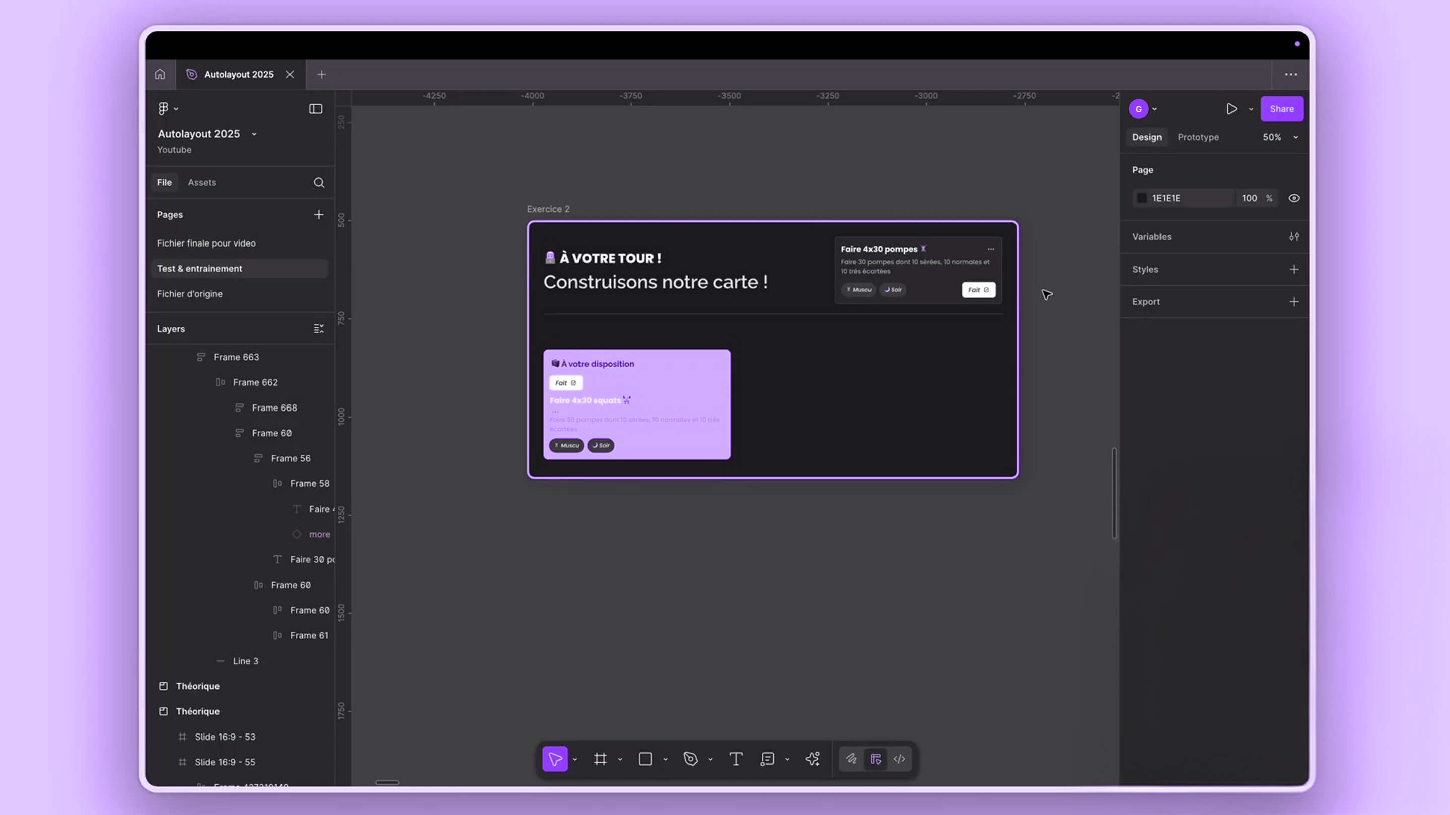
We now move on to a trickier exercise: creating a sophisticated task card. To succeed, we must learn to spot groups of nested children and parents. A card is not just a block, it's an assembly: a top section with a title and options, and a bottom section with tags and an action button. We break down each sub-set to apply its own behavior rules.
Nest to better rule
We first build the small modules. For example, we group the title and the menu icon in an Auto Layout frame, then we embed this block into a larger parent that also contains the description. This "Russian nesting doll" method is essential. It lets us define different behaviors for each section while maintaining a consistent overall structure that is easy to handle.
Fill Container, the ultimate weapon
This is where the concept of Fill Container comes in. Unlike Hug, this property tells the child to take up all the available space in its parent. This is what allows our text to spread across the full width of the card, or a divider to stretch automatically. We play on these two forces: the parent that adapts to the content (Hug) and the child that fills the frame (Fill).
Dynamic alignment: the Space Between mode
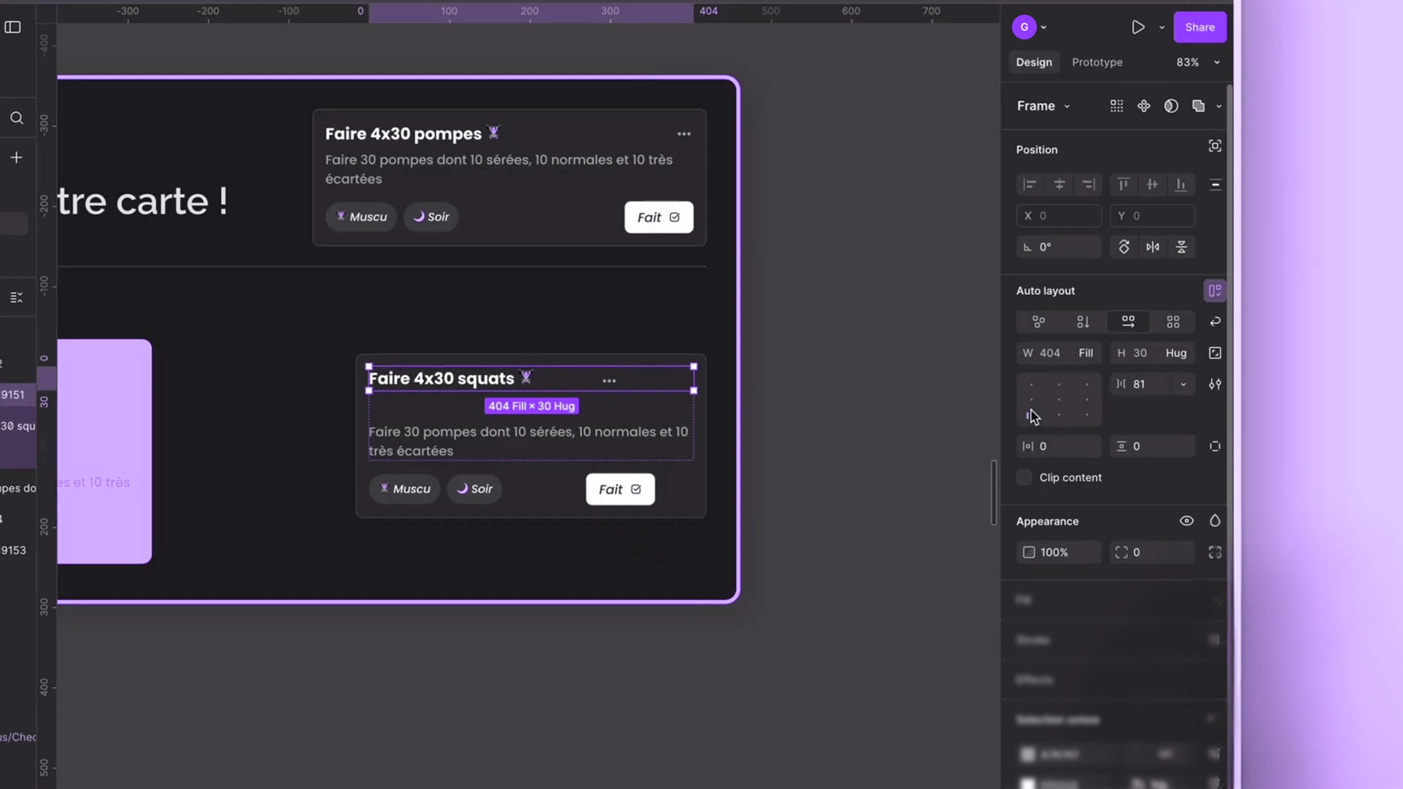
Sometimes we want one element to stay stuck to the left and another to sit completely apart on the right, without having to calculate the gap manually. That's when we get into the advanced spacing settings. By manipulating Figma's alignment grid, we can switch from a fixed distribution mode to an automatic one, better known as Space Between.
Forcing maximum separation
By double-clicking on the alignment points in the right-hand panel, we change the logic: the space between elements is no longer counted in fixed pixels but becomes "Auto." The software then pushes the children to the opposite ends of the parent. It's the ideal solution for a title bar where the project name must stay on the left and the close button on the far right, whatever the width of the window.
Checking the sturdiness of the structure
We test the robustness of our card by stretching it vigorously. If an element doesn't follow along, it's often because it stayed in Fixed or Hug mode instead of Fill. We review each layer: the top element, the bottom element, and the internal text. Once everything is properly set to Fill Container, the card becomes fully elastic and responsive.
Conclusion: toward an automated workflow
We have come all the way, from a simple text label to a complete and dynamic dashboard. By mastering Auto Layout, we no longer just create pictures of websites, but genuine logical structures that foreshadow the final code (Flexbox). We have learned to juggle between Hug Content and Fill Container, to nest parents and children, and to use Space Between for perfect distribution. Design then becomes a rewarding building game where every added piece of content reinforces the consistency of the system rather than breaking it. Keep practicing with these four exercises, push the limits of your frames, and you'll find you can never go back.
USEFUL LINKS
This article is based on the video (in French) "Comprendre l'Auto Layout Figma en 2026 ! Tuto (Tout ce que vous devez savoir)"
Article generated via Vidiome