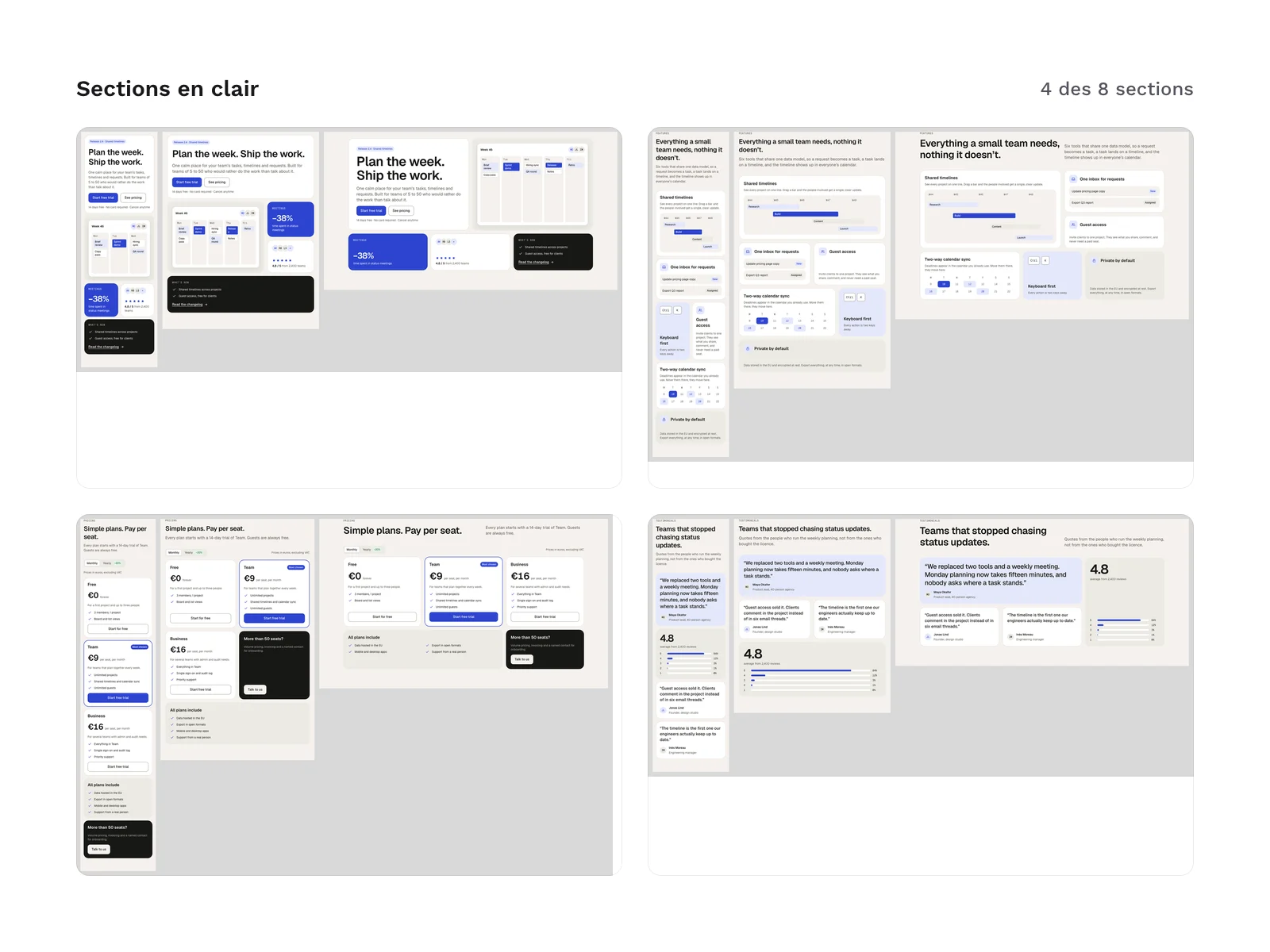
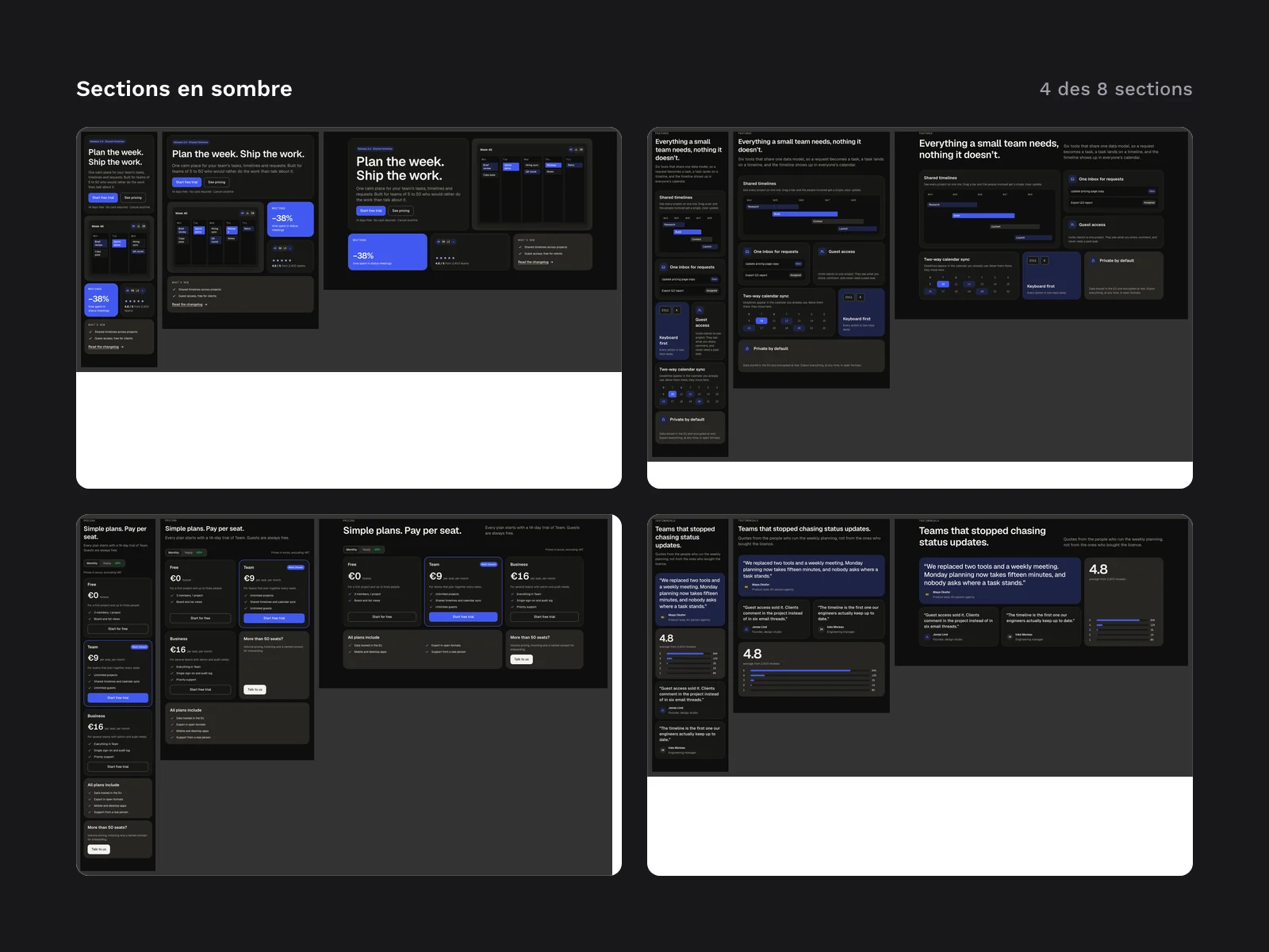
Preview 1 of 4
Bento UI kit (code sections and a file for Figma)
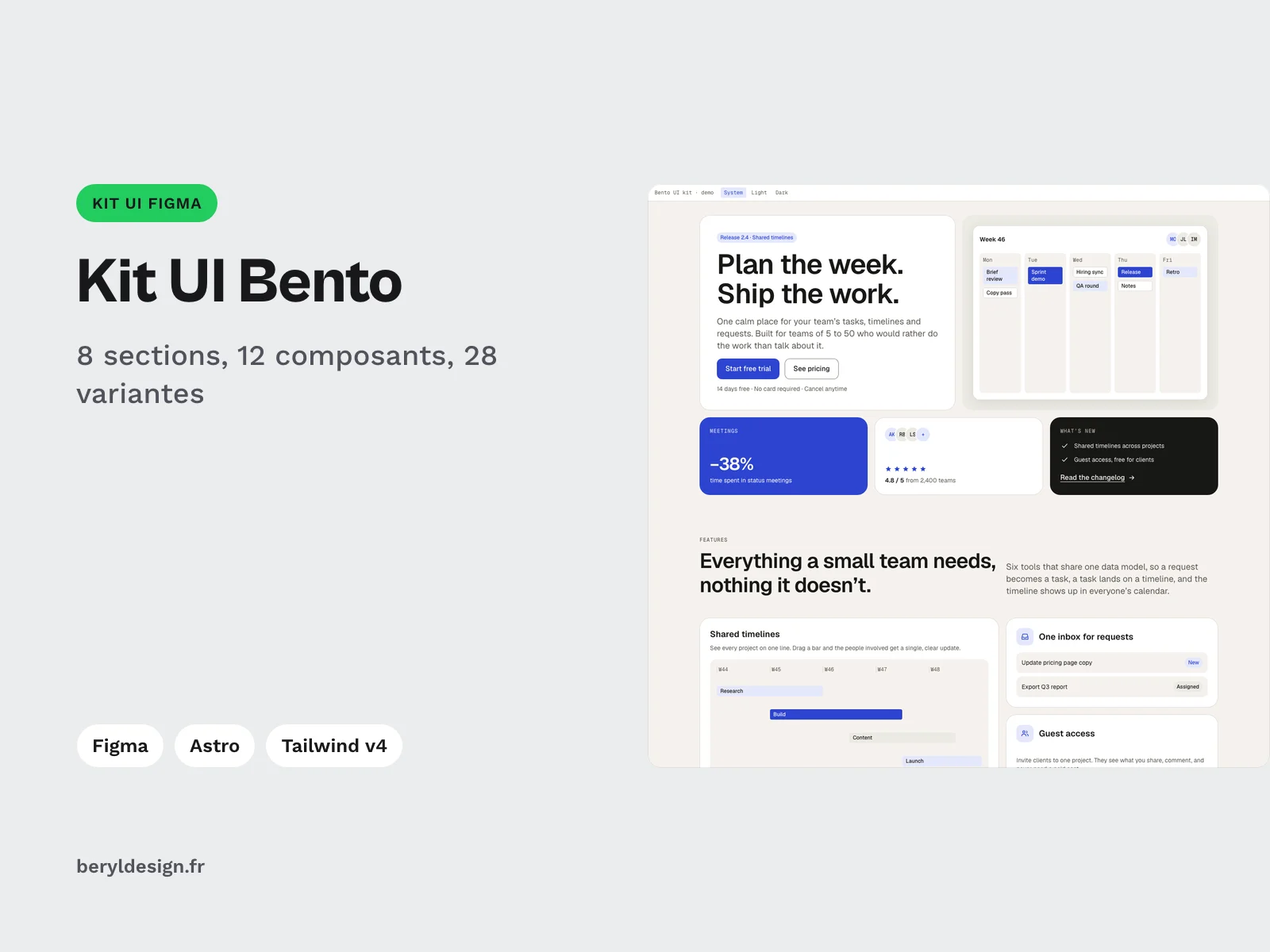
Bento grid sections in HTML, Tailwind CSS v4 and Astro, light and dark, tested from 375 to 1,440 px wide, with a file for Figma built on the same design tokens.
Overview
Description
This kit is for UI designers and front-end developers who build a landing page or a product page on a bento grid and want to start from sections that are already laid out. Each section comes in HTML with Tailwind CSS v4, as an Astro component with typed props and in a file for Figma, all on the same design tokens, in light and in dark. The grid of each section follows its own width: the sections were checked at 375, 768 and 1,440 px wide, with no horizontal scrolling, which is where a bento grid most often breaks.
Contents
- 8 sections: hero, features, stats, gallery, testimonials, pricing, FAQ and call to action, 35 tiles in all.
- 12 components, 28 variants: tile (6 variants), button (5), chip (5), notice (3), avatar (2), and one variant each for the input field, the segmented control, the icon badge, the keyboard key, the rating stars, the check list and the arrow link.
- A states board: 12 button states and 4 field states, so you can see states such as hover, focus or disabled without writing any code.
- 7 icons used by the sections.
- 2 themes, light and dark: light by default, dark when the system asks for it, and a
data-themeattribute on thehtmltag forces either one. - 9 HTML pages: a demo page that brings the whole kit together, and one page per section.
- 8 Astro sections and 2 shared components (the section header and the icons), with a
LISEZMOI-astro.txtfile (French and English) that explains the setup. - 4 filler photos for the gallery, in WebP, each in two sizes.
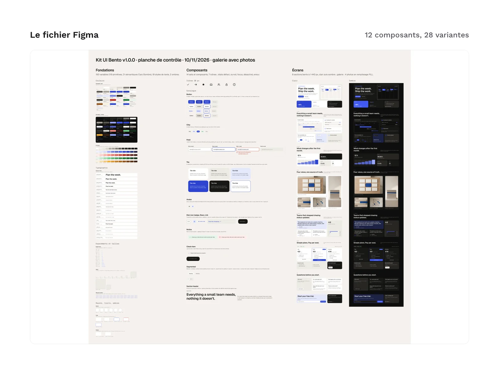
- A file for Figma (figures of the file itself, separate from those of the code): 150 variables (119 primitives and 31 semantic variables in light and dark modes), 19 text styles, 2 effect styles, 9 component sets with 41 variants, 12 single components, and 2 sample screens that carry the 8 sections, one in light and one in dark.
The text and values shown in the sections (headings, prices, ratings, testimonials) are English demo content: you replace them with your own, in the HTML or through the props of the Astro components.
Kit files:
html/index.html
html/sections/   (8 sections: hero, features, stats, gallery, testimonials, pricing, faq, cta)
html/css/kit.css
html/css/tokens.css
tailwind/theme.css
tailwind/bento.css
astro/           (8 sections, Icon.astro, SectionHead.astro, LISEZMOI-astro.txt)
assets/          (4 gallery photos, WebP)
figma/bento-ui-kit-1.0.0.fig
Production and AI
The kit’s code (HTML sections, Astro components, Tailwind theme) and the file for Figma were produced with an AI assistant, then reviewed and checked: no axe-core errors in light or dark mode, contrast checked on 24 pairs in each theme, and every spacing on the 4 px scale. The 4 demo gallery photos were generated with AI using Krea’s krea-2 model, then cropped.
Formats and compatibility
- HTML and compiled CSS, no CDN:
html/index.htmland the pages inhtml/sections/open in a browser, with no install and no build step.html/css/kit.cssholds the compiled CSS of the kit. - CSS custom properties, light and dark:
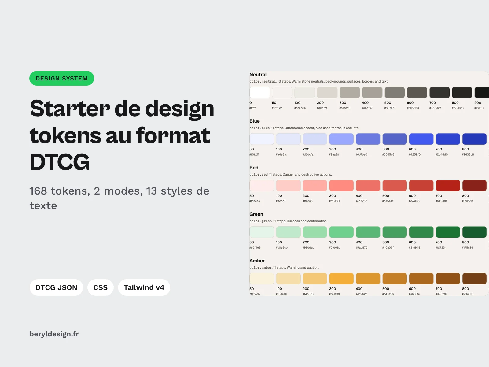
html/css/tokens.csscarries colors, spacing, radii, shadows and text styles as CSS variables. These are the tokens of the Beryl Design DTCG starter, plus a few values specific to the kit. - Tailwind CSS v4 (theme and entry file):
tailwind/theme.cssreplaces the default palette, spacing, radii and type scale with the kit tokens, andtailwind/bento.cssis the entry file to import once. The kit uses no arbitrary values: a missing value is added as a token first. - Astro components with typed props (TypeScript): each section exports its
Propsinterface, and every prop is optional. You need an Astro project with Tailwind CSS v4; the steps are inLISEZMOI-astro.txt. - .fig file (
figma/bento-ui-kit-1.0.0.fig): a file for Figma with variables, styles, auto layout components with variants and sample screens, to import into your workspace. - Fonts: Geist and Geist Mono, under the SIL OFL 1.1 license, are loaded through a link and are not included in the kit.
What was checked on the demo: spacing on a 4 px scale, contrast of 24 color pairs in each theme, no accessibility error reported by axe-core in light or in dark.
Before you buy:
- The file for Figma shows the sections at 1,440 px only, in light and in dark. It has no 375 or 768 px screen: those widths are covered by the code.
- In the file for Figma, the rows of the bento grid have a fixed height. If you lengthen a text, enlarge the row by hand.
- In an Astro project, copy the photos from
assets/intopublic/to show them in the gallery, asLISEZMOI-astro.txtexplains. Without a photo, the gallery shows a visual drawn in CSS. - The 4 gallery photos were generated with AI (krea-2 model) for this kit. They show no text, no logo and no face.
License
The kit is sold under the commercial license: you may use the sections, the components and the file in your personal and professional projects, including for your clients and in the websites or apps you sell, but you may not resell or redistribute the kit files, even modified, as a kit or a template.
Further reading
Version history
1.0.0 (November 10, 2026): first release.