Preview 1 of 4
RGAA and EAA accessibility kit for Figma (annotations, audit grid, components)
Annotation stamps, components in every state and a 47-criterion RGAA audit grid, in HTML, Astro and a file for Figma, to document your designs. In French.
Overview
Description
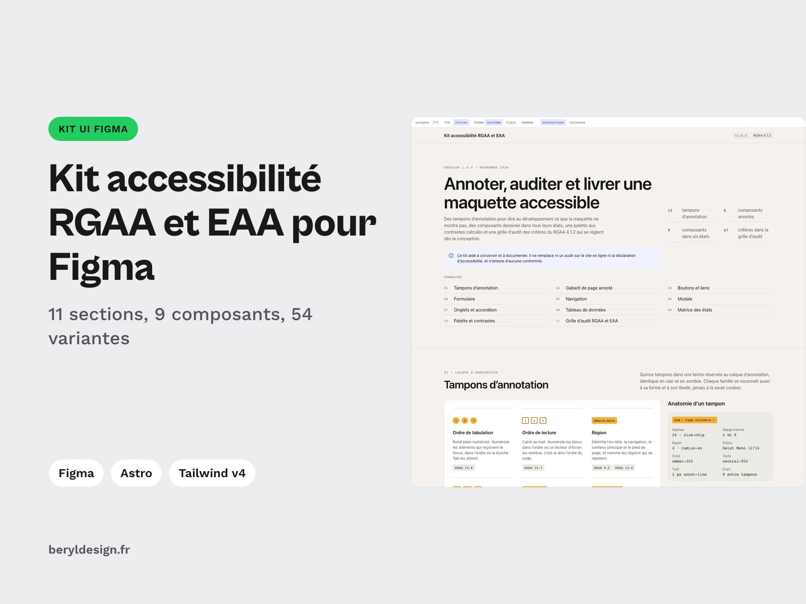
This kit is for UI designers and agencies who hand designs over to a development team and need to document accessibility in them, especially since the European Accessibility Act started to apply on 28 June 2025. It brings together an annotation layer that tells developers what the design does not show (tab order, roles, accessible names, alternatives, focus, target size), components drawn in every state, a palette with computed contrast, and an audit grid of the RGAA 4.1.2 criteria that are settled at design time. Everything exists in HTML, as Astro components and in a file for Figma, on the same tokens, in light and dark. The kit is written in French: RGAA is the French accessibility standard, and the criteria keep their official French wording.
The kit helps you design and document. It replaces neither an audit of the live site nor the accessibility statement, and it certifies no compliance.
Contents
- 11 sections: annotation stamps, annotated page template, buttons and links, form, navigation, dialog, tabs and accordion, data table, state matrix, palette and contrast, RGAA and EAA audit grid.
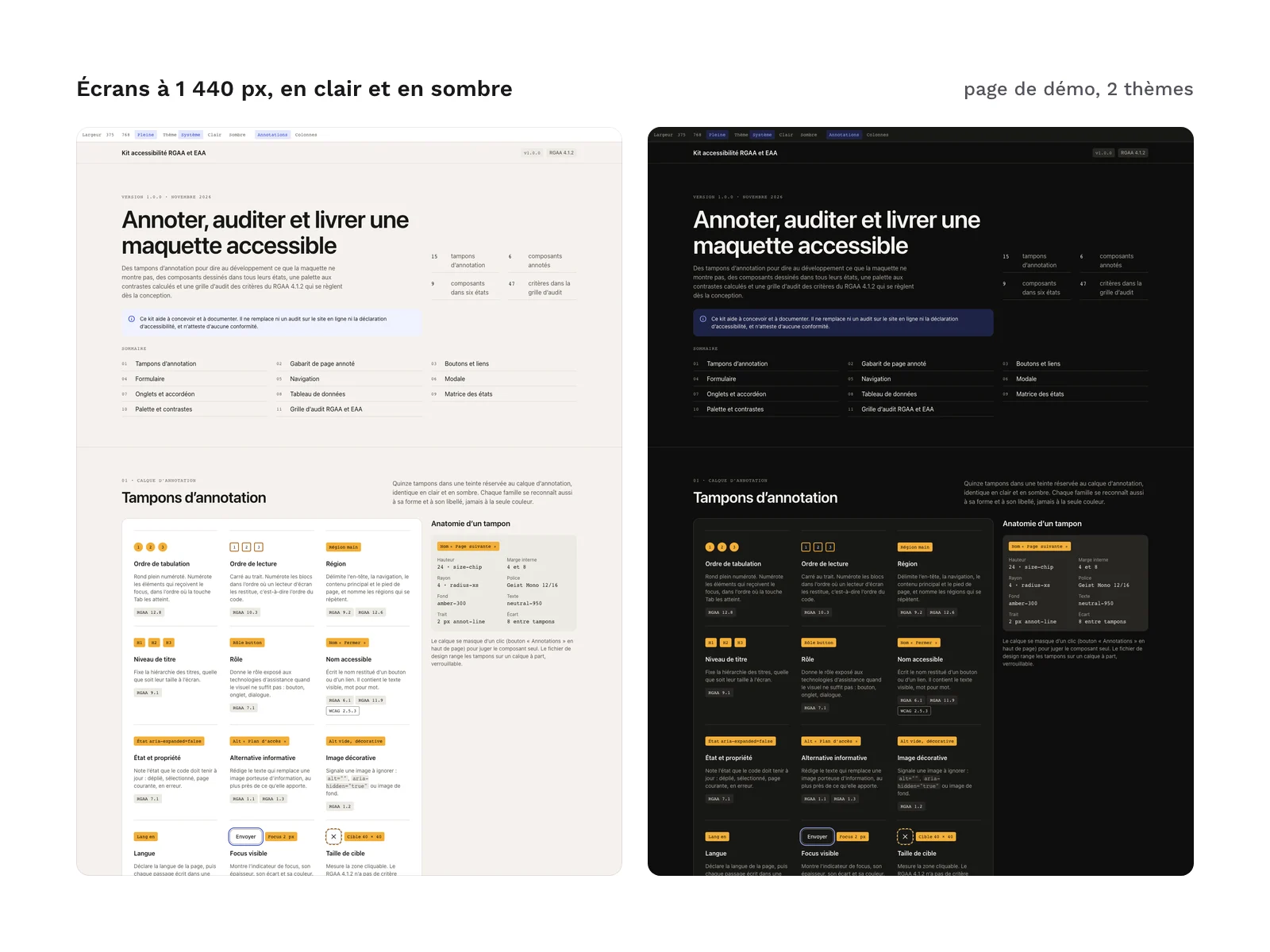
- 15 annotation stamps: tab order, reading order, region, heading level, role, accessible name, state and property, informative alternative, decorative image, language, visible focus, target size, contrast, status message and note reference. They use an amber hue reserved for the annotation layer, identical in light and dark, and each family is also recognisable by its shape and label, never by colour alone. The legend gives the RGAA criterion each stamp relates to.
- 6 annotated components: buttons and links, form, navigation, dialog, tabs and accordion, data table. A toggle hides every stamp so you can judge a component on its own.
- A state matrix: 9 components (primary, secondary and destructive button, icon button, navigation link, text field, checkbox, radio button, tab) in 6 states (default, hover, keyboard focus, active or selected, disabled, error or pending), 54 variants in all. Each cell names the attribute or pseudo-class that carries the state in the code.
- A palette and its contrast ratios, computed in each of the 2 themes.
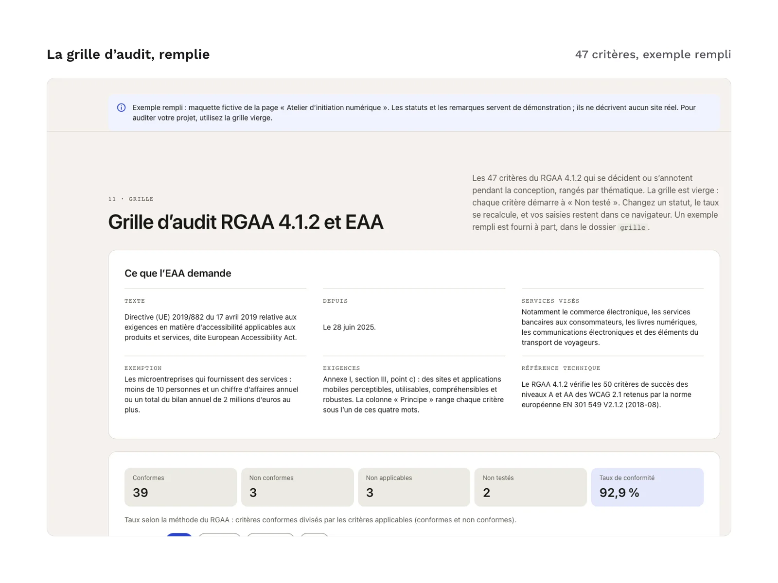
- An audit grid of 47 criteria in 11 themes: images, colours, tables, links, scripts, mandatory elements, information structure, presentation of information, forms, navigation and consultation. These are the RGAA 4.1.2 criteria that are decided or annotated at design time, with their official wording. Each criterion sits under one of the principles (perceivable, operable, understandable, robust). The grid comes blank and as a filled example on a fictional design.
- An EAA panel next to the grid: the reference text, Directive (EU) 2019/882, its application date, the services covered, the micro-enterprise exemption, the requirements of Annex I, Section III, point (c), and the technical reference: RGAA 4.1.2 checks the level A and AA success criteria of WCAG 2.1 adopted by the European standard EN 301 549 V2.1.2 (2018-08).
- 2 themes, light and dark.
- 3 HTML pages: the demo, which gathers the 11 sections, and the blank and filled audit grids. The demo’s top bar sets the width, the theme and two layers: annotations and the column grid.
- 11 Astro sections and 3 supporting components (page frame, icon sprite and behaviours), with a
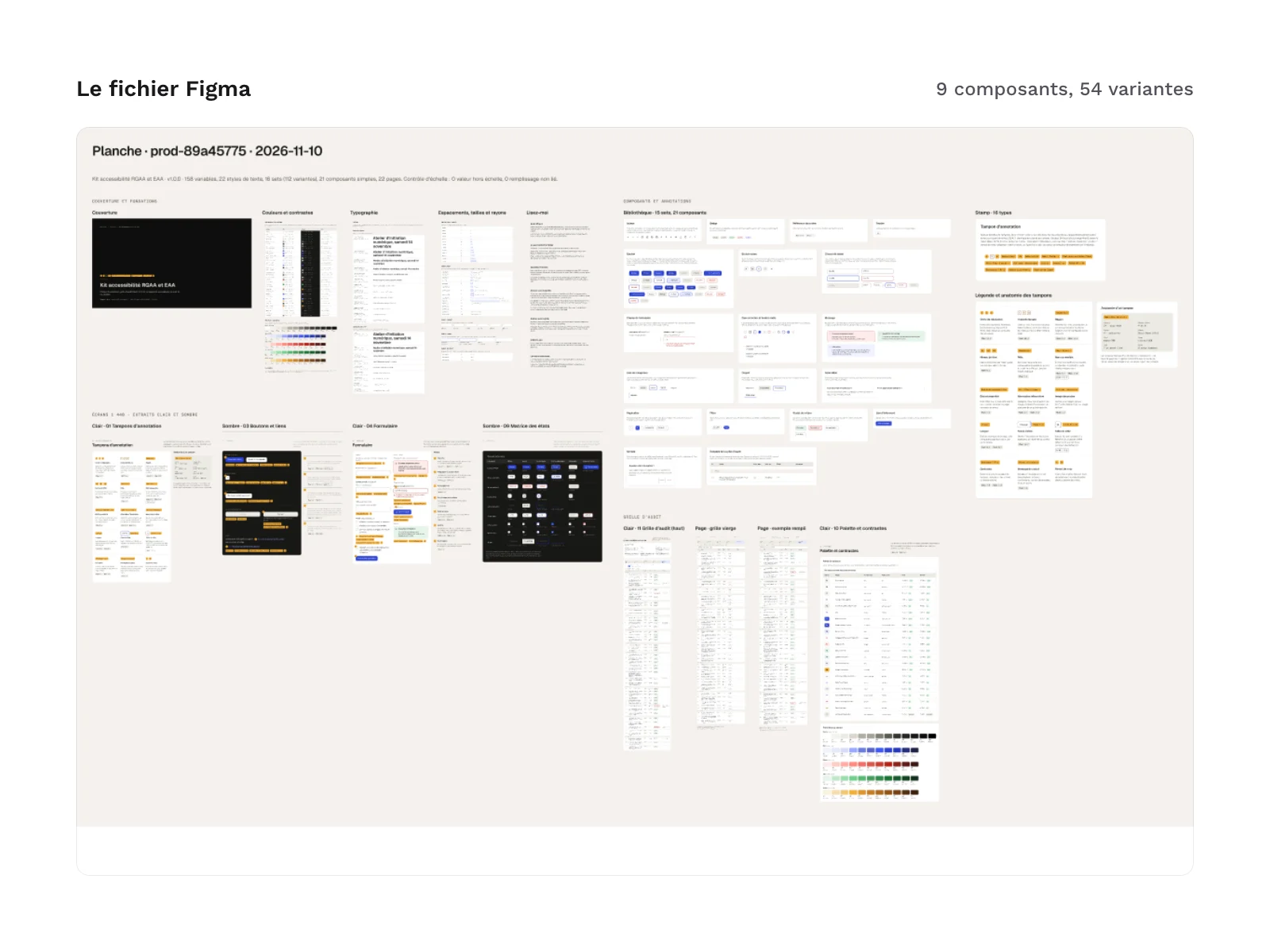
LISEZMOI-astro.txtfile (in French) that explains the setup. - A file for Figma: the same tokens as variables in light and dark modes, components in every state, the 15 stamps plus a free stamp (“Other”) for a note that fits no family, the audit grid, the filled example and sample screens in light and dark.
Kit files:
GUIDE.txt
html/index.html
html/sections/   (11 sections and the icon sprite)
html/css/tokens.css
html/css/kit.css
html/js/kit.js
tailwind/theme.css
astro/           (11 sections, KitPage.astro, IconSprite.astro, KitBehavior.astro, LISEZMOI-astro.txt)
grille/          (audit-grid-blank and audit-grid-example, in HTML and CSV)
figma/rgaa-accessibility-kit-1.0.0.fig
Production and AI
The kit’s code (HTML sections, Astro components, Tailwind theme), its texts, the audit grid and the file for Figma were produced with an AI assistant, then reviewed and checked: no axe-core error on the demo in light or dark, contrast checked on 24 pairs in each theme, spacing on the 4 px scale, and regulatory references reviewed in the demo, the sections, the Astro components and the grids. The kit contains no AI-generated image.
Formats and compatibility
- HTML and compiled CSS, no CDN:
html/index.htmland the grids open in a browser, with no install and no build step. The files inhtml/sections/are fragments to copy into your page; the comment at the top of each file lists what it needs (tokens.css,kit.css, the icon sprite andkit.js, which carries the behaviours: menu, tabs, sorting, form, contrast, grid). - CSS custom properties, light and dark:
html/css/tokens.cssholds colours, spacing, radii, sizes and text styles as CSS variables. - Tailwind CSS v4 (theme):
tailwind/theme.cssuses the same names and values astokens.cssand replaces the default scales: a value missing from the scale produces nothing. - Astro components with typed props (TypeScript): tested with Astro 7.4, with no dependency other than Astro. The required Node version and the steps are in
LISEZMOI-astro.txt. - Audit grid in HTML and CSV (UTF-8): the HTML page keeps your statuses in the browser and recalculates the rate with the RGAA method (compliant criteria divided by applicable criteria). The CSV, UTF-8 with BOM and semicolon-separated, opens directly in a spreadsheet set to French; columns: theme, number, criterion, principle, status, note (headers in French).
- .fig file (
figma/rgaa-accessibility-kit-1.0.0.fig): a file compatible with Figma, to import with File, Import. - Fonts: Geist and Geist Mono, under the SIL OFL 1.1 licence, are loaded by a link and not included in the kit. You can also host them yourself.
What was checked on the demo: no accessibility error reported by axe-core in light or dark, contrast of 24 colour pairs in each theme, spacing on a 4 px scale, and no horizontal page scroll at 375, 768 and 1,440 px wide (only the tabs and the tables scroll, inside their own container).
Good to know before you buy:
- The kit is entirely in French: demo texts, stamps, criterion wording and grid.
- The grid gathers the criteria settled at design time, not the whole RGAA: the others are checked on the live site, through an audit.
- The file for Figma shows the screens at 1,440 px only, in light and dark: the 375 and 768 px widths are covered by the code. The dialog is static there; the interactions (focus, Escape key, sorting, filtering, recalculated rate) only exist in the code.
- The text of disabled components stays below the contrast threshold, as the rules allow for an inactive component; the palette and contrast section documents it.
License
The kit is sold under the commercial license (terms in French): you may use the stamps, components, grid and file in your personal and professional projects, including for clients, but you may not resell or redistribute the kit’s files, even modified, as a kit or as a template.
Further reading
Version history
1.0.0 (10 November 2026): first version.