Preview 1 of 4
Native Scope Kit for Shopware 6 (Storefront)
A 127-feature sourced scope matrix, labelled screens, a child theme and a guide, to price a store on Shopware 6 before design, plan by plan. In French.
Overview
Description
This kit is for designers, freelancers and agencies who design a store on Shopware 6 with the Storefront theme, and who need to price it before they design it. It answers one question, block by block: is what you are drawing native, configurable in the admin, tied to a paid plan, or custom development? Every block on the screens carries a label that points to a row of the matrix, and every row cites the official documentation page or the published file it rests on. You show your client designs the platform and its theme can deliver, and you price separately whatever needs a paid plan, a payment extension or development.
The kit is written in French. The scoping guide is in French only, as are the matrix and the screen labels; documentation excerpts stay in their original language, and admin paths follow the English admin interface, as the official documentation writes them. No English version of the guide is included.
The kit draws the store with the Storefront, the default theme: its Twig templates render the storefront pages and its styles are built on Bootstrap. A row caught at scoping is priced before the design rather than at handover: a quick view or an advanced search that needs a paid plan, a one-page checkout the Storefront does not ship, a filter that is neither a property nor a built-in filter, online payment that goes through an extension, a spacing and radius scale the admin cannot set.
Official sources checked on 11 November 2026, for Shopware 6.7.16.0 Community Edition and the Storefront theme of the same version, built on Bootstrap 5.3.8, on a fresh install. The kit helps you scope and design: it is not legal advice, an audit of your store or a guarantee of completeness.
Specifications
| Matrix | 127 rows |
|---|---|
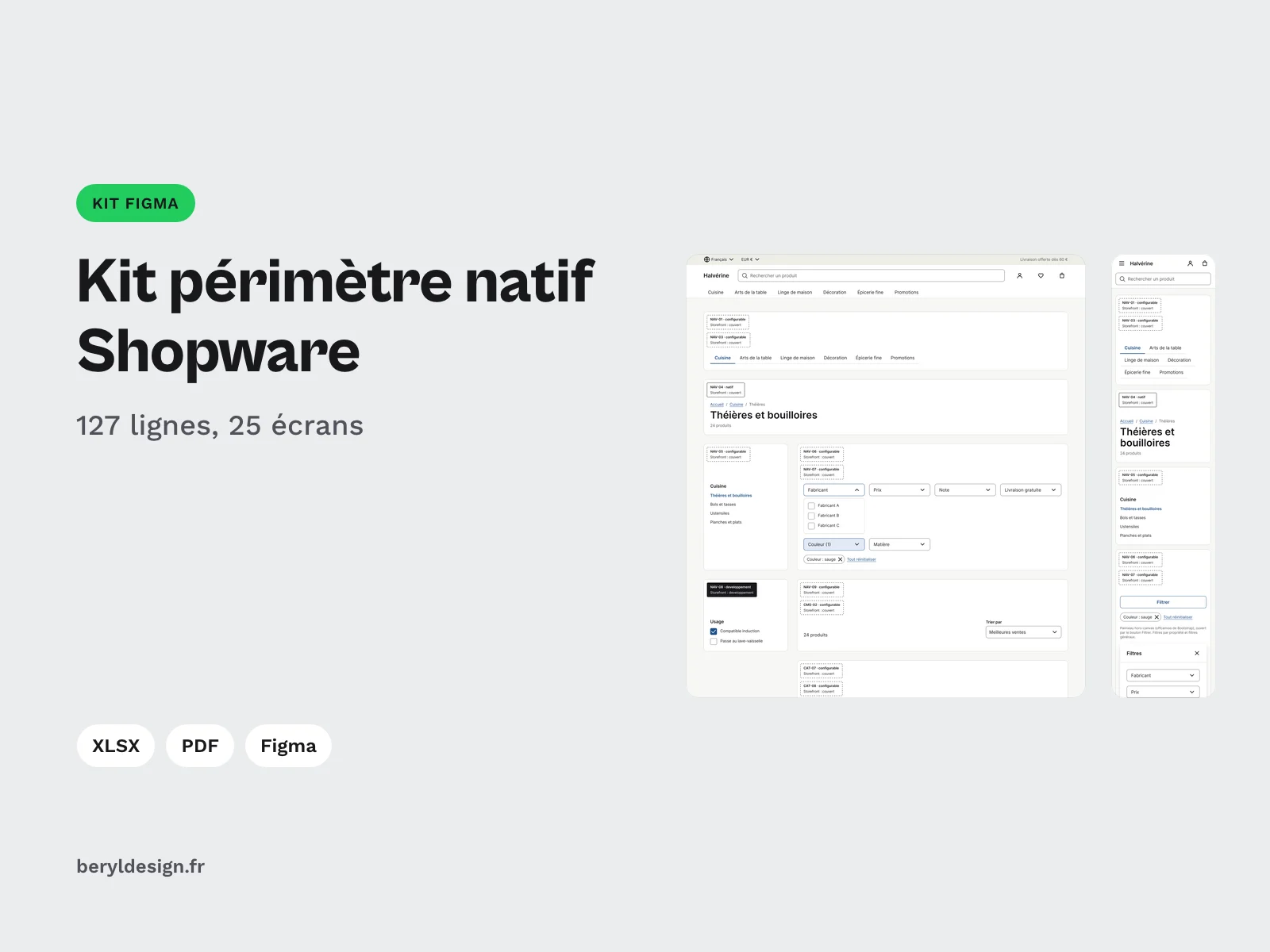
| Screens | 25, 22 of them in desktop and mobile, plus 3 emails |
| Tokens | 64 |
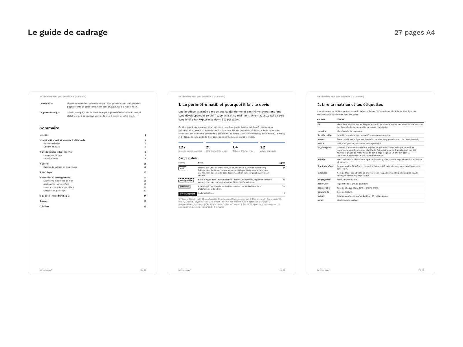
| Scoping guide | 27 pages |
| Handoff checklist | 20 items |
| Formats | XLSX, UTF-8 CSV, tagged A4 PDF, Markdown, DTCG JSON, DTCG 2025.10 JSON, child theme theme.json, SCSS, CSS |
| License | commercial (page in French) |
| Version | 1.0.0 of November 11, 2026 |
Contents
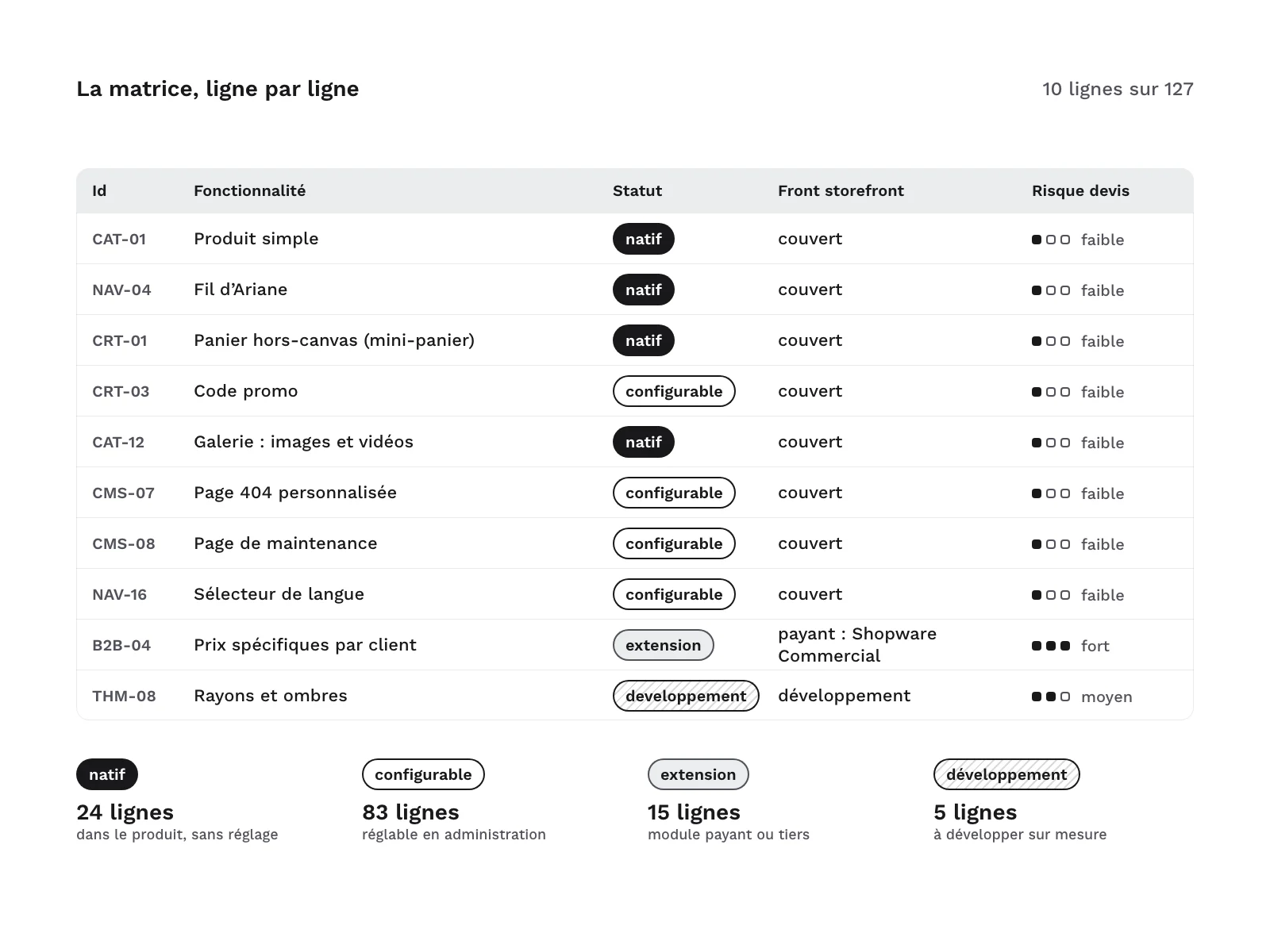
A 127-row matrix, one row per feature, grouped by area: catalog, navigation and search, product page, cart, checkout, account, content, emails, international, theme and B2B sales. These columns drive the quote:
| Column | Split of the 127 rows |
|---|---|
| Status | 24 native, 83 configurable with the path in the admin or the Shopping Experiences, 15 extension (a paid plan to subscribe to or an extension to install), 5 development |
| Minimum plan | 113 in the Community Edition, 4 with the Rise plan, 8 with the Evolve plan, 2 with the Beyond plan |
| Storefront front end | 101 rendered by the platform and the Storefront, 1 by an extension shipped with the platform, 14 by the Shopware Commercial extension with the named plan, 5 to develop, 6 with no storefront rendering (admin, email, configuration) |
| Quote risk | 107 low, 9 medium, 11 high |
What each plan unlocks. Shopware 6 comes as the Community Edition, free and under the MIT license, and as paid plans, Rise, Evolve and Beyond, which add features through the Shopware Commercial extension. Each plan includes the features of the one before, and the matrix’s edition column gives the minimum plan that unlocks each row:
| Edition or plan | What it adds in the matrix | Rows |
|---|---|---|
| Community Edition | Everything the matrix rates native, configurable or development, including the business account (private or company customer, VAT number, customer group), and online payment through the vendor’s payment extension, shipped with the platform but to be installed | 113 |
| Rise | Customer-defined product options, return status in the account, AI-generated order confirmation message, 3D block placed in a Shopping Experiences page | 4 |
| Evolve | Quick view from the listing, advanced search, bundles, custom forms, content targeted by rule or restricted to a customer group, and B2B features (employees and roles, quotes from the cart, quick order, order approval) | 8 |
| Beyond | Subscriptions, customer-specific prices | 2 |
The guide and the Extensions sheet give the price of the Rise and Evolve plans as read on 11 November 2026 on the vendor’s pricing page, the kit’s only price source; the Beyond plan is priced on request. Check these prices again on the date of your quote.
- High risk: the 11 rows where the quote changes in nature, namely the Evolve and Beyond plan features, and a listing filter that is neither a property nor a built-in filter, drawn but to be developed. The 9 medium-risk rows are priced separately without changing the nature of the project: the Rise plan, the vendor’s payment extension and setting up the kit’s scale through the child theme.
- Sources: each row cites its official page, the date it was read and a short excerpt in the original language, 25 words at most, 86 source URLs in all, 33 of them published files of the platform. The spreadsheet has 5 sheets: How to use, Matrix, Screens, Extensions (the 5 extensions cited, with their terms and the plan price when the extension comes with a plan) and Sources.
- A design file for Figma: 22 screens in desktop and mobile, and 3 emails (order confirmation, registration confirmation, password reset).
- Screens: home, category listing with filters, search results and suggestions, product page, product page with variants, cart drawer, cart, checkout: address (sign-in, registration or guest checkout) then confirmation, order complete, sign-in and registration, forgotten password, account overview, orders, edit an order (payment, cancellation), addresses, profile, wish list, content page, contact, not-found page, withdrawal request.
- Labels: 98 matrix rows are drawn, in 88 blocks per screen set and 288 labels in all (141 on desktop, 141 on mobile, 6 in the emails). Each block carries a two-line label: the ID and the status, then « Storefront : » followed by the front-end value, which names the plan when one is needed. Everything is spelled out, and the outline repeats the status. The labels sit on an annotations layer you can hide.
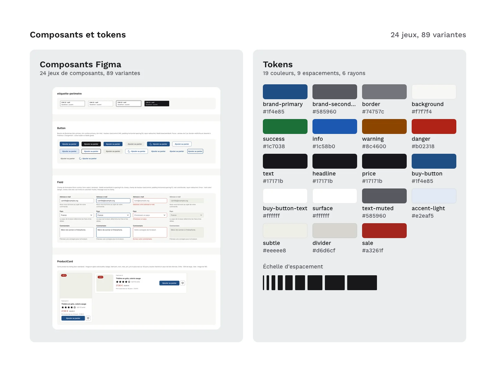
- Foundations and components: 62 variables, 13 text styles, 2 effect styles, 24 component sets with 89 variants (scope label, buttons, fields, checkboxes and radio buttons, swatches, quantity, badges, price, ratings, breadcrumb, pagination, tabs, accordion, messages, checkout steps, active filter, facets, product card, cart line, order summary, header, footer, drawers, modal) and 37 icons. No logos: payment methods are written as text labels.
- 64 tokens: 19 colors, 9 spacings, 6 radii, 9 text steps each with a size token and a line-height token, 2 font families, 2 font weights, 4 sizes, 2 border widths and 2 shadows. They are identical in the design file (62 variables and 2 effect styles), both token files,
theme/theme.jsonandtheme/theme.css. Spacings, radii, sizes, line heights and shadow offsets are multiples of 4 px. - A Storefront child theme, in the
theme/folder:theme/theme.jsonsets one field per token, 64 fields in all: the 15 color and font fields the Storefront makes configurable, with the kit’s values, and 49 fields added by the kit. It inherits the Storefront’s configuration.overrides.scssoverrides 63 Bootstrap and Storefront variables, read before they compile, andbase.scsssets the kit’s CSS properties and heading line heights after them.theme/theme.cssis the kit’s share of the compiled CSS, for checking.theme/ecarts-config-defaut.mdlists the 15 differences between the child theme and the Storefront’s default configuration, each with its reason, where to set it and the action to decide at handover, then the 18 Storefront values and the 15 Bootstrap values that fall off the 4 px grid.
- A 27-page scoping guide, in French: native scope and the versions checked, editions and plans, reading the matrix and the labels, the 8 questions to ask the client before designing, a step-by-step scoping workshop, 12 pitfalls where a plausible design leaves native scope without saying so, handover to development, applying the child theme and its differences, the 21 features the kit does not settle (15 with no official page, 4 outside its scope, 2 with no storefront screen), and 31 sources.
- A 20-point handover checklist, in the guide and as a text file to paste into a ticket.
Files in the kit:
LICENCE.txt,LISEZMOI.txt,CREDITS.txtfigma/native-scope-kit-for-shopware-1.0.0.figguide/guide-cadrage.pdf,guide/checklist-passation.mdmatrice/perimetre-natif.xlsx,matrice/perimetre-natif.csvtokens/tokens.json,tokens/tokens.2025-10.jsontheme/theme.json,theme/theme.css,theme/ecarts-config-defaut.mdtheme/app/storefront/src/scss/overrides.scss,theme/app/storefront/src/scss/base.scss
Formats and compatibility
- Matrix in XLSX and UTF-8 CSV, with the same IDs: the spreadsheet has drop-down lists and a frozen header, and filters by plan, by screen, by status or by risk; the CSV imports into any spreadsheet or tracking tool. Admin paths follow the English admin interface, as the official documentation writes them.
- Guide as a tagged A4 PDF, in French, and the checklist in Markdown.
- Tokens in DTCG JSON in the pre-2025.10 format, with string values (
tokens/tokens.json), and the same tokens in DTCG 2025.10 format for other tools (tokens/tokens.2025-10.json). - Child theme:
theme/theme.jsonwas validated against a schema taken from the Shopware 6.7.16.0 code, and the SCSS compiled with the Storefront files at the same tag and Bootstrap 5.3.8, in a test project, where the 64 tokens were read back at render. Thetheme/folder is copied into thesrc/Resources/folder of a theme extension. It has not been installed in a live store. - Platform and theme code: the kit contains no file from Shopware, the Storefront or Bootstrap, and no Twig template. Its child theme reuses the names of the Storefront’s configuration fields and SCSS variables, so the configuration plugs in, with the kit’s own values; 3 common values match the default configuration, and the guide declares them. The Storefront’s values are quoted, for comparison only, in
theme/ecarts-config-defaut.mdand in the matrix. - .fig file: a Figma-compatible file, to import into your workspace. Desktop screens at 1,440 px, mobile at 375 px, emails at 600 px.
- Fonts: Inter (SIL OFL 1.1), the Storefront’s default font, is referenced by the tokens and the font fields, with no font file: the project loads it. The guide is set in Work Sans (SIL OFL 1.1), embedded in the PDF.
- Versions checked: Shopware 6.7.16.0 (tag v6.7.16.0), the Storefront theme of the same version, Bootstrap 5.3.8 and Twig ^3.29, on a fresh Community Edition install; official documentation read on 11 November 2026, each matrix row carrying its reading date.
Good to know
- The checkout chains an Address page and a confirmation page: the first for sign-in, registration or guest checkout, the second gathering addresses, shipping, payment, items and total. A single-page checkout, sign-in included, is priced as development.
- Blocks tied to a paid plan are drawn, with the extension label and the plan on the second line: without that plan, remove them from the design before quoting. The Evolve plan’s B2B features and the Beyond plan’s customer-specific prices are not drawn.
- The listing filters by properties and by the built-in general filters (manufacturer, price, rating, free shipping). Any other filter is developed, and the kit draws one with that label.
- Online payment goes through an extension: the platform ships cash on delivery, invoice, prepayment and direct debit; online payment goes through the vendor’s payment extension, shipped with the platform but to be installed, or through another provider’s extension. The kit quotes no provider fees: check them on the date of your quote.
- The admin sets no sizes, spacings, radii or shadows: only colors and fonts. That is why the kit ships a child theme, whose setup is priced.
- The Storefront ships in German and English: French comes from the community translations, updated from the admin.
- The Storefront has no visitor-selectable dark mode, and the kit draws none. The vendor’s premium themes are deprecated, according to the vendor: the kit starts from the Storefront.
- Store, people and product names on the screens are fictitious.
- The PDF is tagged, but its PDF/UA conformance has not been measured.
- The kit is not a complete theme and contains no extension: it is for scoping, designing and handing over to development.
- The matrix names a few extensions and providers, for reference only.
- The guide, the matrix and the labels are in French; there is no English guide.
- Updates: free for buyers, released as the platform evolves, with no guaranteed schedule. Shopware 6.8 has been announced: when it ships, the matrix, labels, child theme and guide will be checked again, and any status, source or setting that changes goes into the kit’s updates. They do not cover the features left out of the matrix, which the guide lists separately.
License
The kit is sold under the commercial license (terms in French), as a one-off payment: you may use it in your personal and professional projects, including for clients, but you may not resell or redistribute its files, even modified, as a kit or as a template. You may ship the child theme (theme/theme.json and theme/app/storefront/src/scss/) inside a client project’s theme extension: that is use in an end product, which the license allows; only redistributing it as a reusable asset is excluded.
Further reading
Version history
1.0.0 (11 November 2026): first version.
Notices
Shopware is a trademark of shopware AG. Community Edition, Rise, Evolve, Beyond, Shopware Commercial and Storefront refer to products of shopware AG, cited to state compatibility and scope. Other product, service and provider names belong to their respective owners and are cited only to describe compatibility. Independent kit, not affiliated with, endorsed or sponsored by shopware AG.
The names of the platform and the theme are used only to state compatibility and scope; the demo content of the design file uses an invented brand. No logos, no screenshots of a real store or of the theme, no imitated interface: the screens are redrawn from the documented page structure.
AI disclosure: the matrix, guide text, tokens, child theme (theme.json and SCSS), check scripts and the build of the design file were produced with an AI assistant (Claude Code, Anthropic), then checked by scripts and review. Official sources checked on 11 November 2026: every matrix row cites the source it rests on. The kit contains no AI-generated images.