Introduction
In Dynasty Nova, the tech tree is the heart of the game: it unlocks buildings, ships and defenses. But a poorly organized tech tree quickly becomes an unreadable wall of text. Here's how I rethought it around categories, and why that choice matters more than it looks.
The problem with a flat-list tech tree
TOO MANY CHOICES, NOT ENOUGH LANDMARKS
OGame-inspired management games often list thirty-odd technologies in a row, with no visual hierarchy. Players have to scan everything to find the research they care about, which slows down decisions and discourages exploration.
A COGNITIVE LOAD THAT DISCOURAGES BEGINNERS
Faced with a thirty-line list, a new player doesn't know where to start. They end up following an external guide instead of exploring the interface itself — a sign the design isn't doing its job of guiding them.
Grouping by intent rather than alphabetical order
CATEGORIES THAT MATCH A PLAYER'S QUESTION
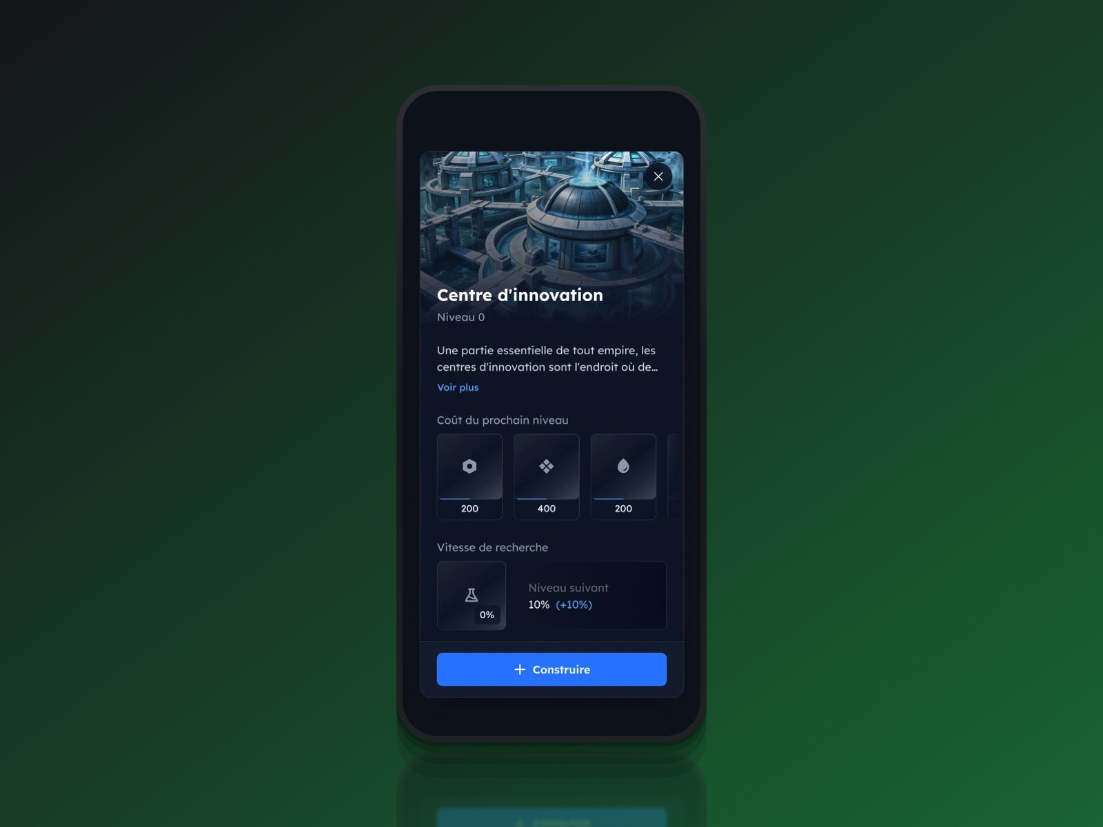
In Dynasty Nova, every research item belongs to a domain: energy sciences, propulsion, offensive systems, protection fields, computing and intelligence. These categories don't follow an abstract technical ranking; they answer a concrete question the player is asking, like "how do I defend myself" or "how do I move faster".
A CATEGORY NAME ALREADY DOES HALF THE SORTING
Before even opening a category, its name already filters the information. A player who wants to reinforce their fleet goes straight to "propulsion" or "offensive systems", without reading research from a domain that doesn't matter right now.
The other screens follow the same logic
BUILDINGS AND INSTALLATIONS: SAME PRINCIPLE, SAME BENEFIT
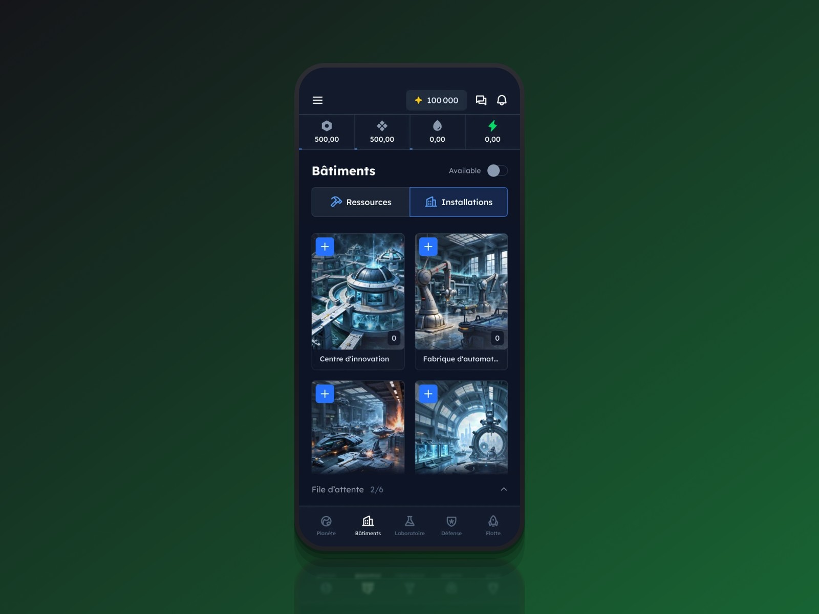
This categorization logic doesn't stop at the lab. Buildings are split into "Resources" and "Installations", and the fleet into "Ships" and "Fleet". Players find the same reflex everywhere: one tab, one intent, one subset of options.
DON'T OVER-SPLIT EITHER
The opposite trap exists too: creating one category per technology just recreates a flat list with an extra step. I capped the number of categories at what a player can remember effortlessly, usually four to six per screen.
What it actually changes for the player
A player opening Dynasty Nova's lab for the first time sees categories first, not thirty lines of text. They pick a domain matching their current goal, and only then read the detail of available research. Categorization doesn't hide information, it orders it the way the player actually needs it.
Conclusion
Reorganizing a tech tree into categories looks like a minor decision. It's actually a choice that determines whether a new player stays on the interface or goes looking for a guide elsewhere. In a management game, where strategic depth rests on dozens of options, structuring information matters as much as designing it.
FURTHER READING
Play Dynasty Nova
Dynasty Nova: Creating a Mobile-First UI Inspired by Best Practices
Gestalt Theory in UX Design: Principles, Applications and Limits
OGame Mobile: A Sacrificed UX? A Critical Look at a Nostalgic Interface