Introduction
A CLASSIC REVISITED IN THE MOBILE ERA
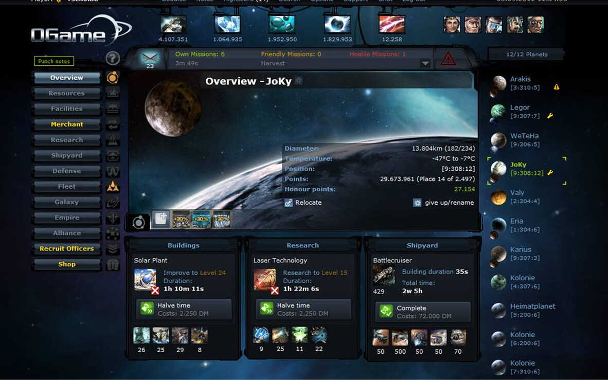
For many, OGame conjures up vivid memories: the thrill of exploring new solar systems, the tension of space battles, and the long-term investment in developing your planets. The original desktop version, despite its minimalist aesthetic, offered a clear interface that made it easy to dive into the game.
Players particularly appreciated the gradual learning curve, which allowed them to progressively master the game's complex concepts (resources, technologies, fleets) while keeping an accessible interface. This educational approach, combined with an active and welcoming community, helped create a unique gaming experience that has stood the test of time.
Context
THE MOBILE SHIFT, A RISKY BET
With the rise of mobile gaming, it made sense for OGame to launch its own mobile version rather than lose part of its community. But porting an interface designed for a large desktop screen down to a small touchscreen is never just a matter of resizing: every element needs to be rethought to stay readable and usable with your thumb.
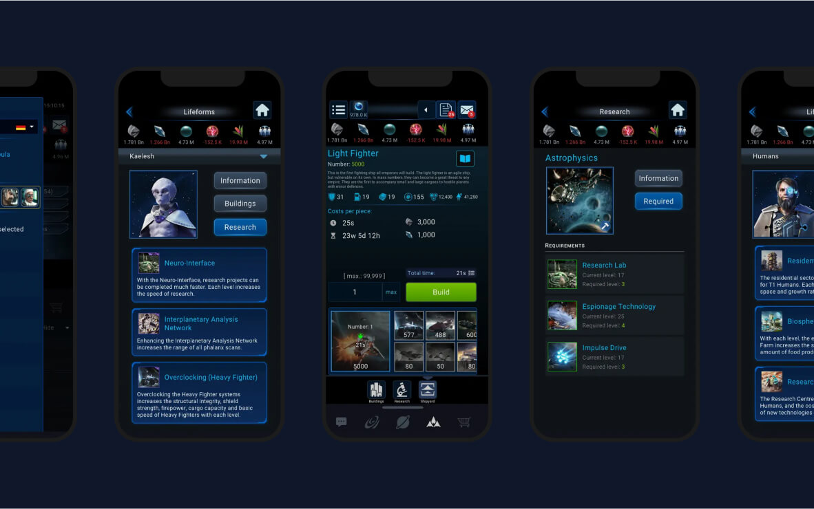
That's exactly where OGame's mobile port falls short. Instead of an interface rethought for touch, it feels like the desktop layout was simply squeezed to fit a smaller screen, without a real redesign of the experience. The sections below break down the main friction points we identified.
Sacrificed ergonomics
CRAMPED INTERFACES
OGame's mobile interface gives an overall impression of being choked: cramped menus, hard-to-read text, buttons too close together. This density hurts readability and hinders smooth interactions. Players often have to zoom in to read certain text or reach buttons, which breaks the flow of the game. On top of that, the lack of adaptation to different screen sizes (iPhone, Android, tablets) creates an inconsistent experience depending on the device used. This "one-size-fits-all" approach demonstrates a lack of consideration for the diversity of mobile users.
DEGRADED VISUALS
The graphic adaptation failed to take advantage of the specifics of mobile. The result: images that are sometimes blurry, stretched, or poorly fitted, which breaks the immersion and reinforces the feeling of a botched port. The animations, which were smooth on desktop, are choppy on mobile, creating a sense of slowness and obsolescence. This visual degradation is particularly glaring during space battles, where graphic precision is crucial to the player's strategy.
The genesis of the project
FROM AN OBSERVATION TO AN AMBITION
Faced with this disappointment, Dynasty Nova was born from a desire: to reinvent this galactic experience, not by copying it, but by modernizing it and truly adapting it to mobile usage. The development team spent several months analyzing the behavior of mobile players, studying UX best practices for strategy games, and experimenting with different interface approaches. This in-depth research phase made it possible to define an ambitious set of specifications, combining technical performance, user intuitiveness, and modern aesthetics.
Technical and aesthetic choices
A ROBUST DESIGN SYSTEM
The project is built on a design system built in Figma, with unified icons via the Phosphor library, ensuring consistency and clarity throughout the user experience. Each component was designed to be responsive and adaptable, allowing for a smooth experience on all screens. The use of CSS variables and reusable components makes maintenance and design evolution easier, while guaranteeing perfect visual consistency.
HIGH-PERFORMANCE TECHNOLOGIES
Tailwind CSS was chosen for its speed of implementation and its flexibility. Assets are optimized thanks to AI tools (Upscayl, Krea, Freepik), ensuring solid performance even on mobile. The code architecture is based on React, delivering a responsive and smooth user experience. Data is managed via a RESTful API, ensuring fast and reliable synchronization of game data.
Conclusion
Dynasty Nova is the result of a twofold requirement: that of a user frustrated by a disappointing mobile experience, and that of a designer convinced that UX must remain at the heart of every digital project. Rather than giving in to the ease of a simple remake, Dynasty Nova takes a clear stance: revisiting a classic to better transcend it.
By drawing on the latest web technologies and UX best practices, the project aims to offer a strategic gaming experience that respects the essence of OGame while adapting perfectly to modern mobile usage. With its innovative approach and its attention to detail, Dynasty Nova could well redefine the standards of mobile strategy games for years to come.
USEFUL LINKS
Play Dynasty Nova
About OGame
Phosphor Icons
Tailwind CSS