
Introduction: what the first three screens actually show
I'm building Dynasty Nova, a browser-based space management game. This isn't an outside teardown — it's a first-hand account of our own choices, with real screenshots of what a player sees before placing a single building.
We've written elsewhere about our tech tree redesign and our Pay-to-Fast monetization. Here, we go back even earlier: the first three minutes, before the player has made a single real gameplay decision. In this genre, onboarding remains the first criterion that separates a well-made game from one that loses players. It's the one we chose to prioritize.
Minute 0: choosing a universe, not just a server
The first screen doesn't ask for a username or a password. It asks the player to pick a universe from a list (Pegasus, Orion, Quantum, Vega…), each one showing its player count and match duration.
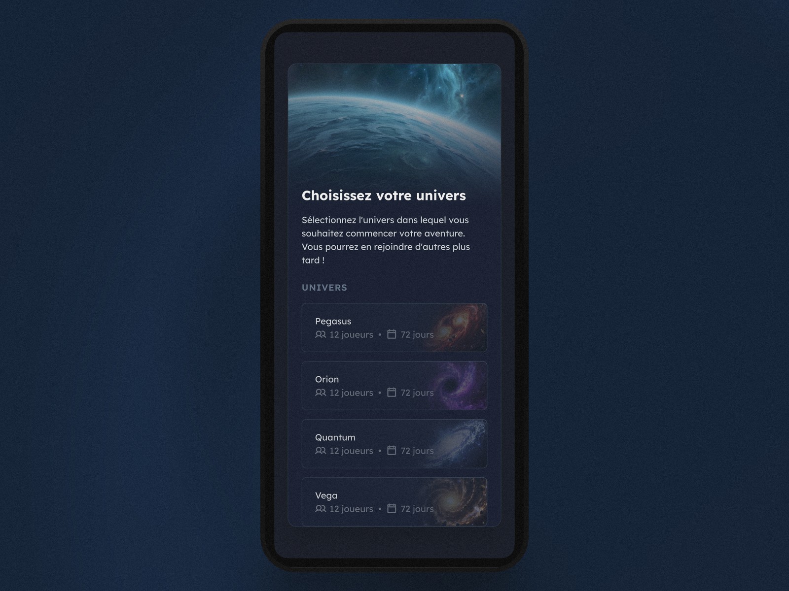
A choice with real consequences, shown before you make it
On Forge of Empires, this same server choice exists but stays under-explained: the player only discovers afterward that server age changes everything. We wanted the opposite — every universe card shows upfront what actually matters for the decision, not just a catchy name.
Each universe also has its own visual identity — an amber nebula for Pegasus, a purple black hole for Orion, a frozen galaxy for Quantum. It's not decoration for its own sake. It helps a new player tell apart, at a glance, options that on other games in the genre boil down to a list of interchangeable server names.
Minute 1: the universe sheet, full disclosure before committing
Tapping a universe brings up a detailed sheet before the player can even tap "Start the adventure." Three numbers structure the screen: player count, match duration, and a speed multiplier (economy, research).
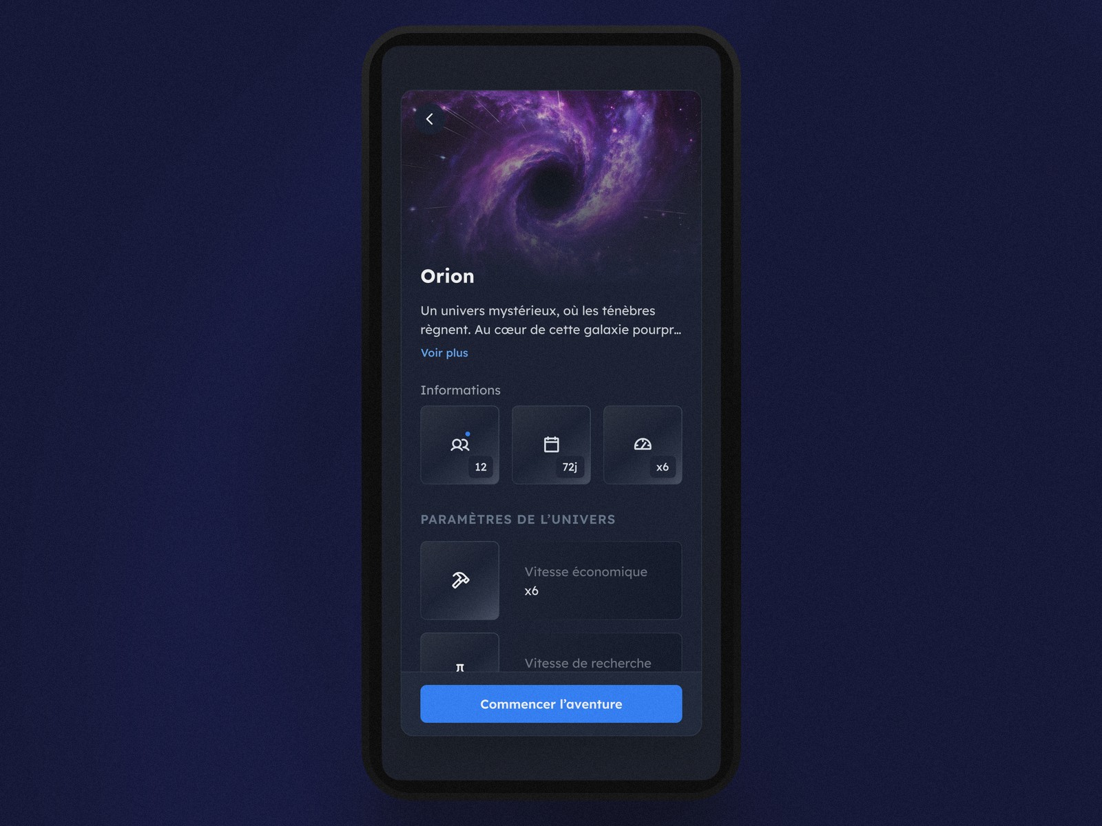
The speed multiplier, a number we refuse to hide
This multiplier sets the whole pace of a match — a player with two hours a day doesn't want the same universe as one who logs in once a week. Many PBBGs treat this setting as a technical detail buried in a submenu. We deliberately made it the most visible piece of information on the decision screen.
The sheet also shows a short flavor text ("See more") to give the universe an identity rather than just a table of numbers. The balance we're after is precise: enough atmosphere to create desire, enough data to decide without guessing wrong. Two universes with the same speed but different flavor text don't tell the same story.
Minute 2: landing on your first planet
Once the universe is confirmed, the player lands directly on their starting planet — no loading screen, no cutscene. Resources and the bottom navigation (Overview, Buildings, Research, Defense, Fleet) are already visible from the very first second.
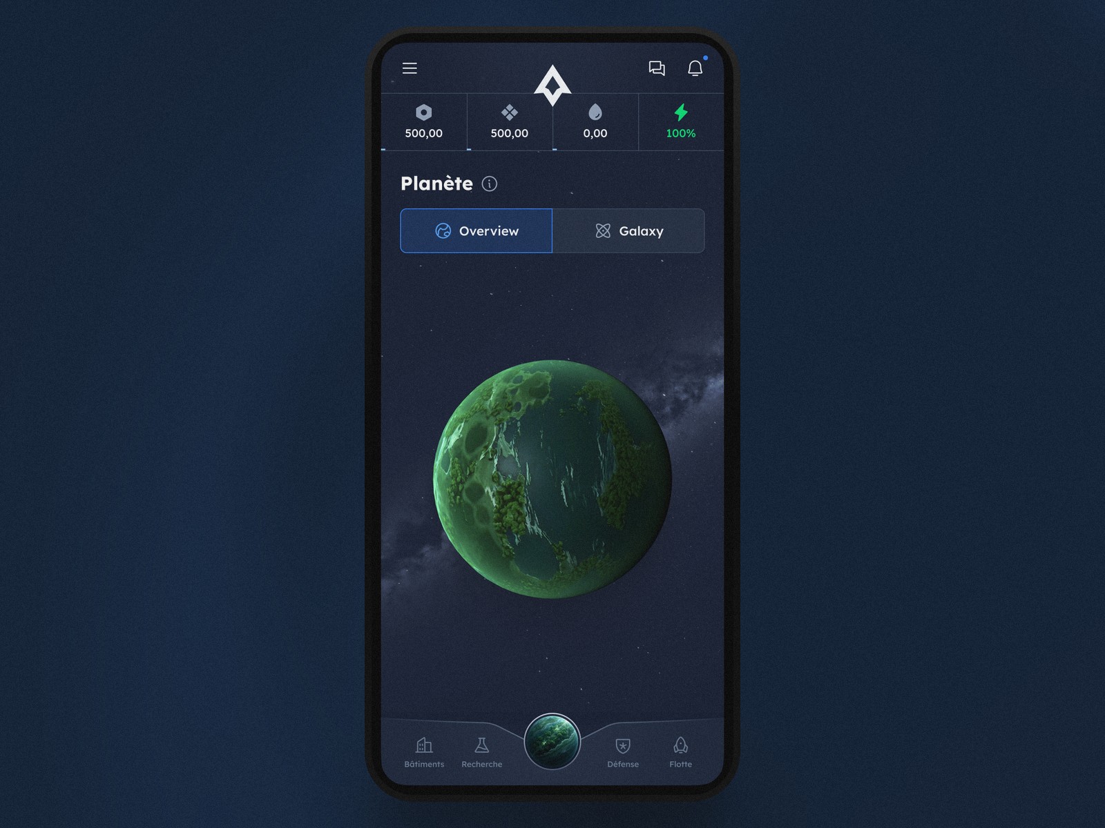
Showing the whole map of the game from second one
The bet is simple: rather than unlocking tabs one by one through a tutorial, we show upfront where every system lives (buildings, research, defense, fleet). A player who explores out of curiosity — instead of following a blinking arrow — understands the game's full structure faster.
One available action, not ten
On this first planet, only one building is actually available on the very first click. The player doesn't choose between ten unlockable buildings: they see the one that makes sense at that exact moment. It's a deliberate design decision: delay advanced options rather than cram them all onto the first screen. Even if that means feeling "thin" to players comparing it, at first glance, to an older, denser game.
Why not a classic step-by-step tutorial
Most PBBGs impose a series of guided steps before letting the player loose. We documented this exact problem on Forge of Empires: the tutorial teaches the basics, then abandons the player right when real strategy begins. A gap entire YouTube channels have sprung up to fill.
We chose the opposite: less explanatory text, more information shown directly on decision screens (speed, duration, population, universe identity). The bet isn't perfect yet — some very new players still ask for more guidance, and we keep adjusting that dial with every wave of feedback. But it avoids the genre's main trap: a tutorial that reassures in the moment without really preparing you for what comes next.
What we still can't measure
We don't yet have enough statistical hindsight to claim this choice improves one-month retention. It's a design hypothesis, not a result validated by months of data. What we can say is that the number of support questions about "how do I start" has dropped noticeably since we put these three screens in place.
Conclusion: three screens, three honest decisions
Dynasty Nova's first three minutes aren't there to impress — they're there to inform: which universe, at what pace, on what map. Three screens, three numbers to understand, and no hidden surprise waiting in a menu you discover three weeks later.
It's a bet we keep adjusting with every player's feedback. But it's exactly the kind of decision we'd rather make upfront, instead of fixing it after the fact like so many games in the genre have had to.
The next stretch we want to document here is minute 10: the moment the first building finishes construction, and the player comes back — or doesn't.