Introduction: a game that changed its face the day before launch
I'm building Dynasty Nova, a browser-based space management game in the OGame tradition. On 25 September 2026, the day before its first public server opened, the game received a complete visual overhaul: nine families of visuals rebuilt in a new art direction, produced with generative AI.
This is not a teardown from the outside. It is a first-hand account of our own choices, with the real before and after visuals. The question it answers is broader than any single pipeline: how do you rebuild a game's visual identity without breaking its interface?
Why change the art direction
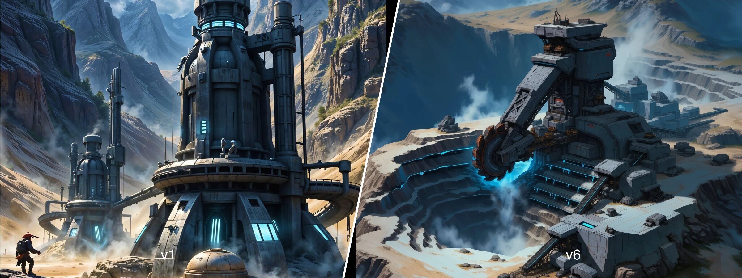
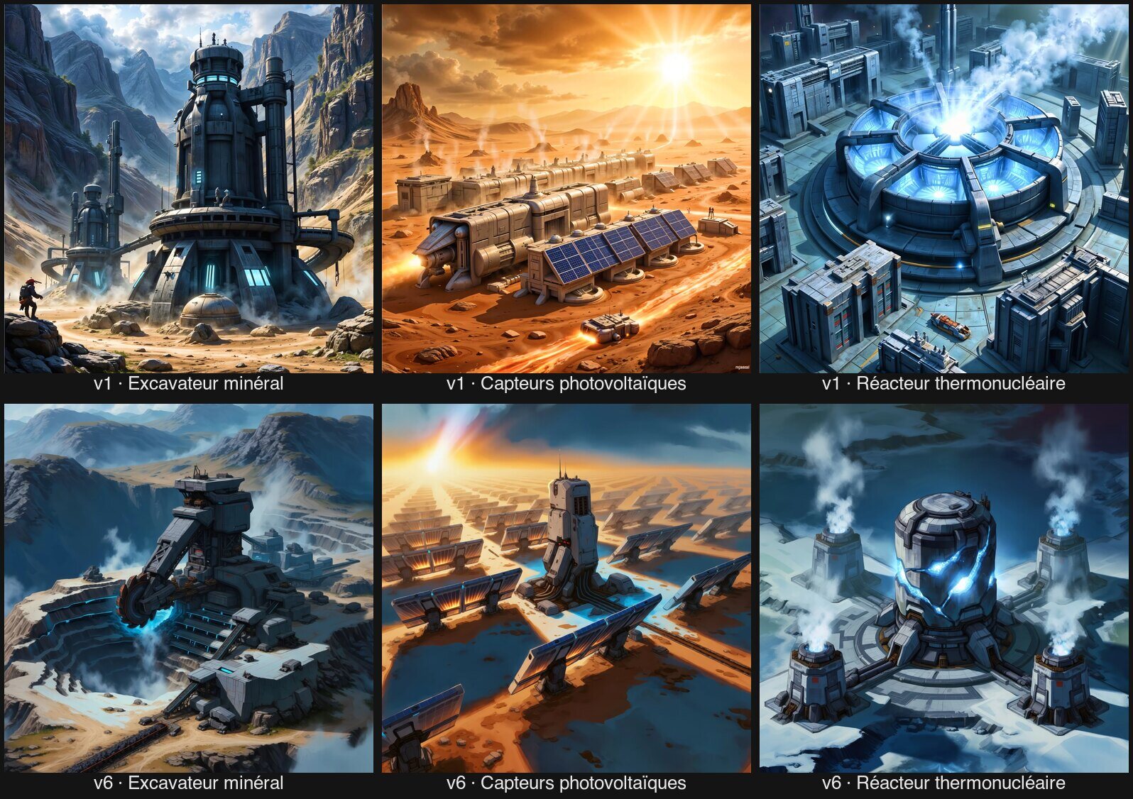
Dynasty Nova's early versions followed a realistic register: prompts opening with "Digital art of…" and closing with "The style maintains a realistic sci-fi aesthetic". An intermediate version tried a "gaming" look built from a blend of trained styles, without convincing anyone.
Realism reads poorly at small sizes
In a management game, a building is mostly displayed in a 179 × 224 pixel card. At that size, realistic detail turns into noise, and two buildings blur together. A painted style, with bold shapes and strong bevels, lets the silhouette carry each object's identity.
One target: the painted game illustration
The new art direction aims for a single register across the whole game: hand-painted illustration, strong bevels, painted highlights, a saturated palette, in the spirit of Warcraft III and StarCraft II. Those references speak directly to strategy players, the natural audience of an OGame-like game.
The real scope
An art direction overhaul is always underestimated. Here is what was rebuilt:
- 61 entities → 20 buildings, 10 defences, 17 research items, 14 ships, plus the colonial base.
- 16 page banners and 10 help illustrations.
- 5 resource visuals and 15 shop packs.
- 48 character portraits and their 48 in-action scenes.
- The planets, whose pipeline is measured inside the 3D engine and shipped separately.
Every entity was drawn in four variants, and every retained variant was picked by the author, never by the tool.
Interface constraints come first
A game image is not a cover illustration. It lives inside an interface that crops it, covers it and shrinks it. Every one of our generation rules comes from there.
Calm corners
The entity card places the action button top left and the level counter bottom right, over a gradient that turns opaque in the corner. Hence an instruction present in every prompt: the subject in the centre, the corners calm for the interface.
Enough brightness
Almost every image sits under a dark overlay that keeps text readable. A dark image disappears under it: each family has a measured luminance floor, set against the darkest visual already in production.
Shape before colour
In greyscale, our production visuals keep 97% of their separation: what tells two objects apart is their shape. Each entity therefore carries a shape motif of its own, written into the prompt. It is the same principle as Gestalt theory applied to a family of icons.
Two dynasties, two identities
The game pits two dynasties against each other, and the lore declared their visual identity untouchable:
- The Heritage (humans, augmented, cyborgs, clones) → worn metal, industrial orange, silver-blue uniforms, medal gold; asteroids, gangways, workshops.
- The Accord (xenos from many species) → bioluminescence, turquoise and violet, chlorophyll green, solar gold; jungles, hives, reefs.
That identity only applies to characters: buildings and ships are shared by both dynasties, and the lore explains why they build the same things.
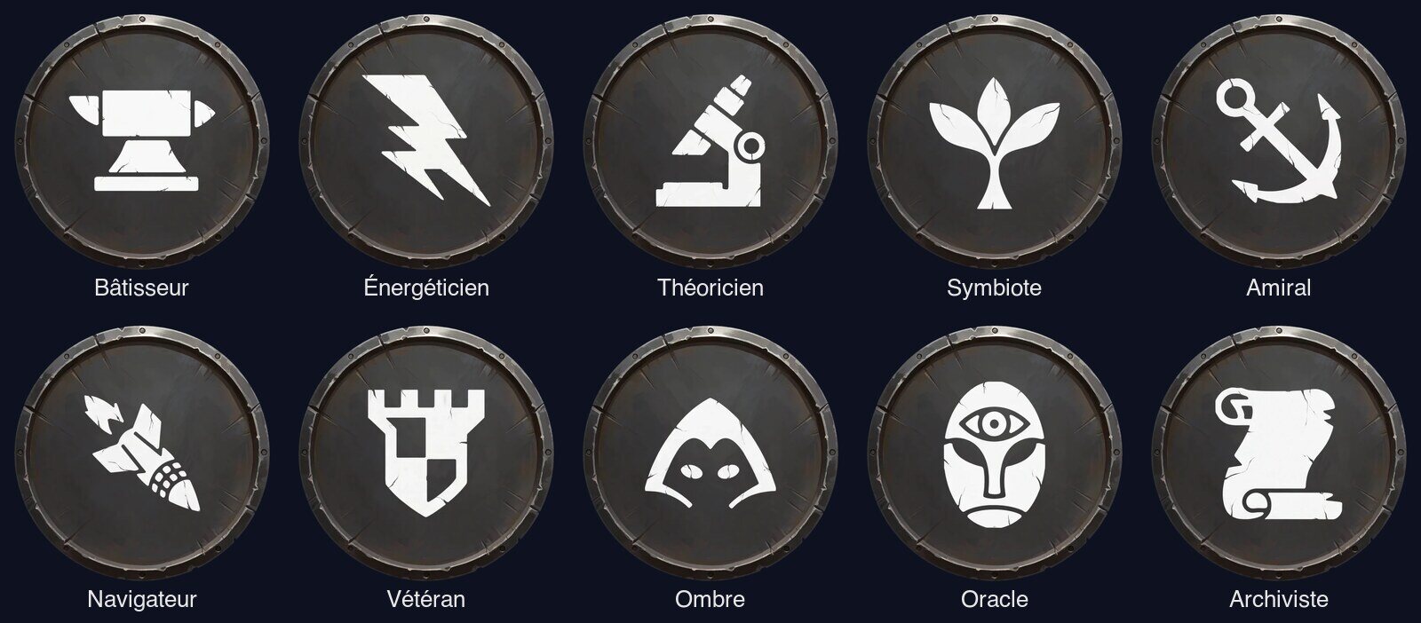
Neutral class emblems
Classes, on the other hand, cut across dynasties. Their emblems were designed to be neutral: the same steel-grey medallion, only the icon changes. A banner would say "a people"; a medallion says "a trade".
Grading is part of the art direction
Once the visuals were delivered, the author set a correction profile in Figma (exposure, contrast, saturation, shadows), then applied it from the command line to every family. It is not a technical tweak: it is a style decision, just like choosing the references.
One deliberate exception
A single banner escaped it: the galaxy banner, which the grading made darker and colder. An art direction rule that admits no exception ends up degrading the very image it was meant to serve.
What we would do differently
Two lessons for anyone considering a similar project.
Settle the style before the volume
The generation mechanism was validated on three hard cases (three climates, three silhouettes) before being rolled out to the 61 entities. Without that pilot batch, the reference imposing its own weather would have been discovered after 244 draws.
Keep the intermediates
Raw portraits, empty backgrounds, prompts and references: everything is kept and traced. An art direction lives long after delivery, and every new shop item or character has to connect to it.
Conclusion
Rebuilding a game's art direction with AI is not about a magic prompt. It is about constraints written before generating: the interface that crops, the overlay that darkens, the silhouette that identifies. AI sped up production; the decisions stayed human. For the game's earlier visual history, our piece on Dynasty Nova's visual identity shows where we started, and our browser game UX guide places these choices within the genre.