Introduction: two interface languages, two opposite bets for 2026
This year's WWDC and Pixel launches draw a clear line in interface design. On one side, Apple is slowing down on the visual front: after the aesthetic shock of Liquid Glass, 2026 focuses on stability, security and on-device AI.
On the other, Google is accelerating with Material 3 Expressive, a system overhaul that pushes motion physics and personalization into every last widget of the Pixel 10.
We cross-referenced three takes — a system-level breakdown of WWDC, a technical deep dive into the animation engine, and a hands-on Pixel 10 review — to understand what these two bets actually change for us as interface designers.
WWDC 2026: Liquid Glass steps back, stability takes the wheel
Unlike previous years, packed with visual flourishes, this WWDC surprised everyone with its restraint. Apple glosses over its cosmetic updates to focus on what matters: security and artificial intelligence. Liquid Glass hasn't disappeared, but it's no longer the star of the show — Apple would rather consolidate what already exists than chase another visual overhaul.
Golden Gate and iOS 27: invisible performance
The new version of macOS, codenamed Golden Gate, along with iOS 27, don't reinvent the visual interface. They optimize the engine at a deeper level: smoother animations, more responsive apps, and color returning to sidebar icons — a small ergonomic win after years of complaints about readability.
The technical details follow the same logic: an AirDrop announced 80% faster, deeper Spotlight indexing, and a custom EQ for AirPods. Three signals of the same choice: polish what exists rather than add more spectacle.
Vision Pro: spatial personalization
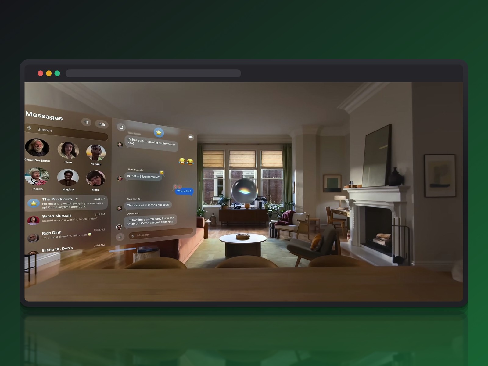
The Vision Pro headset gains flexibility: it now lets you use your own panoramas as virtual environments, where spatial computing used to lock you into fixed sets like Mars or Yosemite. A vacation photo can become your workspace.
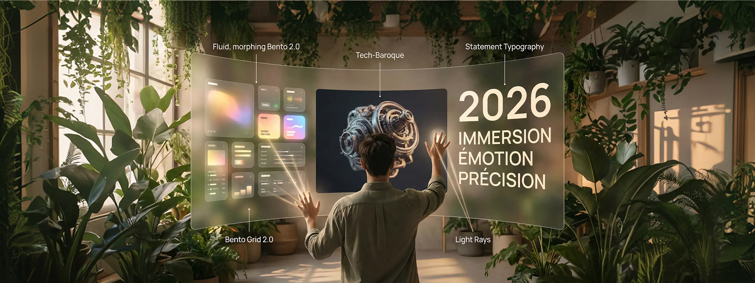
This is where Liquid Glass keeps showing up in practice: translucent interface panels floating in a real living room, with reflections and depth that respond to ambient light. This language of depth and shading remains Apple's true visual signature, even in a year that doesn't put it front and center.
Apple Intelligence: Siri finally wakes up
The moment everyone was waiting for is the overhaul of Siri under the Apple Intelligence banner. Not a total revolution, but a necessary upgrade to keep pace with ChatGPT, Claude or Gemini. Apple's strength: local integration that gives Siri access to messages and calendar without any of it leaving the device.
Activation happens through the Dynamic Island or the power button, with a more modern animation and a more expressive voice. Conversation history syncs across the whole ecosystem: start a request on iPhone, finish it on the Mac.
On autonomy, Apple plays it cautious next to Google's agents: where a competitor might try to buy concert tickets on our behalf, Siri stops at adding the event to the calendar. A deliberate limit to avoid costly hallucinations — at the cost, for now, of needing an iPhone 17 Pro or Air to run these models locally (12GB of RAM minimum).
Material 3 Expressive: motion physics as the new standard
While Apple consolidates, Google is engineering its own break from the past: Material 3 Expressive doesn't just bolt new components onto the classic Material Design library. It redefines how an app breathes and reacts to touch.
The motionScheme parameter and the overshoot effect
Technically, everything starts from a single setting: the motionScheme parameter, added to the MaterialTheme composable (still gated behind the 1.5.0-alpha dependency version). This one line unifies the motion behavior of an entire app.
Switching the scheme from Standard to Expressive radically changes how the interface feels: animations no longer stop dead at their destination, they overshoot it slightly before settling. This subtle but crucial overshoot effect mimics real-world physics and removes the robotic feel of linear animation.
Spatial vs. Effect: two distinct animation families
The system offers speed categories — fastSpatial, slowSpatial, defaultSpatial — chosen based on the visual weight of the animated element: a small icon uses the fast mode, a full-screen transition needs something slower.
More structurally, Google draws a line between two kinds of transformation: change a size or position, and you use the Spatial scheme; change a color or opacity, and you switch to the Effect scheme. This distinction lets the rendering engine apply the most natural easing curve to each type of motion.
Pixel 10: Material 3 Expressive put to the daily test
On the ground, a week with the Pixel 10 Pro confirms that Material 3 Expressive isn't just decorative varnish. Google isn't only chasing a new look: it wants an interface that builds a genuine emotional connection.
Motion synchronized with touch
Swiping away a notification triggers simulated physical resistance: the element briefly clings to the next notification before detaching with a crisp haptic snap. The recent apps menu follows the same logic — a released window bounces slightly with natural inertia.
The volume slider captures this sensory philosophy well: a haptic vibration scales with the sound level, intensifying as it rises. Some of the "squish" effects promised in early demos are still missing from the notification shade rollout, replaced for now by a more conventional fade.
Personalization that seeps into the whole system
Google pushes personalization well beyond Material You. A personal wallpaper photo can be given a misty mood or a light rain effect that reacts in real time — and that theme then colors the search widget, the quick settings panel, and even the fonts.
Android 16's typography actively guides your eye: varied weights, deliberate kerning, oblong buttons and bold text in apps like Clock or Calculator. This tactile, textured approach echoes some neumorphism reflexes, just bolder and more colorful.
Calling Card and shapes that tell a story
The Calling Card feature lets you configure an entire call screen per contact: photo, font, matching Material 3 Expressive colors. That same care extends to the charging screensaver, where weather shows up as playful bubbles and organic shapes.
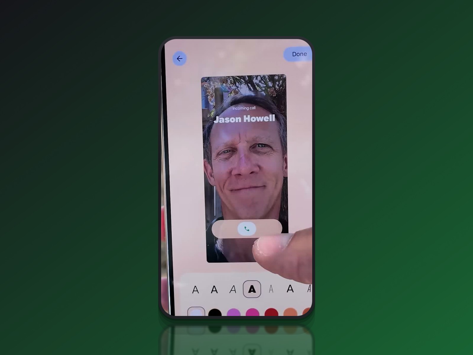
Squircles, oblong shapes and wavy lines — visible right down to the Spotify widget — replace the perfect squares and circles of old. Every app keeps its own personality while following a shared grammar, the opposite of the uniformity older Material Design used to chase.
What the three takes reveal
The three videos each light up a different facet of the same shift. The WWDC breakdown shows an Apple that chooses restraint: it consolidates Liquid Glass and bets everything on security and on-device AI rather than another visual shock.
The technical deep dive reveals the opposite: a Google that structures motion as a full design system variable, on par with a color or a typeface.
The hands-on review, meanwhile, tempers the enthusiasm: while Pixel 10's system apps are exemplary, the Play Store or Google Maps remain on the sidelines of this new physics.
That last point might be the most instructive one. Material 3 Expressive's success will depend entirely on third-party developers adopting it through the motion API — without them, it stays a Pixel exclusive rather than an Android standard.
Apple, for its part, has never had that problem with Liquid Glass: a visual language enforced by the system applies everywhere, at the cost of a year without much new to show for it.
What this actually changes for us as interface designers
Both approaches converge on one point: motion becomes a design system variable, not a finishing touch bolted on at the end of a project. Whether through motionScheme or the easing variables of a tool like Figma Motion, we now need to think about a transition's speed and bounce with the same rigor as a color palette.
In practice, three reflexes to build in right now:
- separate position/size animations (spatial) from color/opacity animations (effect) → two different easing curves
- treat haptics as a design material in its own right, not a technical bonus tacked on afterward
- document a sober mode (Standard) alongside an expressive one, for contexts that call for it
The other lesson is about adoption. A system-level interface is only as good as the third-party apps that actually pick it up — the Play Store's and Google Maps' own lag behind their house language is a reminder of that. Before promising a new motion physics, it's worth checking whether it will survive the lowest-priority app on the roadmap.
Conclusion: two bets that don't cancel each other out
2026 doesn't pit one "winning" interface language against another. Apple is holding its breath on the visual front to shore up a system and an AI people can trust; Google is betting on emotion and sensory feedback to make Android more lovable, even if that means fragmenting the experience while third-party apps catch up.
Both bets tie into a broader trend we mapped out in our roundup of 2026 UI trends: immersion and emotion increasingly outweigh plain function. It's up to us designers to consciously pick which of the two reflexes — restraint or expressiveness — serves our own product best.
Further reading
This synthesis article is based on the following videos:
- WWDC 2026 : entre optimisation système et intégration locale de l'IA sous haute sécurité matérielle
- Maîtriser Material 3 Expressive pour créer des interfaces Android plus vivantes et naturelles
- Pixel 10 et Material 3 Expressive : le pari de Google pour humaniser l'interface Android
Articles generated via Vidiome, then merged and enriched.