
Introduction: the bridge between the web and Figma
We've all wanted to take an existing site apart without spending hours redrawing it by hand. That's exactly the promise of HTML to Figma: turn a plain URL into editable Figma layers, ready for competitive analysis, moodboarding, or a quick redesign. We looked at three ways people actually use it — a hands-on test of the flagship plugin, a more technical walkthrough (settings, ethics, dynamic content), and the freshest take, which pushes the exercise all the way to AI generation — to pull together a complete playbook, limitations included.
Importing a site in one click: the html.to.design workflow
The basic idea fits in one sentence: paste a URL, say Apple's, and the plugin hands back the page as editable Figma layers within seconds. But two choices shape the quality of the result before you even hit import.
Viewport, theme, and target resolution
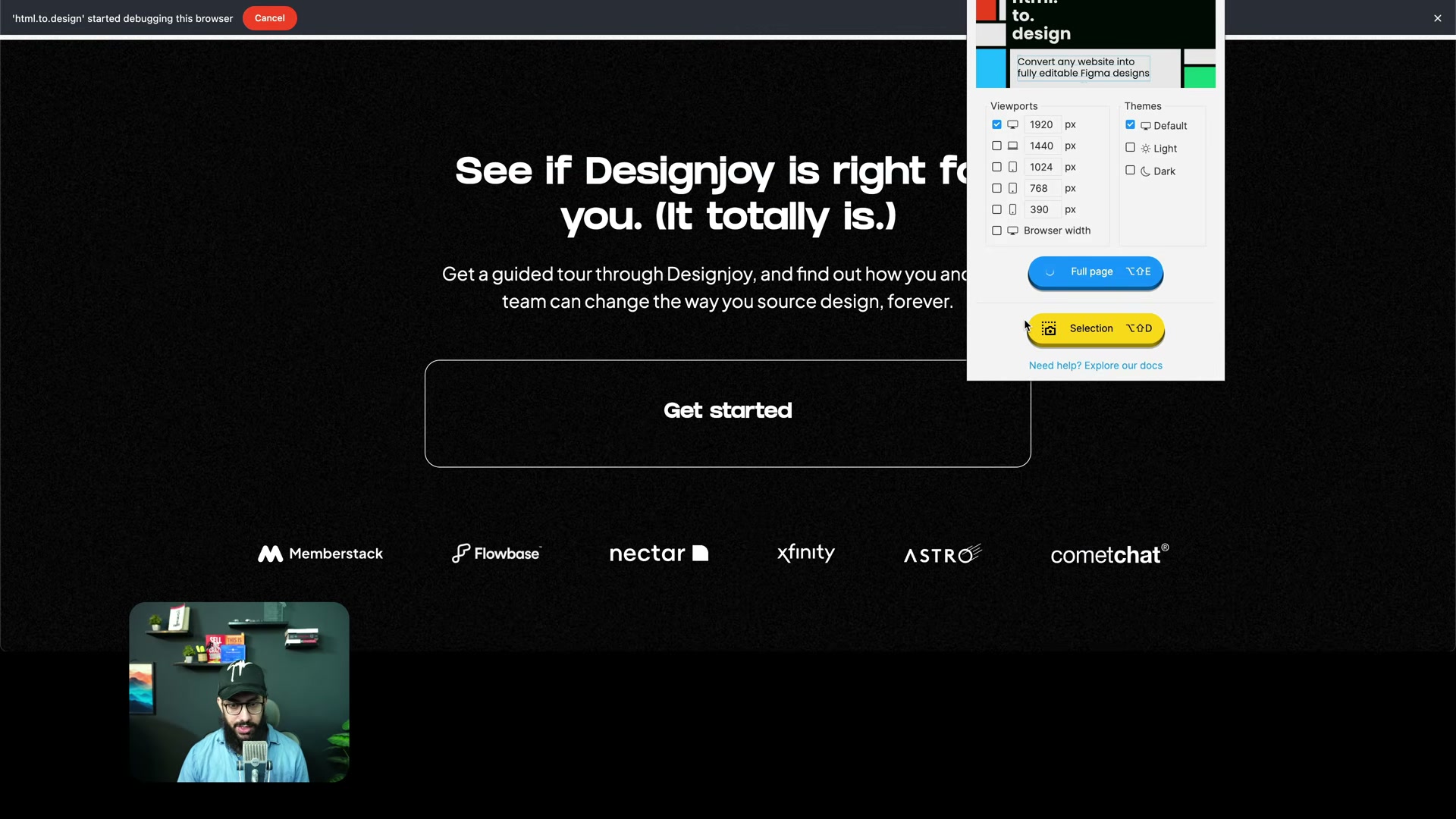
You're not limited to a single capture. The plugin offers several reference widths (1920, 1440, 1024, 768, 390px) and a theme choice (Default, Light, Dark) to faithfully reproduce a site that adapts by device or display mode. Switching to a mobile format genuinely reflows the elements, which makes this a useful competitive-watch tool for understanding how a brand adapts its experience across screens.
A pricing model worth knowing before you commit
The free tier allows 12 imports every 30 days, which is plenty for occasional inspiration. The Pro Plan lifts that cap for heavier workflows → occasional use for inspiration vs. daily competitive monitoring. The right choice mostly comes down to how often you need to dissect complex sites. Other plugins like Builder.io take a similar approach, adding AI-assisted generation once the import is done.
Vectors, fonts, layers: what the output is actually worth
The result is surprisingly faithful structurally: not a flat screenshot, but a usable layer hierarchy. Logos and icons come in as SVGs, scalable without quality loss, and the original typography is preserved (SF Pro Display on apple.com, for instance), making text immediately editable. Layer naming often mirrors the real content — a button reading "Shop Now" gets a layer named "Shop Now" — which keeps an otherwise unreadable file navigable. One recurring catch: a font not installed on your machine (a site's custom Grifter, say) gets silently swapped for a fallback like Inter, which can slightly shift the overall look until you install the real one.
The limits you should expect going in
Two caveats show up consistently in our tests. First, performance depends directly on page density: a lean landing page imports in seconds, while a heavy news portal takes noticeably longer. Second — and this is the real weak spot — the tool recreates no Auto Layout and no native Figma components: you get a static structure that needs manual rework to become genuinely flexible. In practice, that shows up as overlapping images or misaligned blocks whenever the source site's layout was a bit complex → overlapping elements right after import → manually switched to a side-by-side arrangement to restore visual consistency. If Auto Layout is still a fuzzy concept, our guide to Auto Layout in Figma covers exactly what raw imports are missing.
The scroll-loaded content trap
Modern sites lean heavily on scroll-triggered animations, hiding content until you scroll down. Importing a raw URL under these conditions produces empty or incomplete sections. The workaround is the plugin's Chrome extension: manually scroll through the entire page in your browser to force lazy-loaded elements to render, then run a Full page export, which generates an .h2d file you drop straight into Figma → empty section on the first attempt → fully loaded content after a manual scroll-through. This remains the most reliable method for interaction-heavy sites, at the cost of one extra manual step.
Where does inspiration end? A question of ethics
Access to these tools raises a real intellectual-property question. The creator of Design Joy, for instance, has publicly called out clones sold on social media that started from a plain import. The line, though, is clear: studying a grid, a type hierarchy, or a palette to sharpen your own skills has nothing to do with republishing another designer's work under your own name — let alone selling it as a turnkey file. We treat these imports as a personal diagnostic lab, never as a shortcut to a ready-made file to commercialize.
Beyond capture: generative AI enters the picture
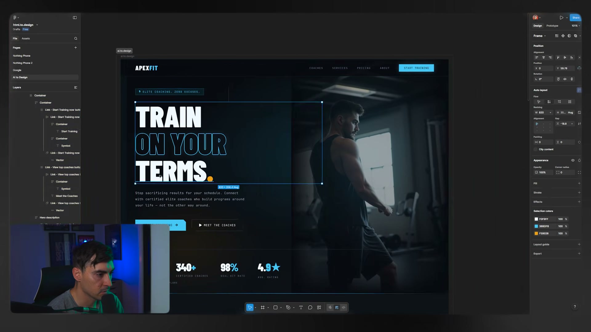
The logical next step after importing is pure generation. The same plugin makers now ship a second tool built for designing from scratch: describe an intent in plain language, and models like Claude, Gemini 3 Pro, or Grok generate a full interface — organized layers (nav, hero section, footer) and system variables extracted automatically, from colors to border widths to font families. Asked for a fitness-coaching landing page, the result delivered a premium-looking design named "Apex Fit," icons and hover effects included. It's not a finished file, but it's a solid starting point for breaking through blank-page syndrome. We see the same logic — describing an intent rather than redrawing one — in our review of Claude Design.
What the three videos reveal together
All three converge, but each lights up a different facet — which is what makes the synthesis worthwhile. The hands-on plugin test lingers on the raw output: vector quality, typography, layer naming, and the performance limits on heavy pages. The more technical walkthrough digs into what the first one skims past: fine-grained viewport settings, the method for capturing scroll-loaded content, and the ethics question few tackle head-on. The freshest take, finally, extends the exercise toward generative AI, framing site capture and prompt-based generation as two sides of the same hybrid workflow.
Should you add it to your workflow?
For occasional use — comparing two competitors, building a quick moodboard — the free tier is plenty. For daily monitoring or regular imports of complex sites, the math quickly tips toward the Pro Plan. Either way, budget time for cleanup: rebuilding Auto Layout, swapping missing fonts, loosening up the structure. The tool speeds up the capture, not the finishing.
Conclusion
HTML to Figma doesn't replace our expertise — it shifts where we spend it: less time recreating an existing structure, more time on analysis and iteration. Between faithfully importing a real site and generating an interface from a single prompt, the line between the web and the Figma canvas keeps blurring — as long as what gets imported is used honestly.
Further reading
This synthesis article is based on the following videos:
- Convert any website into a Figma design (Nick Babich)
- Transform web pages into Figma designs with the HTML to Design plugin (AM Design)
- Copy any website design into Figma in seconds (Jeremy Mura)
Articles generated via Vidiome, then merged and enriched.