Preview 1 of 4
Design tool line icons: 48 free icons (vectors, structure, alignment, typography, color, export)
48 design tool line icons as SVG, PNG and SVG sprite: vectors, structure, alignment, typography, colour and export. Free with a Beryl Design account.
Overview
Description
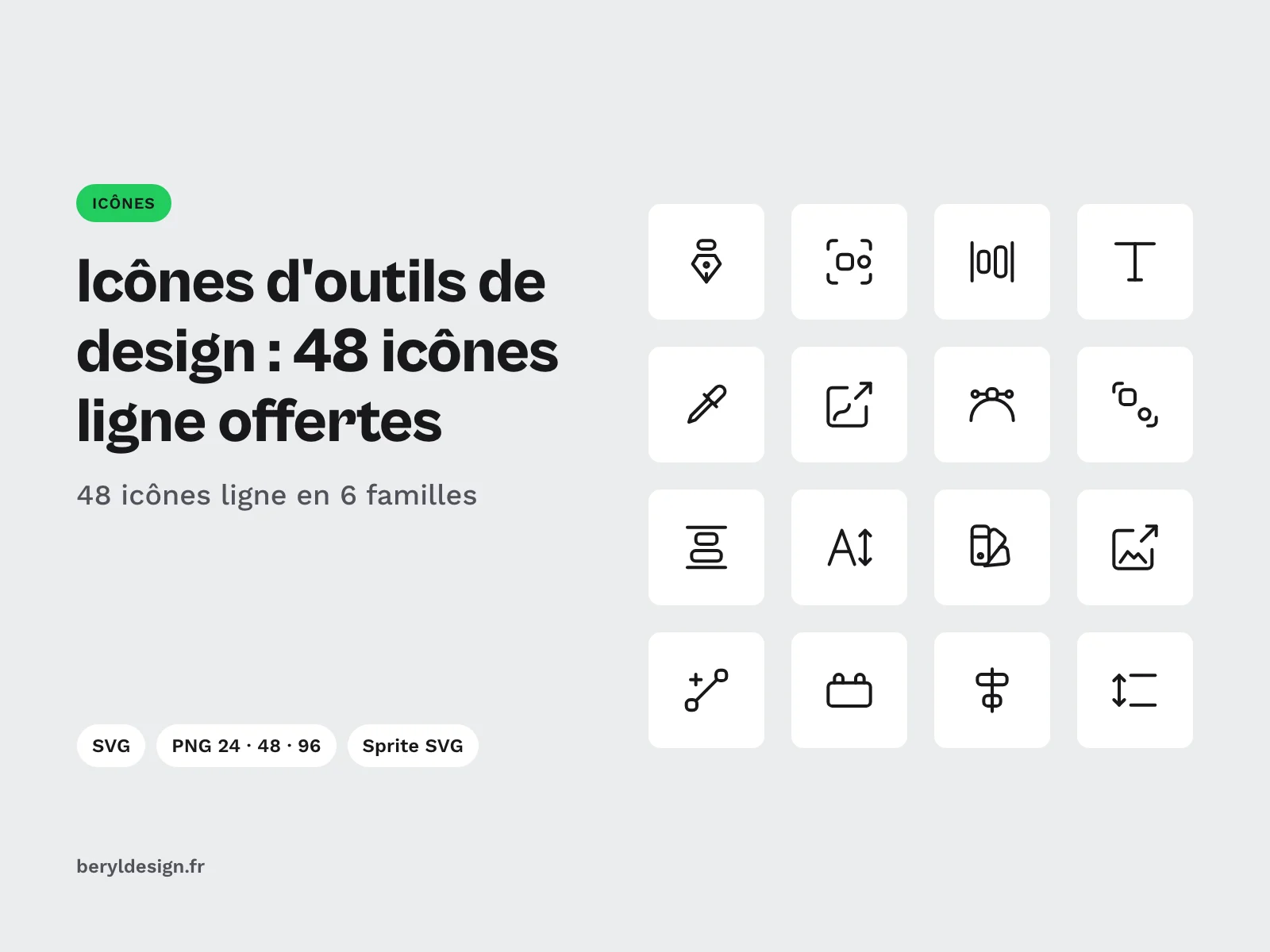
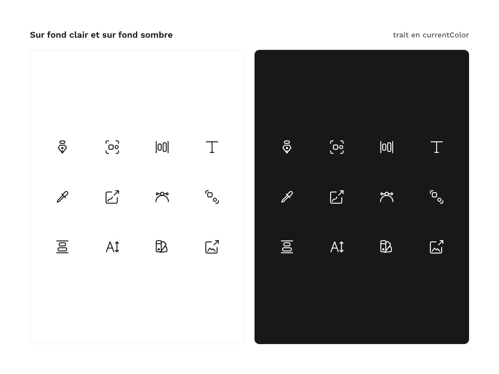
This pack brings together 48 line icons for the actions of design tools, delivered as SVG, PNG and SVG sprite, free with an account and under a commercial licence. It is for designers and developers who build an online graphic editor, a visual generator, the toolbar of an extension, the documentation of a design system, a course or a tutorial: drawing with the pen, combining shapes, grouping layers, managing components and variants, aligning and distributing, setting type, picking a colour, exporting and handing off to developers. To pick the right extensions for each of these tasks, see the guide to plugins by task (in French). Each file has a plain English name (pen, auto-layout, dev-handoff) that you can reuse as is in your code. All icons share the same stroke, with no fill and rounded ends, so a toolbar, a properties panel and an export menu stay in one style.
The pack contains no brand: no software logo, no interface icon copied from an existing tool, no file format acronym drawn. The actions are redrawn to read outside any particular software.
Specifications
| Icons | 48, line style |
|---|---|
| Families | 6 of 8: vectors, structure, alignment, typography, color, export and handoff |
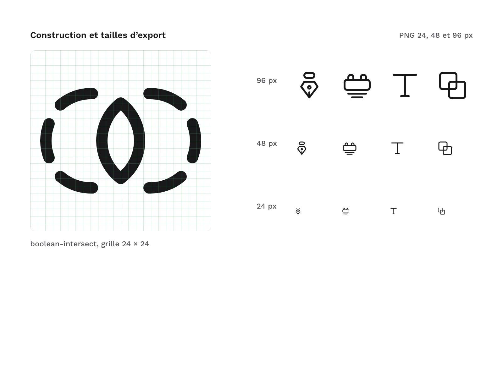
| Grid and stroke | 24 px grid, 1.5 stroke, no fill |
| Formats | SVG, PNG 24, 48 and 96 px, SVG sprite, HTML demo page |
| Files | 194 in the archive |
| Licence | commercial, free with an account |
| Version | 1.0.0 of 13 November 2026 |
Contents
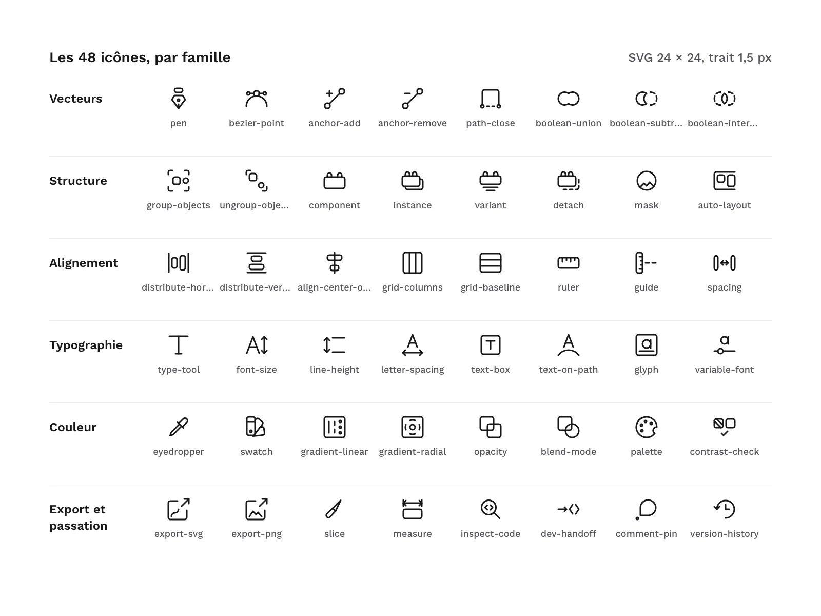
- 48 line icons, in 6 families of 8:
- Vectors (8):
pen,bezier-point,anchor-add,anchor-remove,path-close,boolean-union,boolean-subtract,boolean-intersect; - Structure (8):
group-objects,ungroup-objects,component,instance,variant,detach,mask,auto-layout; - Alignment (8):
distribute-horizontal,distribute-vertical,align-center-objects,grid-columns,grid-baseline,ruler,guide,spacing; - Typography (8):
type-tool,font-size,line-height,letter-spacing,text-box,text-on-path,glyph,variable-font; - Color (8):
eyedropper,swatch,gradient-linear,gradient-radial,opacity,blend-mode,palette,contrast-check; - Export and handoff (8):
export-svg,export-png,slice,measure,inspect-code,dev-handoff,comment-pin,version-history.
- Vectors (8):
- 48 SVG files, one per icon.
- 144 PNG files: each icon at 24, 48 and 96 px.
- 1 SVG sprite that gathers the 48 icons as symbols.
- 1 HTML demo page.
A few drawing choices to know before you download. The three boolean operations start from the same two overlapping circles: boolean-union keeps the outer outline, boolean-subtract a crescent, boolean-intersect the central lens. The four component icons share a brick: alone for component, doubled by an offset copy for instance, set on a base for variant, with a dashed, broken outline for detach. export-svg and export-png share a frame with an arrow coming out of it: a smooth curve inside for vector, a ridge line for image. No icon carries a file format acronym, and the typography icons only ever use one letter at a time.
Some subjects have no drawing that everyone recognises at first glance: opacity (two overlapping squares), blend-mode (a square and a circle overlapping), mask (an image cropped in a circle), auto-layout (two blocks in a frame), variant and detach. In an interface, pair them with a label or a tooltip.
The pack follows the same grid as the other Beryl Design line icon packs: same stroke, same radii and same rounded ends. If you already use one of these packs, the icons combine in the same interface without any touch-up, and no file name is duplicated.
File structure:
svg/
png/24/
png/48/
png/96/
sprite/design-tool-line-icons.svg
demo/index.html
Production and AI
The icons were drawn as SVG with an AI assistant, on the range’s grid, then rendered, measured and reviewed one by one: grid, stroke and safe area checks, rendering on contact sheets at 24 and 48 px, then a final review of each icon. The pack contains no image made by an image generator.
Formats and compatibility
- SVG: fill-free vectors whose stroke takes the text colour (
currentColor). You change the colour with the CSScolorproperty and the weight with thestroke-widthattribute, set once on the root tag. The files open in most design tools and can be used directly in code (HTML, components). - PNG 24, 48 and 96 px: black icons on a transparent background, for a presentation, a document, a mockup or software that does not import SVG.
- SVG sprite: a single file where each icon is a
<symbol>named after its file, called with<use href="#pen"/>. - HTML: a standalone demo page, with no script or external resource, that shows the icons by family at 24, 48 or 96 px and in several colours, including on a dark background.
Licence
The icons come under a commercial licence: you can use them in personal and professional projects, including for clients and in products you sell, but you may not resell or redistribute the files, even for free.
Further reading
- A library of elements or a complete system: the difference between a UI kit and a design system.
- Components that adapt to their content: mastering auto layout.
Version history
1.0.0 (13 November 2026): first version.