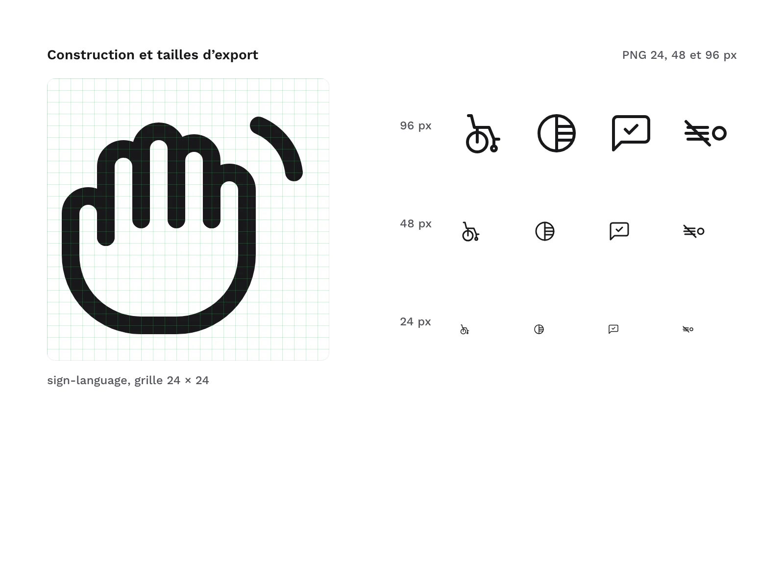
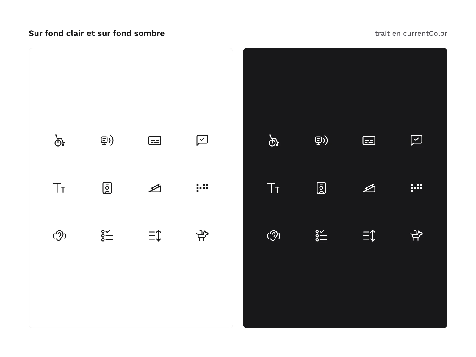
Preview 1 of 4
Accessibility pictograms: 36 line icons
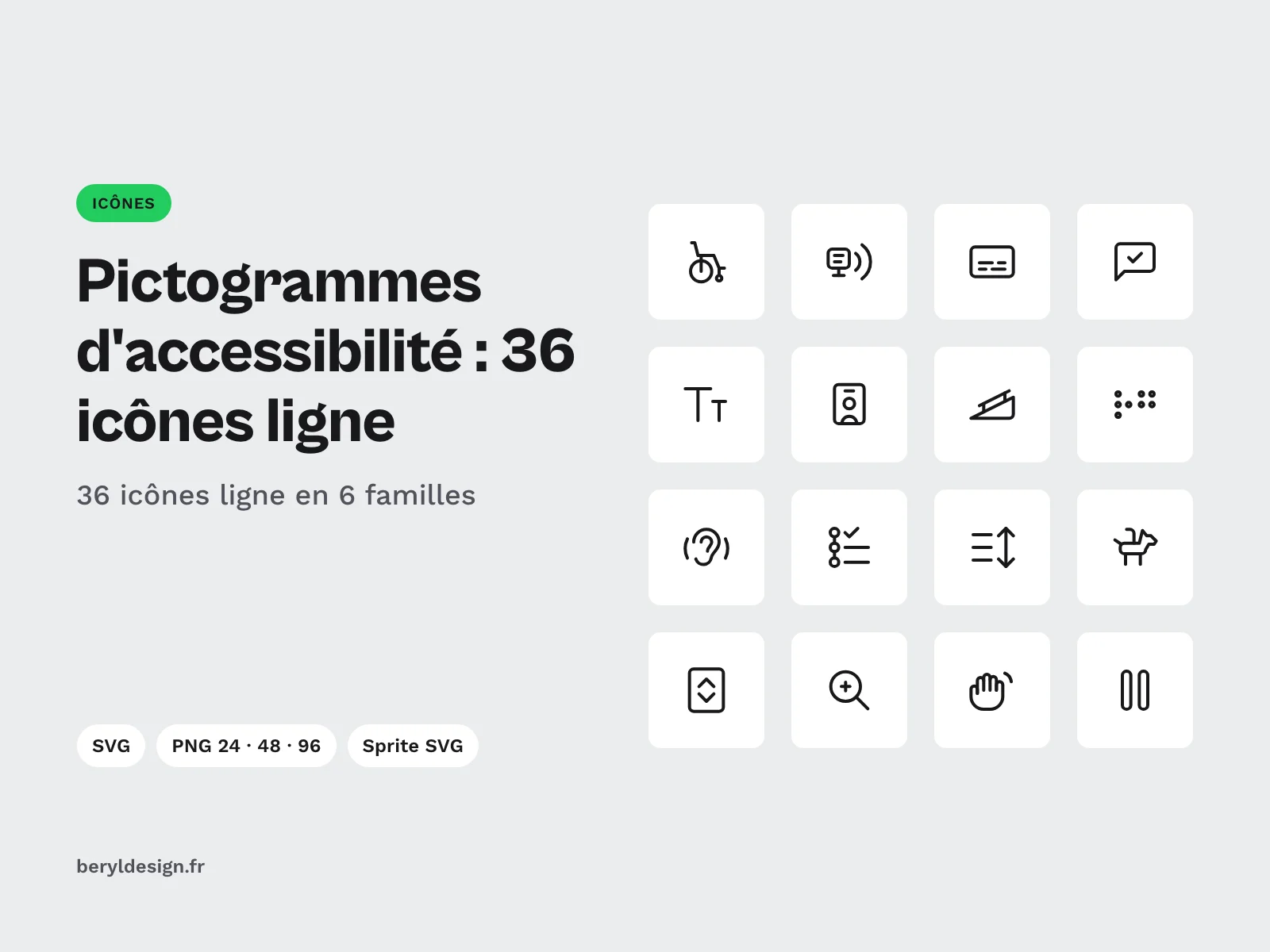
36 accessibility pictograms as line icons, in SVG, PNG and SVG sprite, for your accessibility pages, your signage and your display settings panels.
Overview
Description
This pack brings together 36 accessibility pictograms as line icons, delivered as SVG, PNG and SVG sprite, under a commercial licence. It is for designers and developers who prepare an accessibility statement, a page presenting the services of a venue or an app, a display settings panel or the signage of a reception area: step-free access, elevator, captions, hearing loop, plain language, text size, trained staff. Each file has a plain English name (step-free, captions, text-size) that you can reuse as is in your code. All icons share the same stroke, with no fill and rounded ends, so a list of services and a settings menu stay in one style.
These pictograms illustrate information, they do not make a page accessible. A website’s accessibility depends on its code, its content and its testing with users, not on the icons that announce it. In an interface, an icon alone is not enough: pair it with a visible label, or with alternative text when it carries meaning, and hide it from assistive technologies when it is decorative.
The drawings are original: the pack reproduces no registered official pictogram and no label logo. wheelchair draws the chair alone, with no figure, reserved-parking is not a road sign, and captions and audio-description carry no acronym. If your signage must show a standardised pictogram, use its official version, along with its usage rules.
Specifications
| Icons | 36, line style |
|---|---|
| Families | 6: mobility, vision, hearing, cognition, display settings, services |
| Grid | 24 px, 1.5 stroke |
| Formats | SVG, PNG 24, 48 and 96 px, SVG sprite, HTML demo page |
| Files | 146 in the archive |
| Licence | commercial |
| Version | 1.0.0 of 12 November 2026 |
Contents
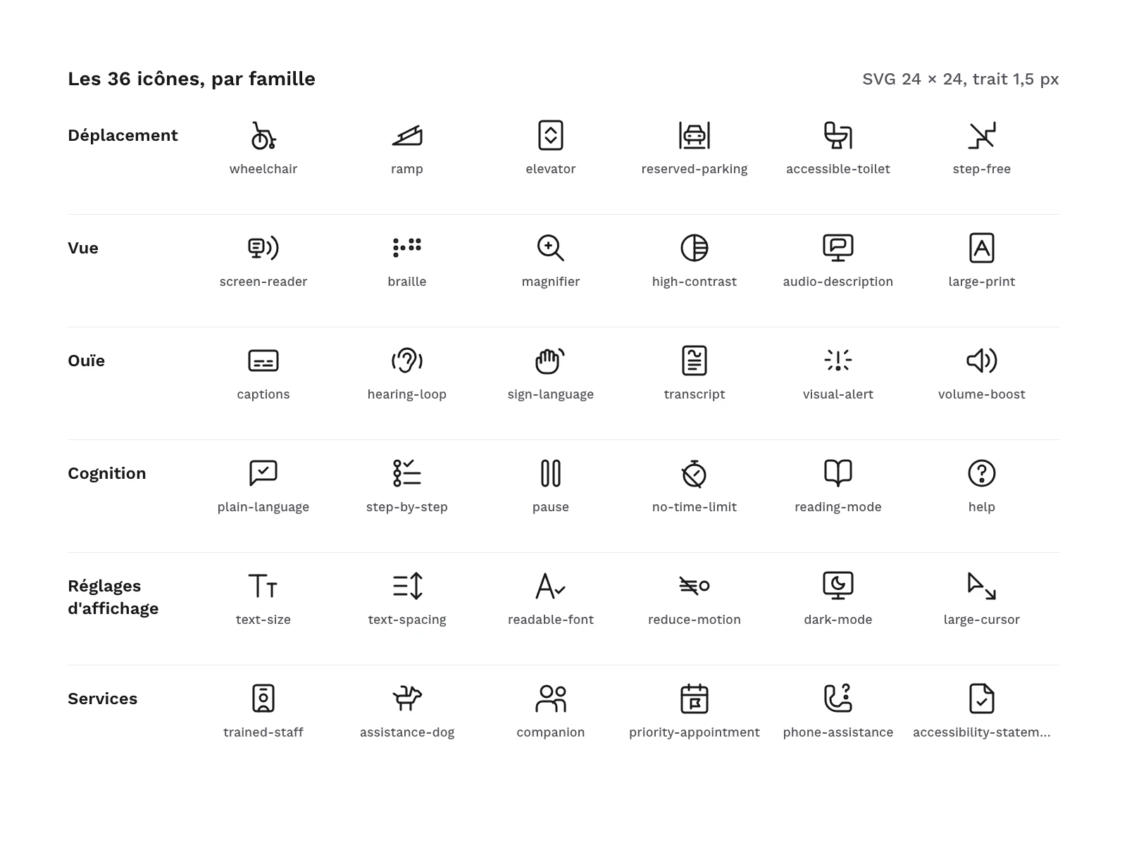
- 36 line-style icons, in 6 families of 6:
- Mobility (6):
wheelchair,ramp,elevator,reserved-parking,accessible-toilet,step-free; - Vision (6):
screen-reader,braille,magnifier,high-contrast,audio-description,large-print; - Hearing (6):
captions,hearing-loop,sign-language,transcript,visual-alert,volume-boost; - Cognition (6):
plain-language,step-by-step,pause,no-time-limit,reading-mode,help; - Display settings (6):
text-size,text-spacing,readable-font,reduce-motion,dark-mode,large-cursor; - Services (6):
trained-staff,assistance-dog,companion,priority-appointment,phone-assistance,accessibility-statement.
- Mobility (6):
- 36 SVG files, one per icon.
- 108 PNG files: each icon at 24, 48 and 96 px.
- 1 SVG sprite that gathers the 36 icons as symbols.
- 1 HTML demo page.
A few drawing choices worth knowing before you buy. large-print is a page bearing a large letter “A”, for a printed document, whereas text-size bears the letter “T” and stands for an interface setting. magnifier reuses the search magnifier from the other packs in the range. hearing-loop and sign-language are drawings specific to this pack: pair them with a label in your interface.
The pack follows the same grid as the other Beryl Design line icon packs: 24 px, 1.5 stroke, same radii and same rounded ends. If you already use one of these packs, the icons combine in one interface without any retouching.
File layout:
svg/
png/24/
png/48/
png/96/
sprite/accessibility-line-icons.svg
demo/index.html
Production and AI
The icons were drawn as SVG with an AI assistant, then reviewed and checked one by one: rendered at 24 and 48 px on light and dark backgrounds, grid and stroke checks, then a review of each icon on a contact sheet. The pack contains no AI-generated image.
Formats and compatibility
- SVG: fill-free vectors whose stroke takes the text colour (
currentColor). You change the colour with the CSScolorproperty and the weight with thestroke-widthattribute, set once on the root tag. The files open in most design tools and can be used directly in code (HTML, components). - PNG 24, 48 and 96 px: black icons on a transparent background, for a presentation, a document, a poster or software that does not import SVG.
- SVG sprite: a single file where each icon is a
<symbol>named after its file, called with<use href="#captions"/>. - HTML: a self-contained demo page, with no script or external resource, that shows the icons by family, at several sizes and in several colours, including on a dark background.
Licence
The icons come under a commercial licence: you can use them in personal and professional projects, including for clients and in products you sell, but you may not resell or redistribute the files, even for free.
Further reading
- The principles to keep in mind from the first mock-up: designing for accessibility.
- Which standard applies to your project: RGAA, EAA, WCAG: which standard applies in 2026? (in French).
- To annotate your mock-ups and prepare an audit, these pictograms complement the Beryl Design RGAA and EAA accessibility kit (annotations, audit grid, components).
Frequently asked questions
Do these pictograms make my website accessible?
No. They signal a piece of information or a service; they replace neither well-structured code, nor suitable content, nor an audit. A page that shows them is not more accessible for it: every icon that carries meaning must come with a label or alternative text.
Does the pack reproduce official pictograms?
No. All the drawings are original, and the pack contains no registered official pictogram and no label logo. If a venue or a document must show a standardised pictogram, use its official version.
How do I change the colour and stroke weight of the icons?
In the SVG, the stroke follows the text colour: the CSS color property is enough. The weight is set with the stroke-width attribute, present once on the root tag of each file. The PNGs come in black on a transparent background.
Version history
1.0.0 (12 November 2026): first version.