Introduction
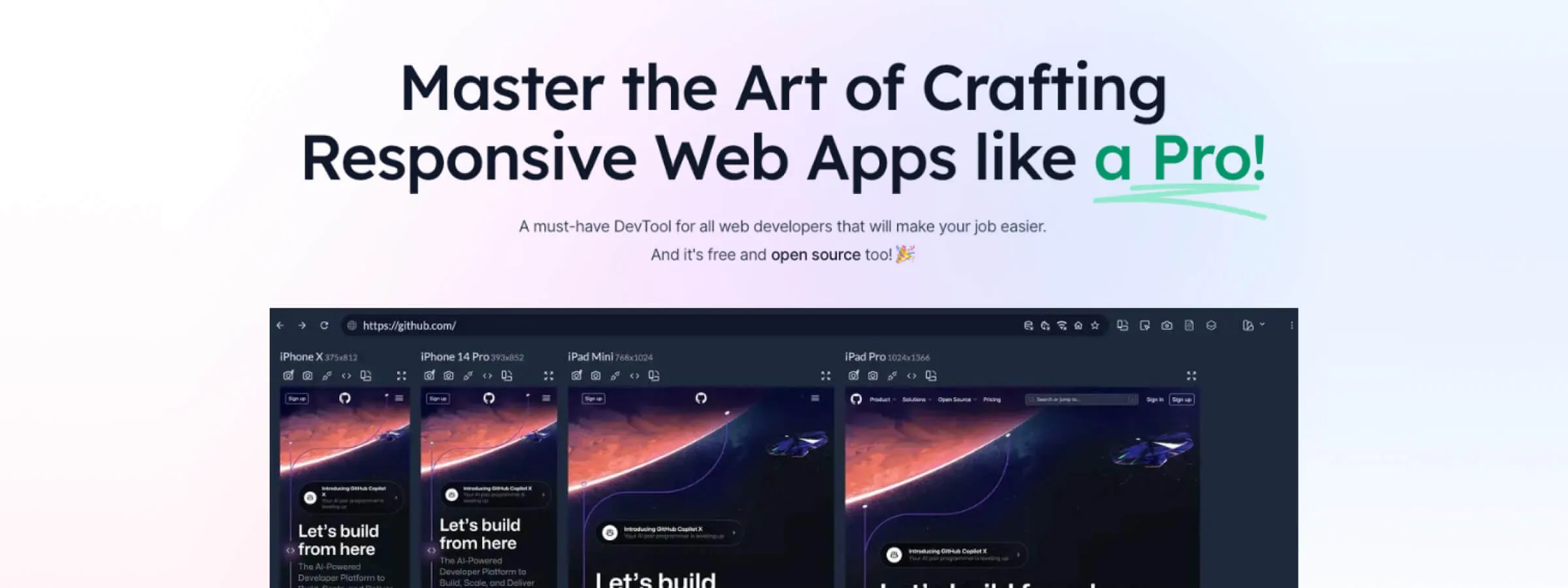
Discover Responsively, the app that simplifies the responsive web development process. As the variety of devices used to browse the Internet keeps growing, it is crucial for developers and web designers to make sure their creations adapt smoothly to every screen.
This is where Responsively comes in, offering an innovative solution to visualize and test the responsiveness of websites across a variety of devices simultaneously. Let's dive into the world of Responsively and discover how this game-changing app can transform your approach to web development.
Why Use Responsively App?
Responsively App is a modern development browser that helps developers test and visualize their websites on multiple devices at the same time. In our experience, this ensures that the site works well on every screen format, from mobile phones to large monitors.
Key features
REAL-TIME PREVIEW
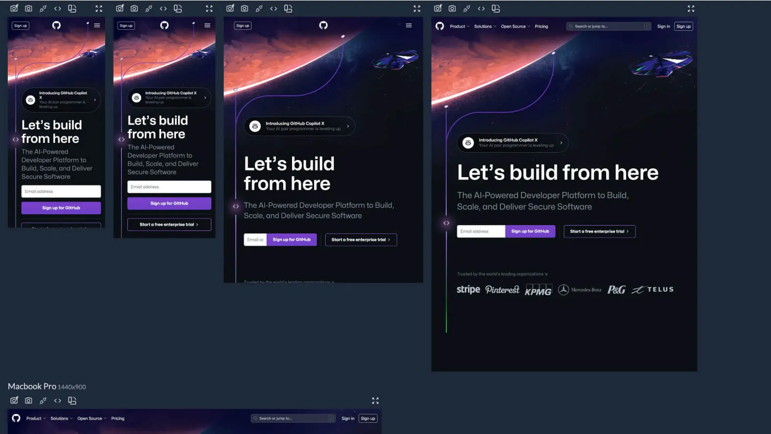
Responsively App offers a real-time preview experience, allowing developers to see changes made to the website instantly across multiple devices. This supports an iterative development process to guarantee optimal compatibility with every screen.
INTERACTION SYNCHRONIZATION
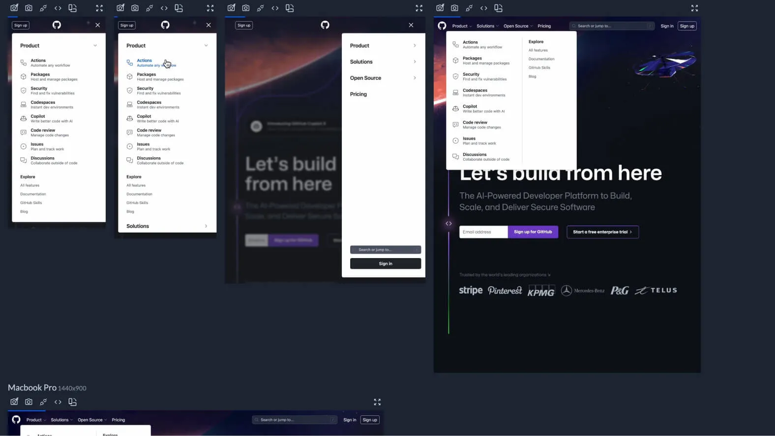
Responsively App synchronizes user interactions such as clicks and scrolls across all devices at once. This simplifies testing interactive features by letting developers confirm that all intended actions run correctly on each platform.
DISPLAY CUSTOMIZATION
Developers can customize the device display in Responsively App to better match the real setups of their target users. For example, they can simulate a mobile environment with a phone and a tablet side by side, making layout issues easier to spot.
EXTENSIVE DEVICE SUPPORT
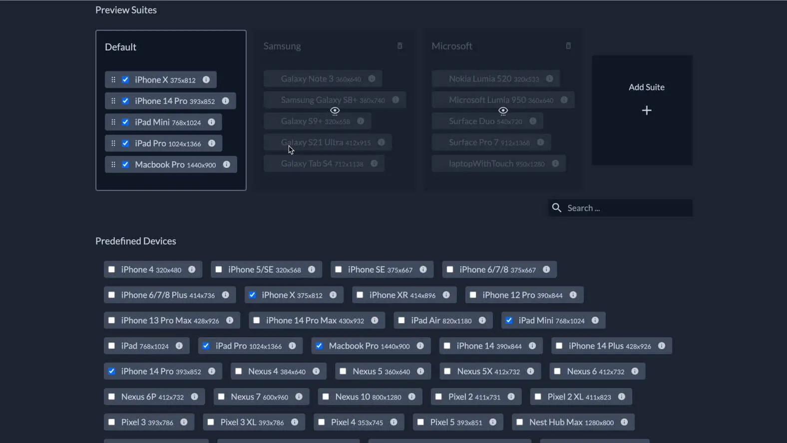
Responsively App offers a vast selection of preconfigured device profiles, covering a wide range of phones, tablets, and desktop computers. This diversity lets developers test their sites on a multitude of platforms, ensuring maximum compatibility with the various devices used by end users.
An ally for Webflow users
For designers, Responsively App is a valuable asset for checking that their visual creations stay consistent across all devices. When combined with Webflow, a visual design tool that, in our experience, lets you build sites without coding, Responsively App becomes even more powerful. Designers can use Webflow to design, then use Responsively to test responsiveness before going live.
Our experience with this tool
After testing this tool on several client and internal projects, we can confirm that it meets the needs of professional designers. Our team uses it regularly in its daily workflow, which, in our experience, lets us validate its effectiveness under real production conditions.
Points tested in detail:
- Performance on large files (500+ frames)
- Compatibility with complex design systems
- Stability during intensive use
- Integration into a team workflow
Points to watch (tested under real conditions)
For the sake of transparency, here are the limitations we identified during our tests:
- Processing time can be longer on very large files
- Requires a stable internet connection for certain features
- Learning curve for beginner users
Conclusion
In conclusion, Responsively positions itself as an indispensable tool to guarantee that your website delivers a consistent and smooth user experience on every device. Whether you are an experienced developer or a budding designer, integrating Responsively into your workflow will help you gain efficiency and precision when developing responsive websites.
With Responsively by your side, you can be sure your website will be ready to face the challenges of cross-platform browsing with confidence and professionalism.