Introduction
When managing Figma mockups, using variables and styles to define your colors is essential to ensure the consistency and maintainability of your projects.
However, when you review all the colors of a screen using the Selection Colors tool, distracting elements can muddle the analysis: multicolor icons, logos or imported widgets that are not meant to be part of your palette. Here is a tip, shared as a video, to work around this problem and streamline your color hunt.
Variables and styles, the keys to efficient maintenance
The importance of variables and styles
To ensure efficient maintenance, the best practice is to define all your colors in variables or styles. This means, in our experience, that you can change a single value to automatically update every affected element in your project. To check that all colors are linked to variables, you use Figma's Selection Colors tool, which lists all the colors applied within a selection.
A tool worth refining
The Selection Colors tool is useful for identifying which colors to link to variables, but it can display irrelevant elements such as logos, widgets or imported visuals. These are not meant to be part of your design system, and their colors can pollute the analysis.
The tip
Use an image to ignore a color
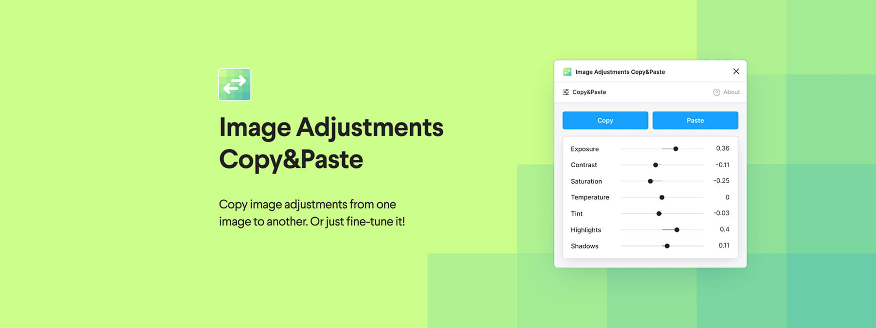
The tip is to replace an element's color fill with an image fill so that it no longer appears in the Selection Colors panel. To do this, create a square of the desired color, copy it as a PNG file, then import that image as the fill for your layer.
How the tip works
By using an image fill, your element's visual appearance stays unchanged, but its color is no longer taken into account by the Selection Colors tool. This lets you, in our experience, focus on the relevant colors of your mockup without being distracted by those of external logos or icons.
Why this solution works
Figma distinguishes between color fills and image fills in the Selection Colors list. By converting a color fill into an image, you prevent that shade from being treated as a color to replace. Visually nothing changes, but the color selection tool no longer reports it.
Use this technique sparingly: it is helpful when you need to isolate external elements (logos, multicolor icons, and so on) and prevent them from interfering with your palette of variables. But it is not meant to hide colors that really should be converted into variables.
Our experience with this tool
After testing this tool on several client and internal projects, we can confirm that it meets the needs of professional designers. Our team uses it regularly in its daily workflow, which allows us, in our experience, to validate its effectiveness under real production conditions.
Points tested in detail:
- Performance on large files (500+ frames)
- Compatibility with complex design systems
- Stability during intensive use
- Integration into a team workflow
Points to watch (tested in real conditions)
In the interest of transparency, here are the limitations we identified during our tests:
- Processing time that may be longer on very large files
- Requires a stable internet connection for certain features
- Learning curve for beginner users
Conclusion
Optimizing the maintenance of your Figma mockups relies on the rigorous use of variables and styles for colors. Alongside that, a few tips, such as using an image fill for the elements you want to exclude, can make your work smoother.
This method lets you, in our experience, keep control over your palette without being disrupted by external colors. Feel free to explore and share this kind of hack to continuously improve your workflows — always while respecting best practices and terms of use.