Introduction
WHAT IS DARK MODE
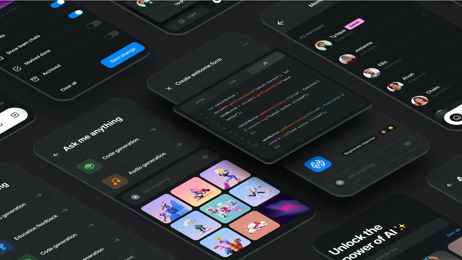
Dark Mode is a display option in user interfaces that alters the classic color palette, generally replacing light backgrounds with dark tones. This shift is more than a simple color inversion; it aims to create a different visual experience and to meet users' specific needs by offering an alternative to the traditional light mode.
ORIGINS
The origins of dark mode date back to the early days of computer graphical interfaces. In its beginnings, dark mode mainly served to reduce eye strain for users working long hours in front of screens. Over time, it evolved in response to technological changes and users' aesthetic preferences.
When and why to use it
LOW LIGHTING AND VISUAL COMFORT
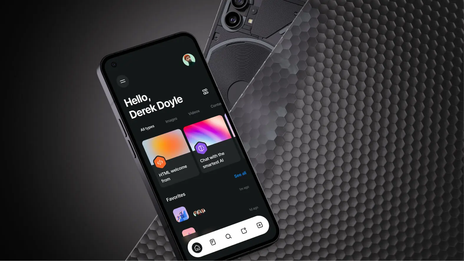
Dark mode finds its predominant usefulness in low-light environments. When lighting conditions are reduced, whether at night or in dark spaces, dark mode offers less contrast with the surroundings, thereby reducing glare and improving visual comfort. This characteristic makes it an optimal choice for extended use, particularly in nighttime reading applications.
ENERGY SAVINGS ON OLED SCREENS
A compelling argument in favor of dark mode lies in its potential for energy savings, especially on OLED screens. In this display technology, each pixel lights up individually. By enabling dark mode, where pixels display darker colors, less energy is required, thereby helping to extend battery life on mobile devices.
USER PREFERENCES AND PSYCHOLOGICAL FACTORS
The reasons for using dark mode go beyond practical considerations. Individual user preferences play a crucial role. Some prefer the aesthetics of dark mode, perceiving dark tones as more soothing for the eyes. On a psychological level, dark mode can create an immersive atmosphere, ideal for applications such as reading or nighttime browsing.
ADAPTING TO HEALTH CONCERNS
For users facing light-sensitivity issues, such as those suffering from migraines or vision-related disorders, dark mode can provide significant relief. By minimizing exposure to bright light, it reduces the risk of triggering uncomfortable symptoms, thereby contributing to a healthier user experience.
CONSISTENT INTEGRATION WITH THE OVERALL DESIGN
The use of dark mode must be integrated consistently with the overall design of the interface. It can be appropriate to apply it in applications focused on creativity, such as photo-editing software, to minimize visual distractions. The thoughtful application of dark mode enhances the user experience by creating a harmonious aesthetic and by highlighting the content.
Best practices
CONTRAST AND READABILITY
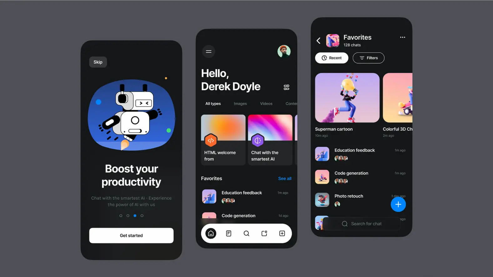
When implementing dark mode, it is essential to carefully manage contrast to ensure optimal text readability. The colors of textual and graphic elements must be chosen wisely to guarantee sufficient contrast without causing eye strain. Subtle and well-balanced shades can contribute to a pleasant visual experience.
APPROPRIATE COLOR PALETTE
Selecting a suitable color palette is crucial. Opt for dark tones that do not compromise the clarity of the displayed information. Shades of dark gray, midnight blue or deep black can be used strategically to create a harmonious balance while preserving visual sharpness.
ADAPTABILITY TO USER PREFERENCES
Personalization is an important dimension of dark mode. Give users the ability to choose between different variations of dark themes. Some may prefer warmer tones, while others will opt for cooler shades. Flexibility in color preferences ensures a more inclusive user experience.
ACCESSIBILITY
Accessibility must be at the heart of dark mode design. Make sure the text remains clear and readable, even in low-light conditions. Use appropriate fonts and adjust the text size as needed. Features such as high-contrast options can improve accessibility for users with specific visual needs.
USER TESTING AND FEEDBACK
Before deploying a dark mode, carry out thorough user testing. Gather feedback on the users' experience across various usage contexts. This helps identify any issues with contrast, readability or accessibility, thereby offering the opportunity to make adjustments before the official release.
Conclusion
In conclusion, dark mode has evolved over time to become an essential feature in interface design. Its benefits in terms of visual comfort and energy savings, combined with its aesthetic appeal, make it a popular option. The choice to use it is not limited to practical considerations but also embraces the individual preferences of users, influenced by psychological factors and health concerns.
The successful integration of dark mode requires particular attention to best practices, ranging from managing contrast and readability to personalizing user preferences. The color palette must be chosen carefully, ensuring visual harmony while preserving the clarity of the displayed information. By adopting these principles, designers can create attractive and functional interfaces, offering an immersive user experience that adapts to a variety of needs and preferences.