Introduction
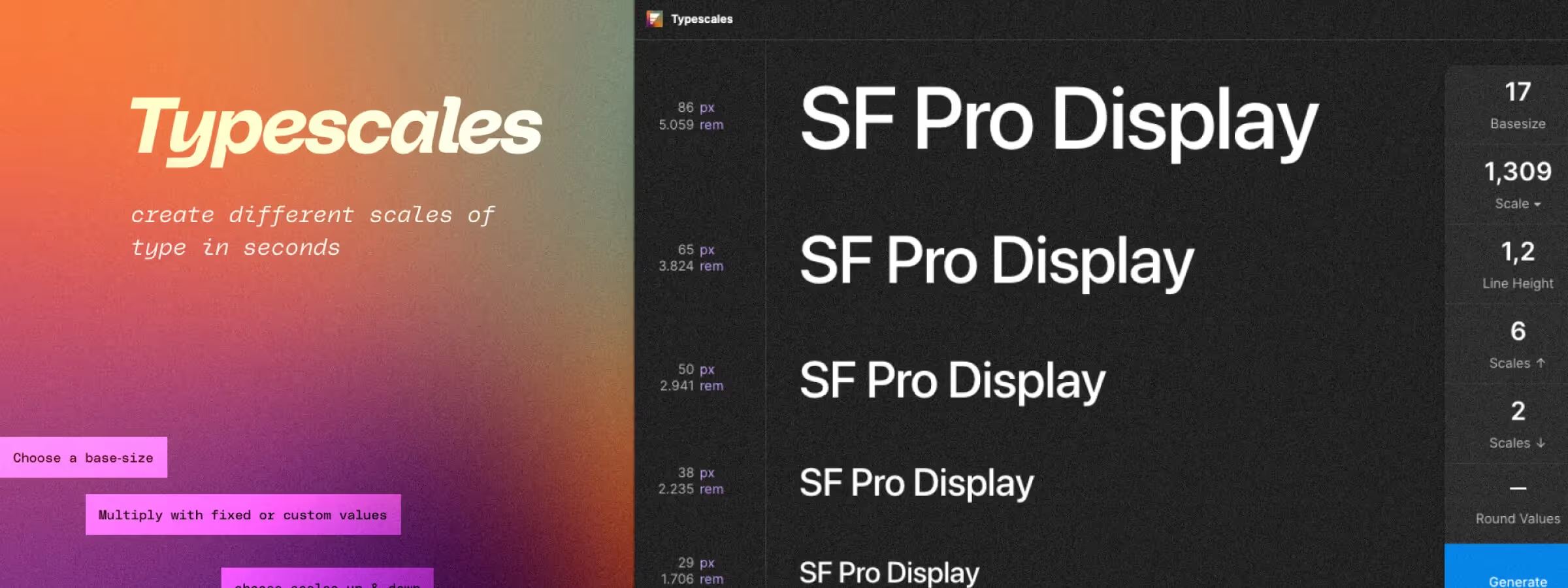
When working on a design project, typography plays an important role in conveying brand identity and the message you want to get across. However, it can be difficult to find the perfect balance between font size and readability. That's where the Figma plugin "Typescales" comes in.
In our experience, this plugin gives you a smart layout tool that lets you define the hierarchy and balance of your fonts using a base value and a multiplier. On top of that, it uses a smart layout algorithm to determine the optimal size and spacing for each heading and subheading level, and it gives you the ability to sync the fonts used across your project to maintain visual consistency.
Features
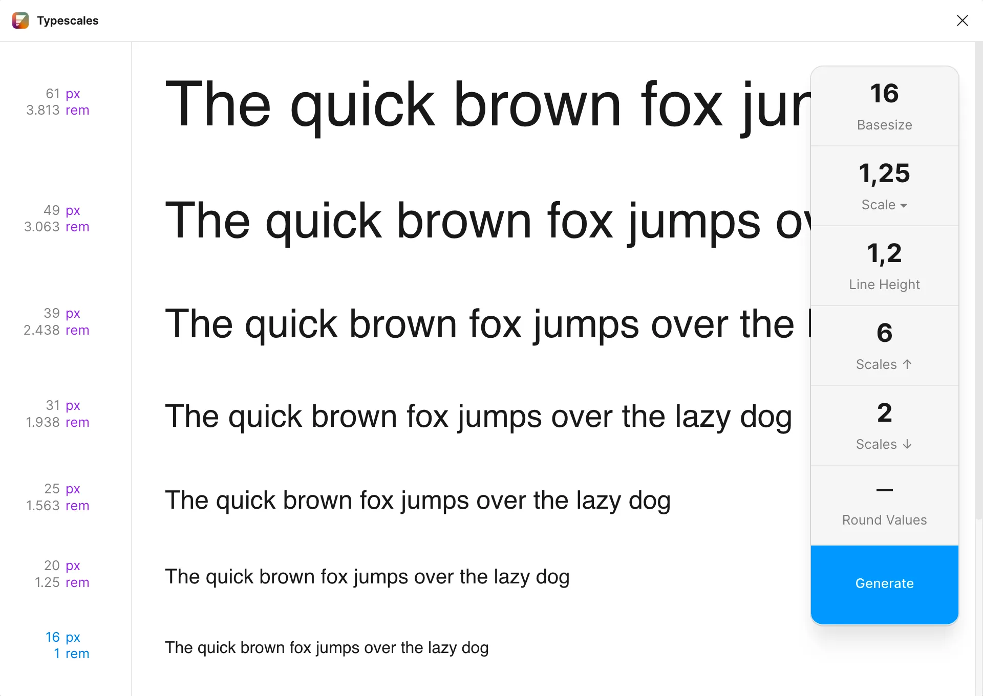
BASE SIZE
It's a good idea to choose a base size that suits your project and your target audience. In general, a base size between 14px and 16px is a solid reference for desktop. This value matters because it determines the font size used for the main body text of your site or app. That said, there's no absolute standard, and the base size can vary depending on the art direction of your project.
Either way, it's important to leave enough room for readability and to plan for styles smaller than the base size rather than starting with a base typography that's too small.
SCALE FACTOR
In our experience, this feature lets you define the hierarchy of the different heading and subheading levels in your project. You can choose a custom value or pick from the most common options such as Minor Second, Major Second, Minor Third, Major Third, and so on.
The scale factor determines the size gap between each heading and subheading level. Major Third is often considered an ideal option for larger screens because it creates a clear, easy-to-read hierarchy. That said, you can adjust the scale factor to match the art direction of your project and your personal preferences.
LINE HEIGHT
This relates to the spacing between lines of text in your design project. It can be adjusted based on the font size and the readability you're after. Larger line spacing can be used to improve readability and add visual breathing room to your project, while tighter line spacing can be used to create a more compact layout. It's important to find a balance between line spacing and readability so that your project is pleasant to read and easy to understand.
UPPER & LOWER STYLES
In our experience, this feature lets you set the number of heading and subheading styles you want to use in your design project. You can define the number of upper styles (headings) and the number of lower styles (subheadings) using the corresponding input fields.
In our experience, this feature helps you create a clear hierarchy and define the heading and subheading levels of your project in a convenient and efficient way. It also gives you the ability to customize your project's layout to fit your preferences and the chosen art direction.
ROUND VALUES
If this option is enabled, font size values will be rounded to the nearest whole number to avoid fractional values. This can be useful if you want your project's font sizes to be precise and easy to work with.
If this option is disabled, font size values will be displayed with fractional values, which can be useful if you want very precise font sizes. Whether to enable or disable this feature depends on your preferences and the art direction of your project.
GENERATE LAYERS
By clicking "Generate Layers", you can get pre-formatted text layers with the defined sizes, which, in our experience, lets you save time and work more efficiently.
Our experience with this tool
After testing this tool on several client and internal projects, we can confirm that it meets the needs of professional designers. Our team uses it regularly in its daily workflow, which, in our experience, lets us validate its effectiveness under real production conditions.
Points tested in detail:
- Performance on large files (500+ frames)
- Compatibility with complex design systems
- Stability during heavy use
- Integration into a team workflow
Things to watch out for (tested in real conditions)
In the interest of transparency, here are the limitations we identified during our testing:
- Processing time can increase on very large files
- Requires a stable internet connection for certain features
- Learning curve for beginner users
Conclusion
The Figma plugin "Typescales" is a handy and effective tool for managing the typography of your design project. It gives you a simple way to define the hierarchy and balance of your fonts using a base value and a multiplier, as well as to sync the fonts used across your project to maintain visual consistency. On top of that, it uses a smart layout algorithm to determine the optimal size and spacing for each heading and subheading level, and it lets you customize line spacing and the number of upper and lower styles.
By using these features, you can improve the quality of your typography and create a consistent visual rhythm in your design project. We highly recommend this plugin for anyone looking to enhance the visual presentation of their project.